At the bottom of the facts
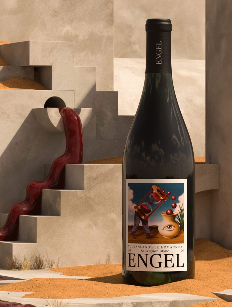
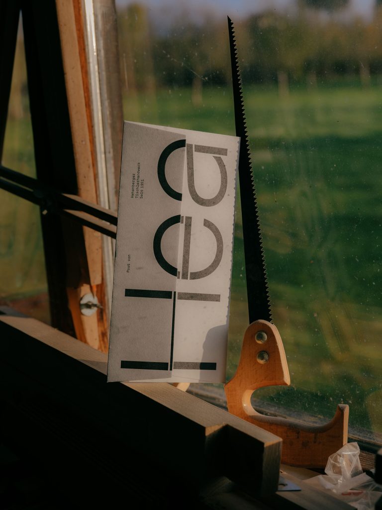
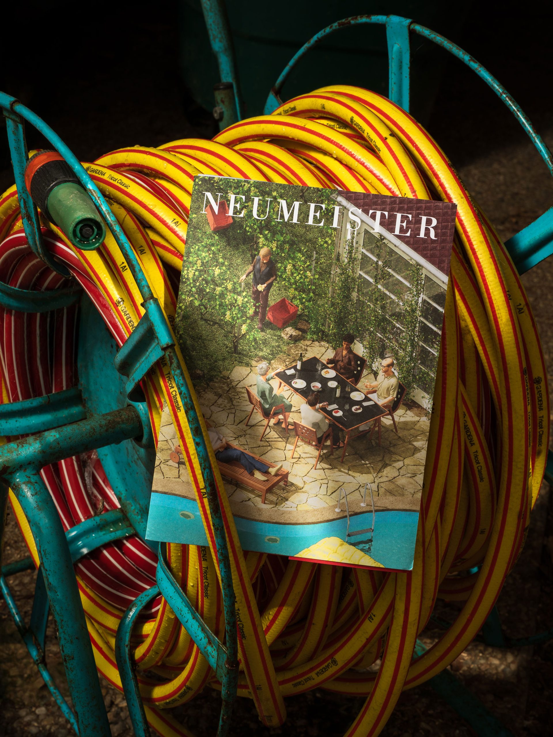
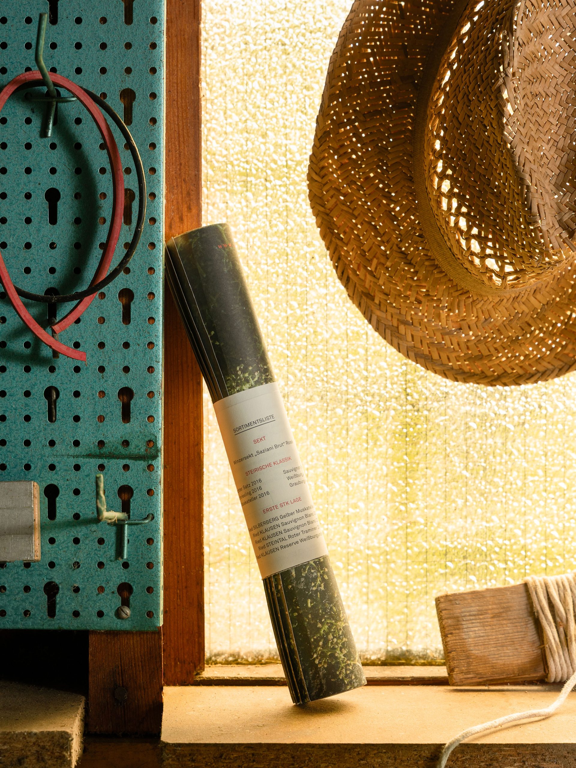
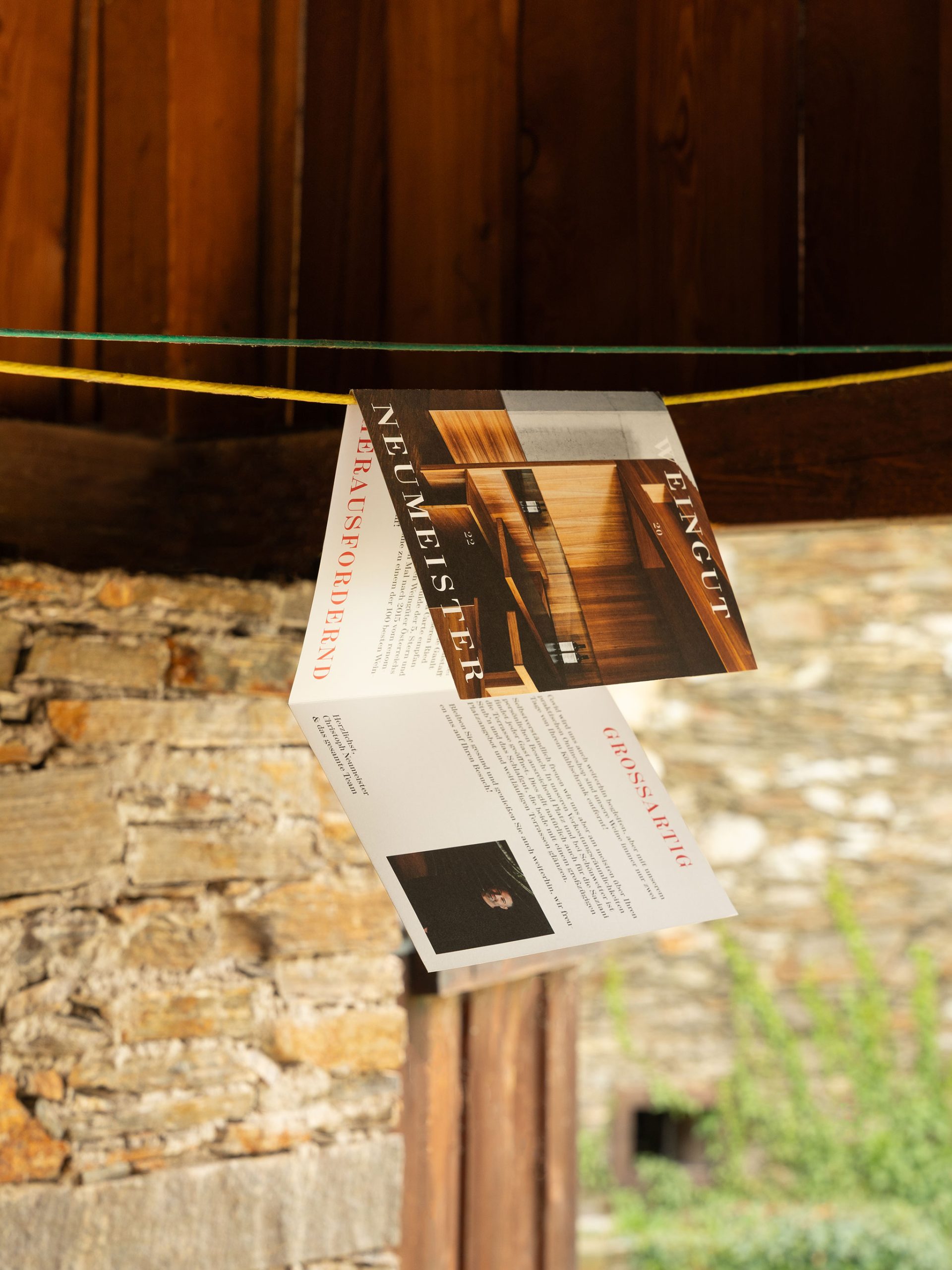
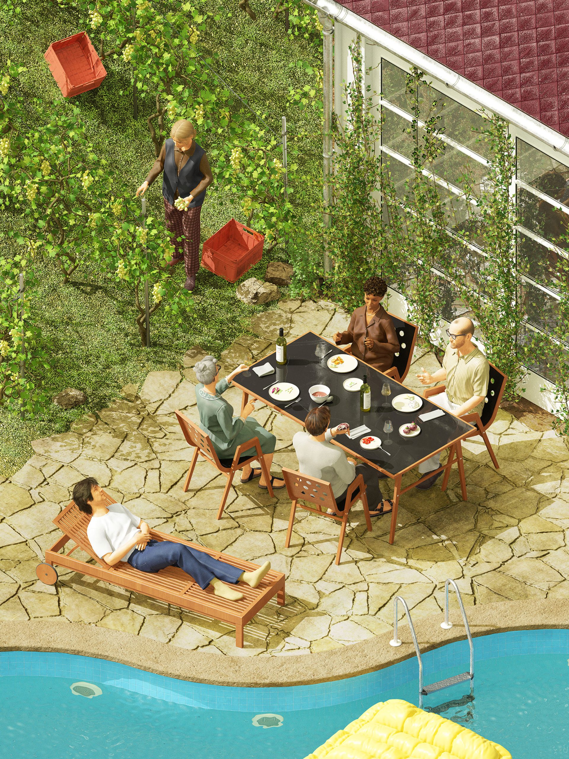
Long-term, holistic & elaborate. This philosophy runs like a red thread through the work of the Neumeister winery. In keeping with the nature of the winegrowing family, the aim is not to push to the fore and be the loudest, but to take up nuanced themes such as terroir, soil, landscape, etc. and link them to their philosophy
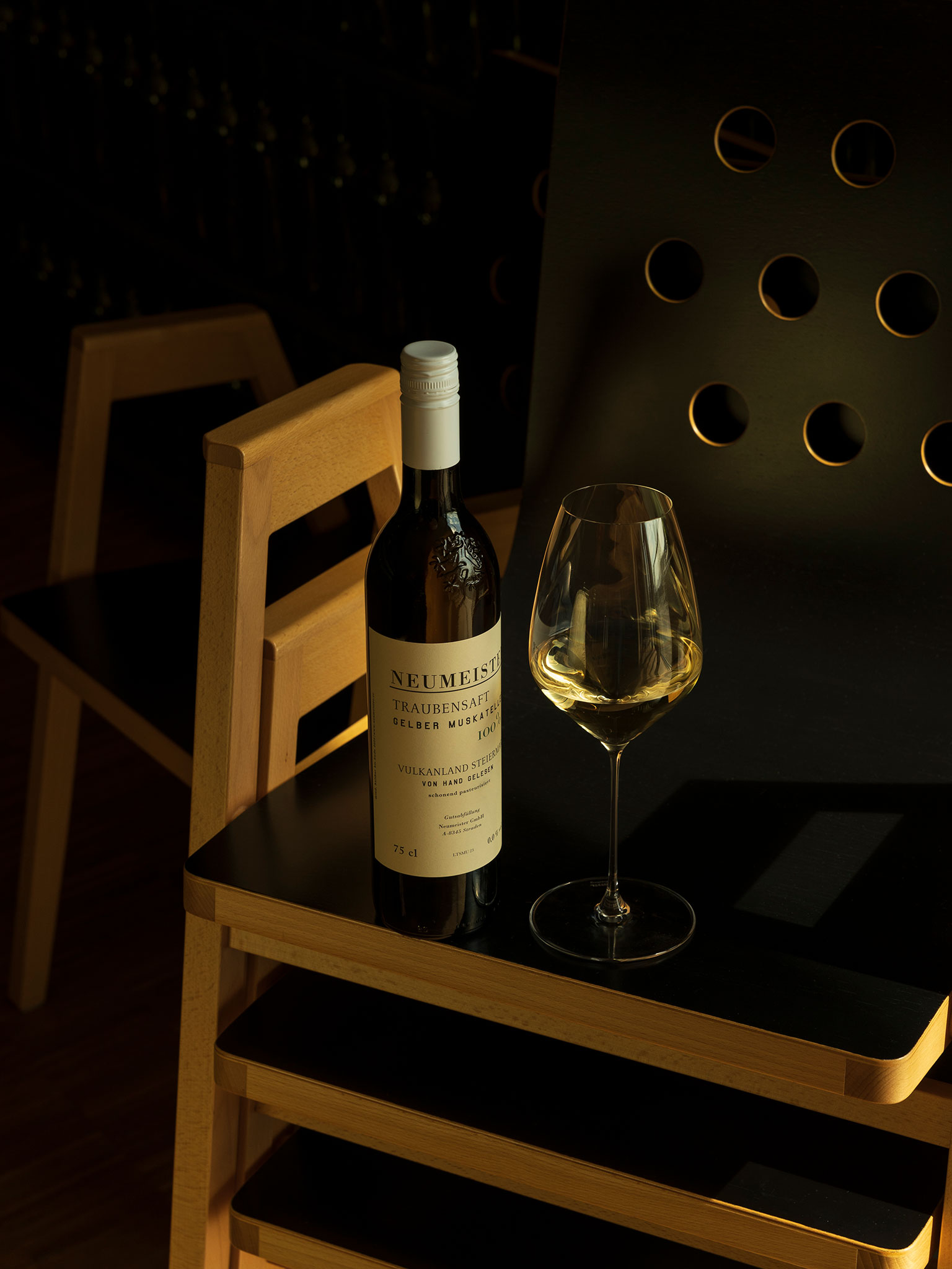
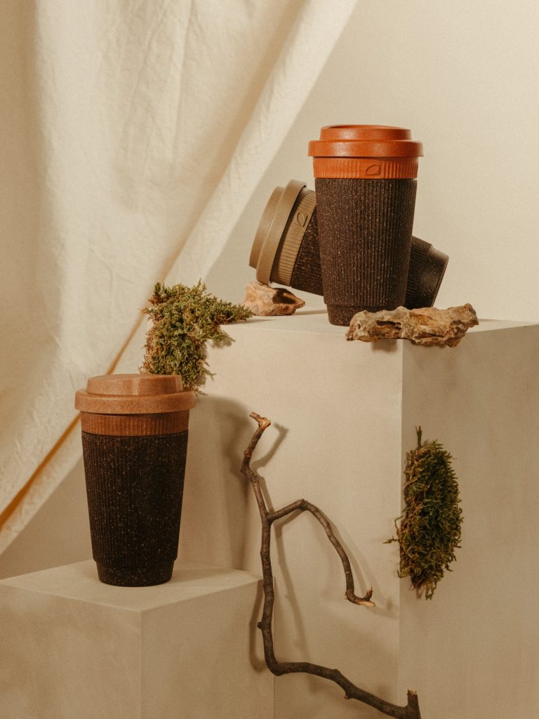
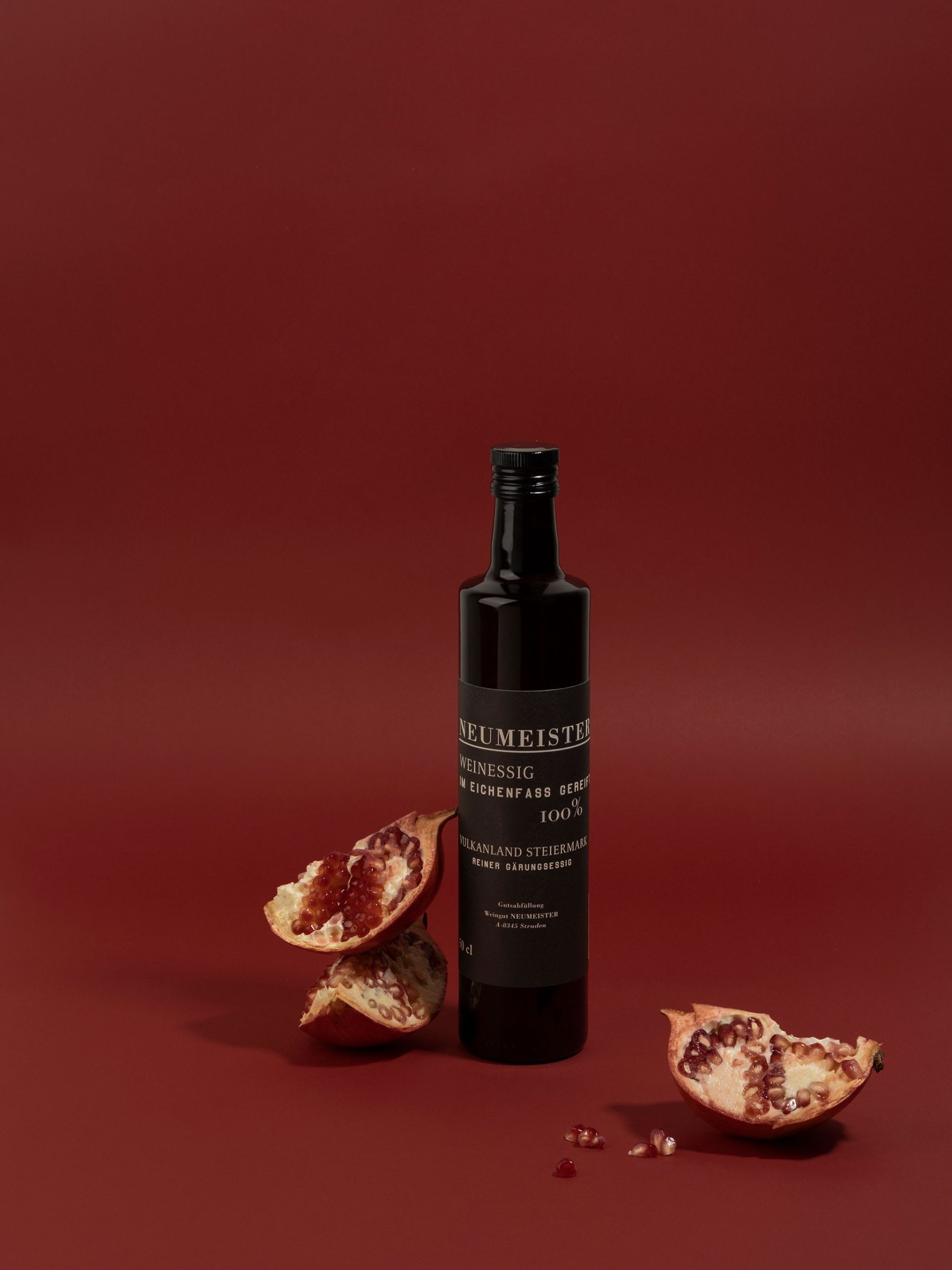
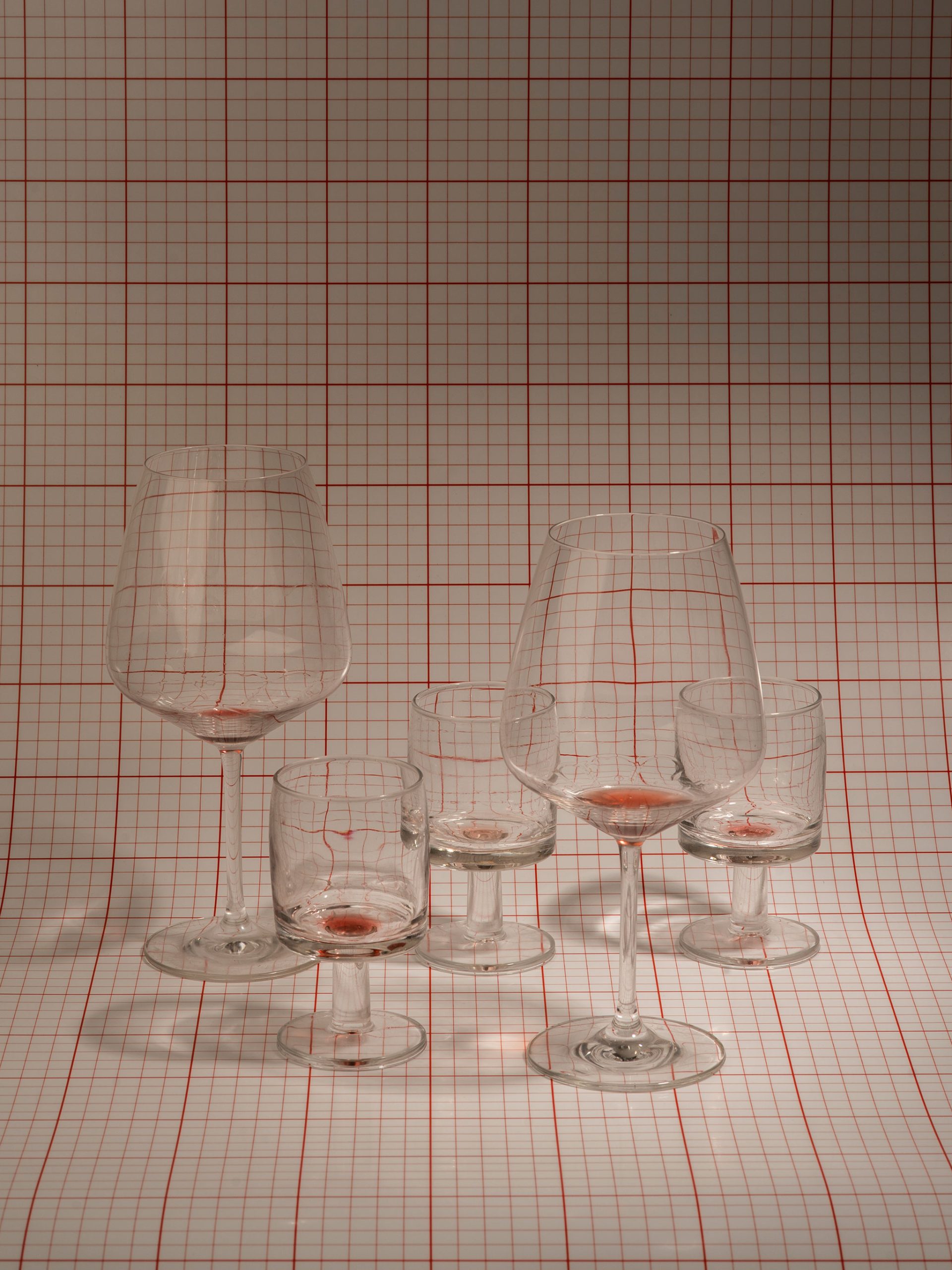
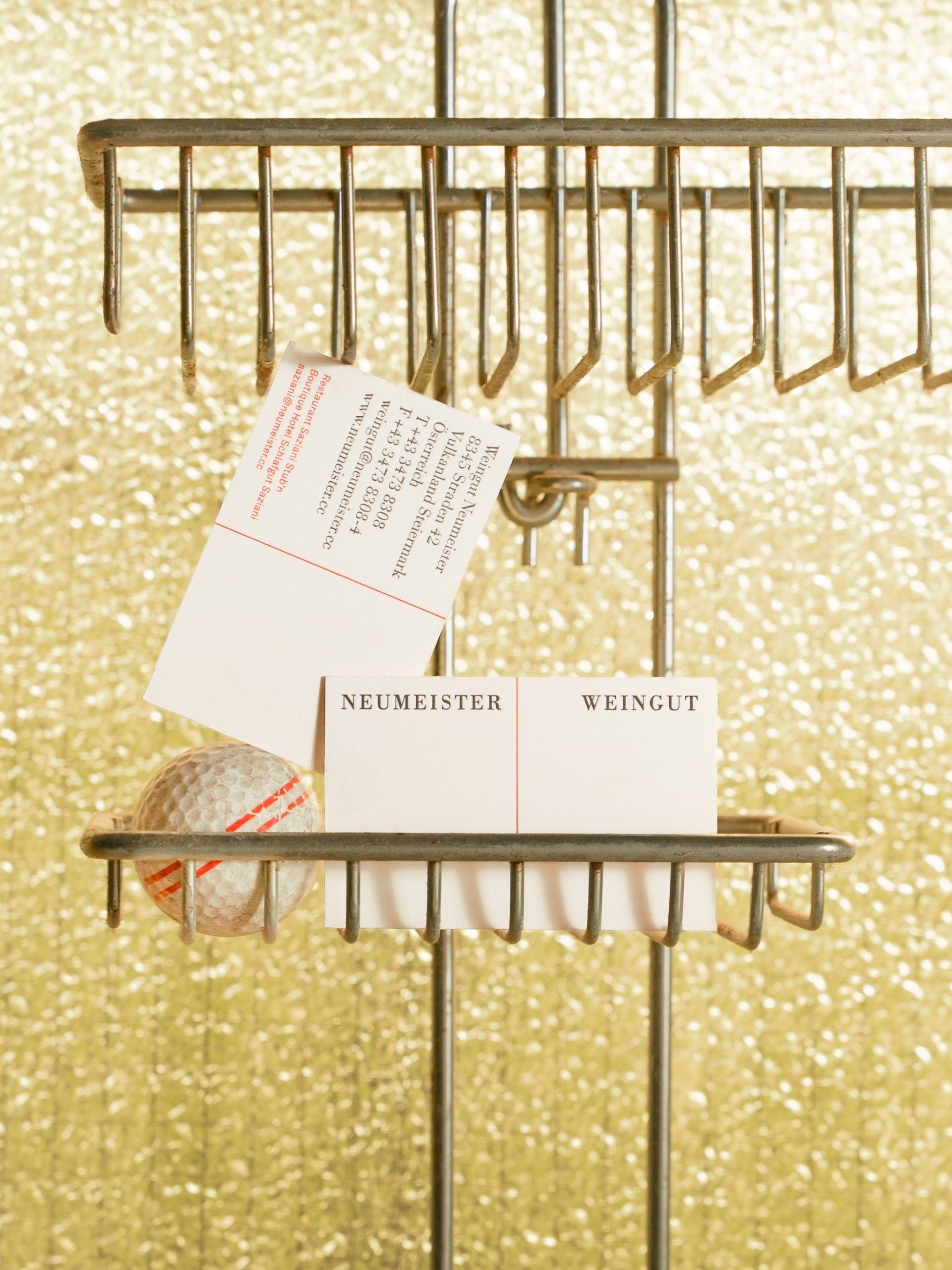
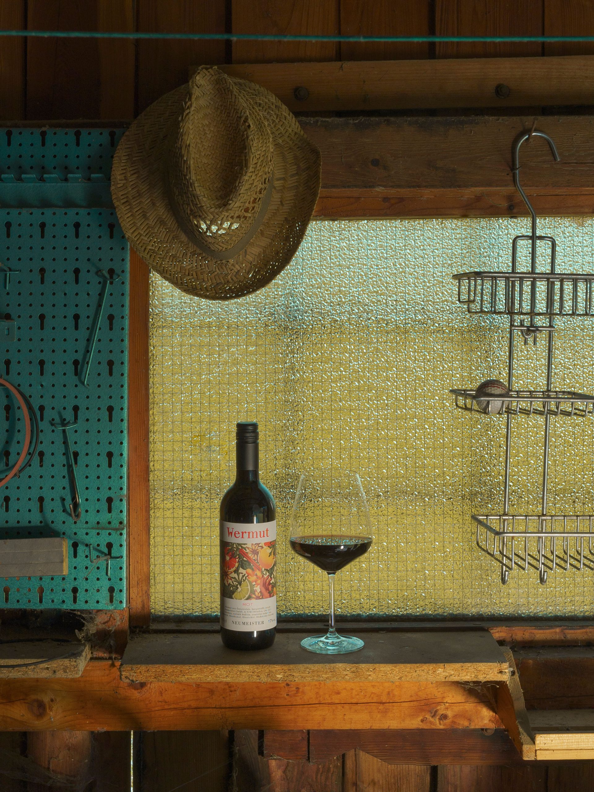
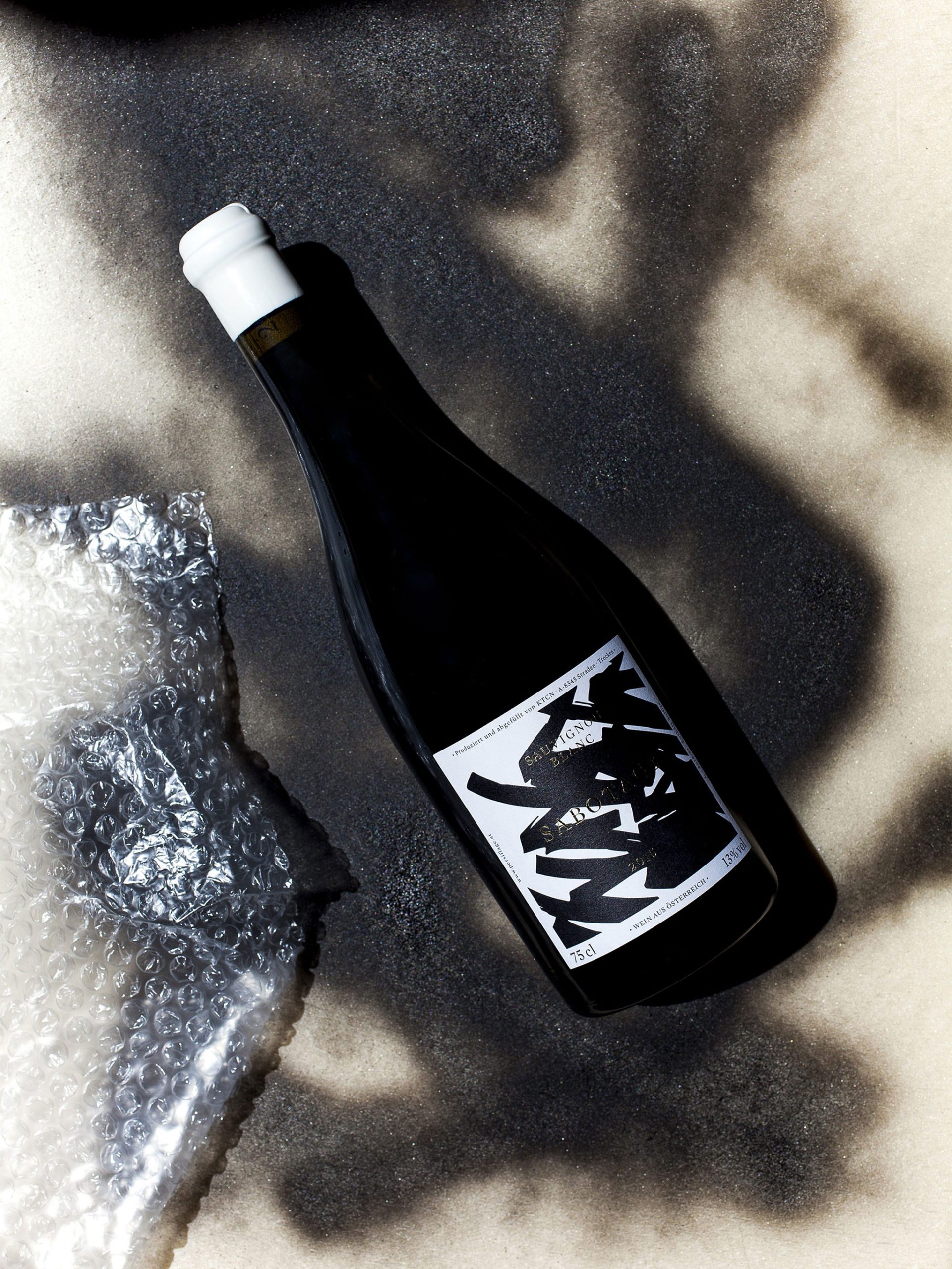
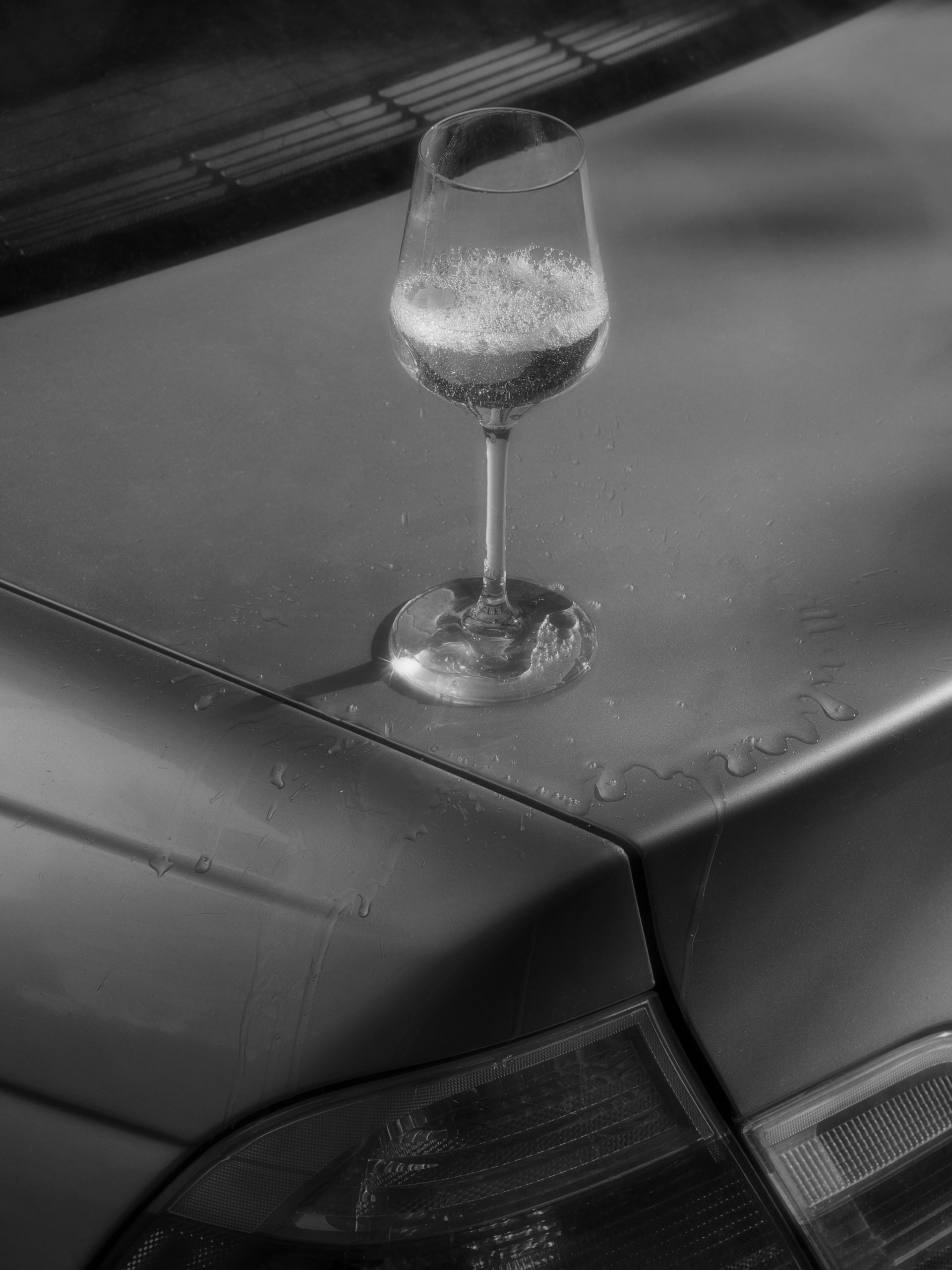
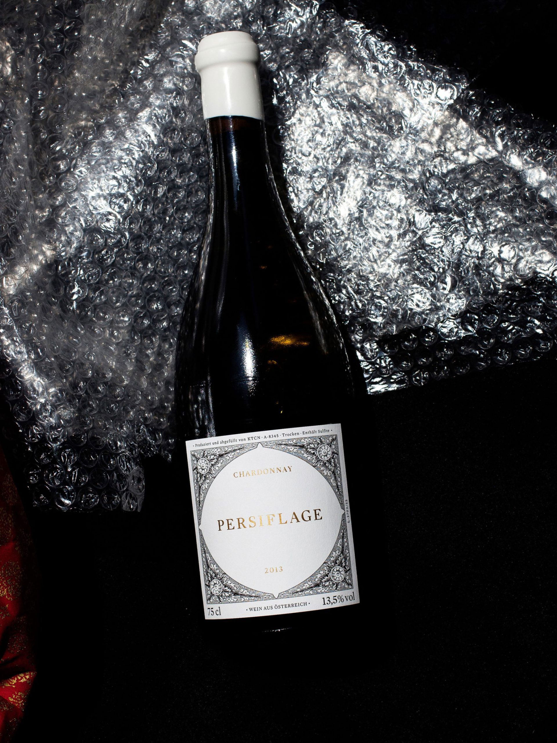
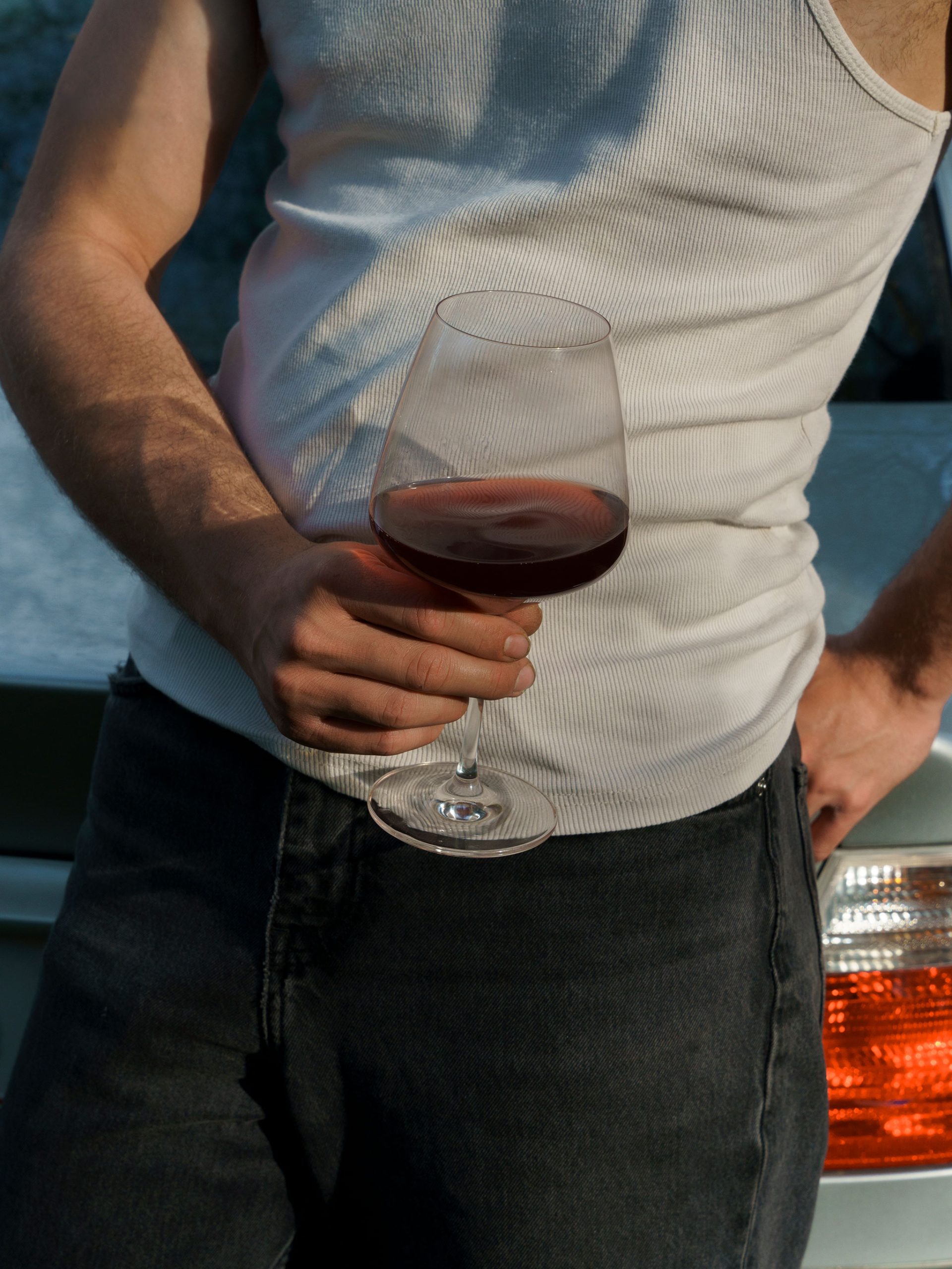
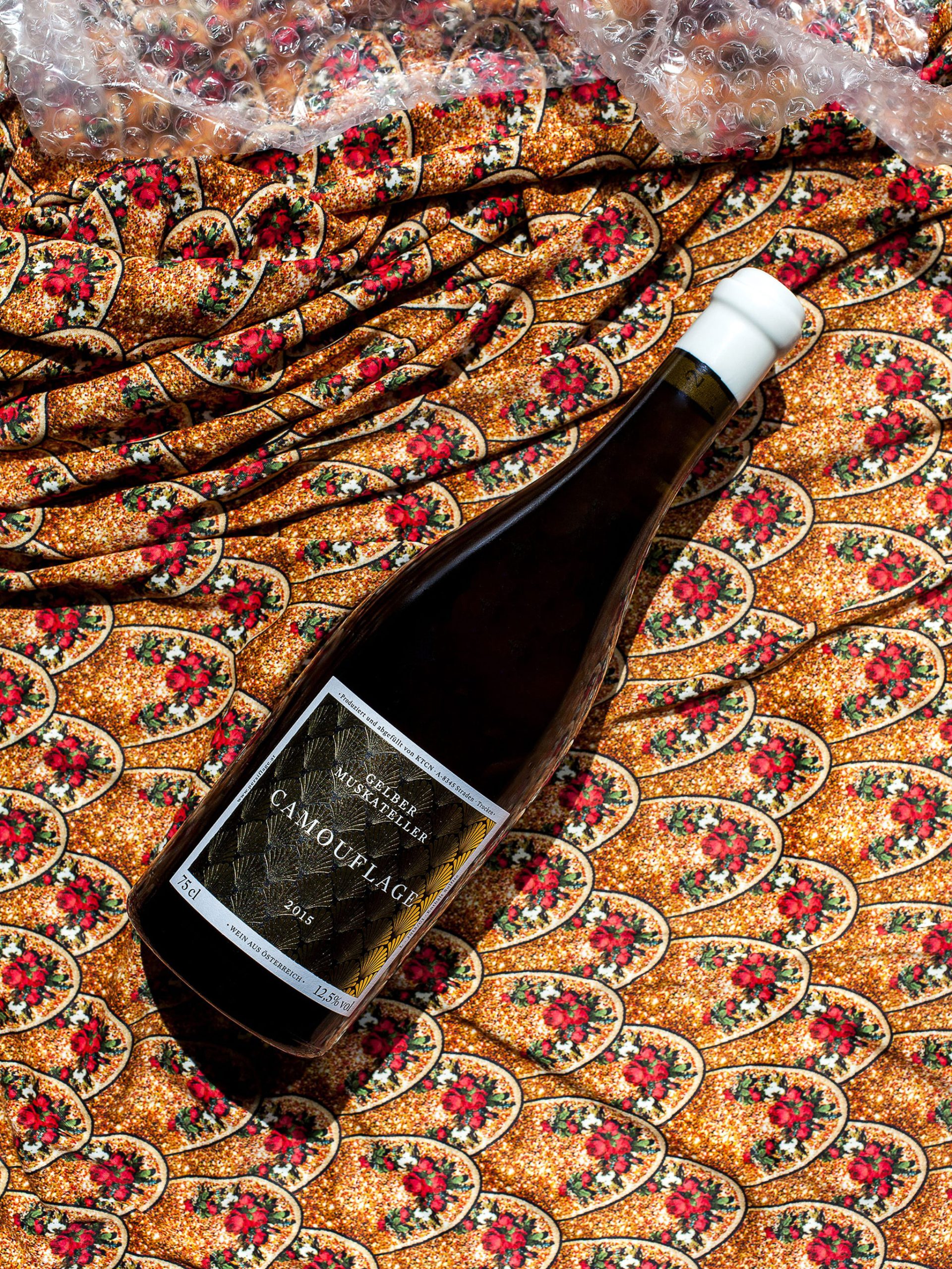
Nevertheless, the wide variety of products and the numerous collaborations require a playground that can emphasize the respective features in a nuanced way. Whether with illustration, imagery or finishing, every touchpoint should be coherent in itself.
Project Details
Scope
Art Direction
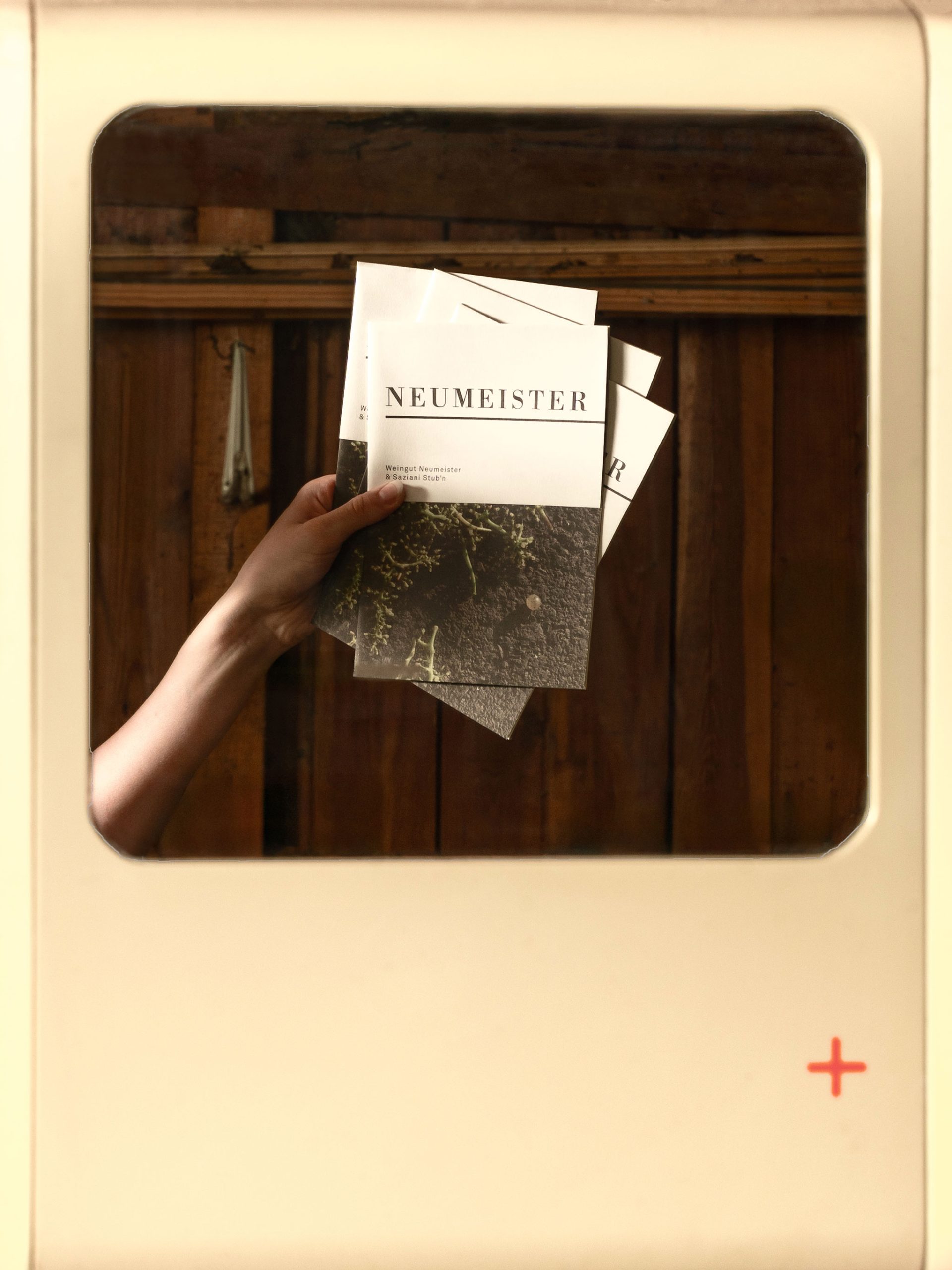
Digital
Illustration
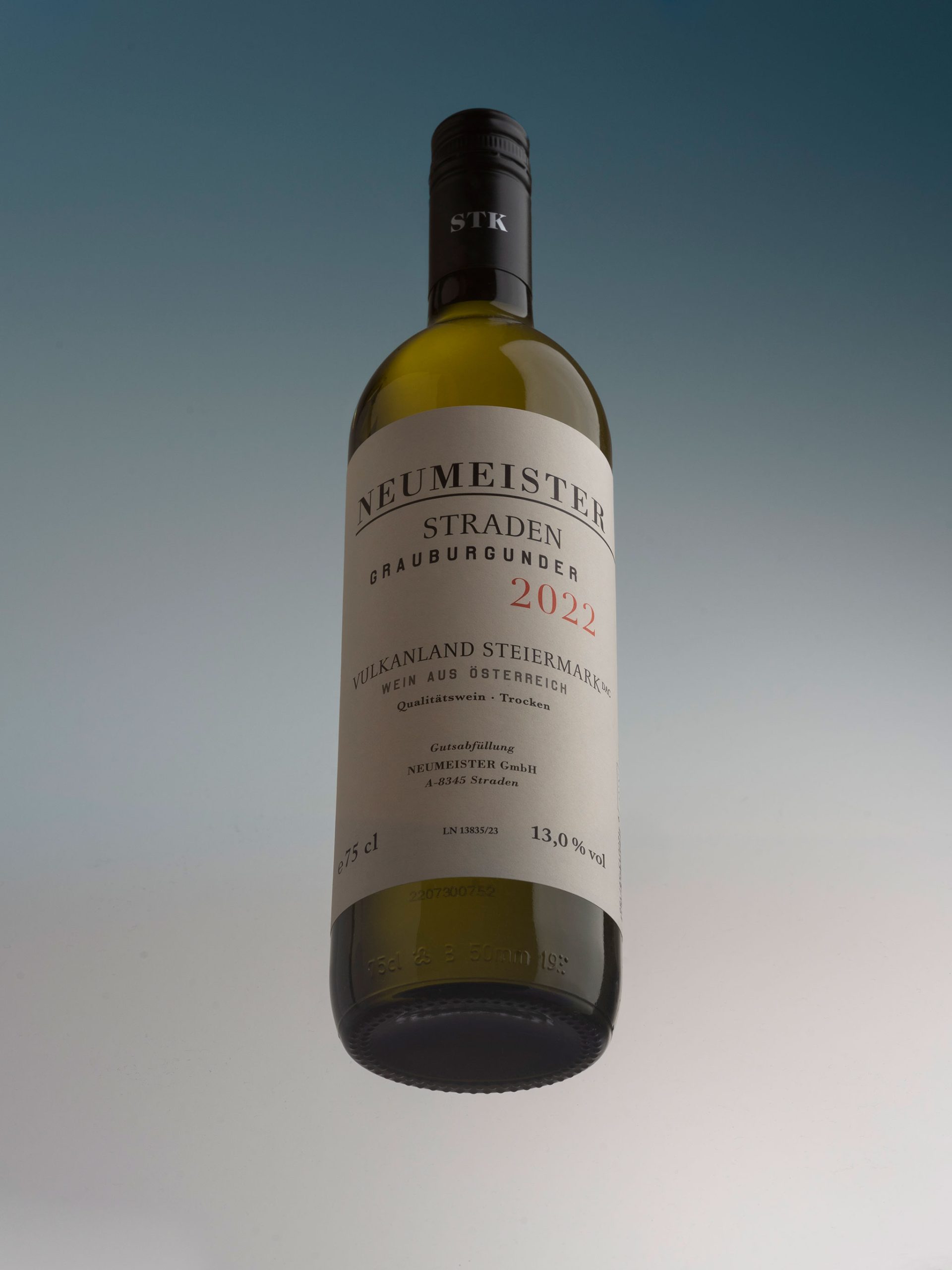
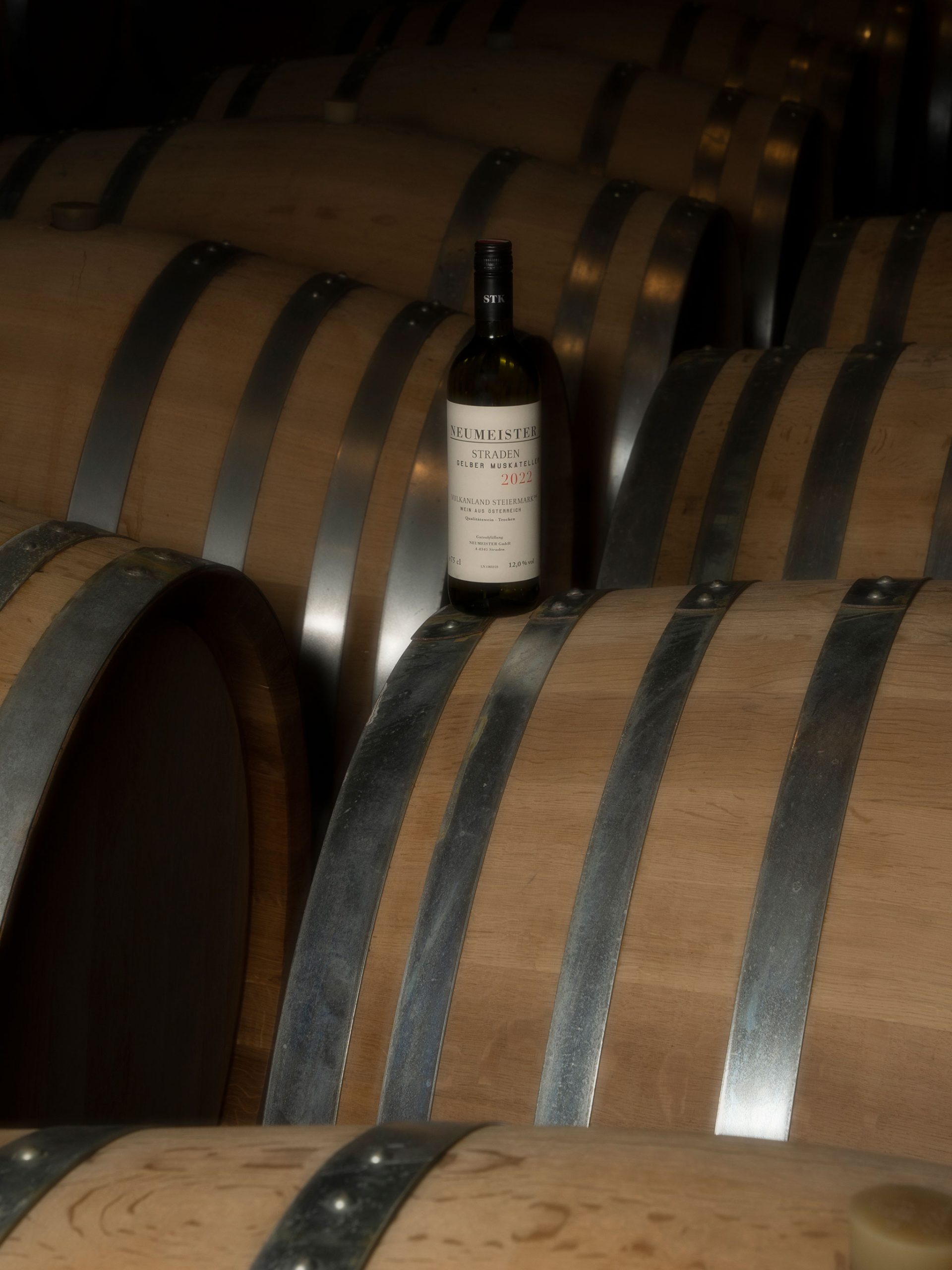
Package Design
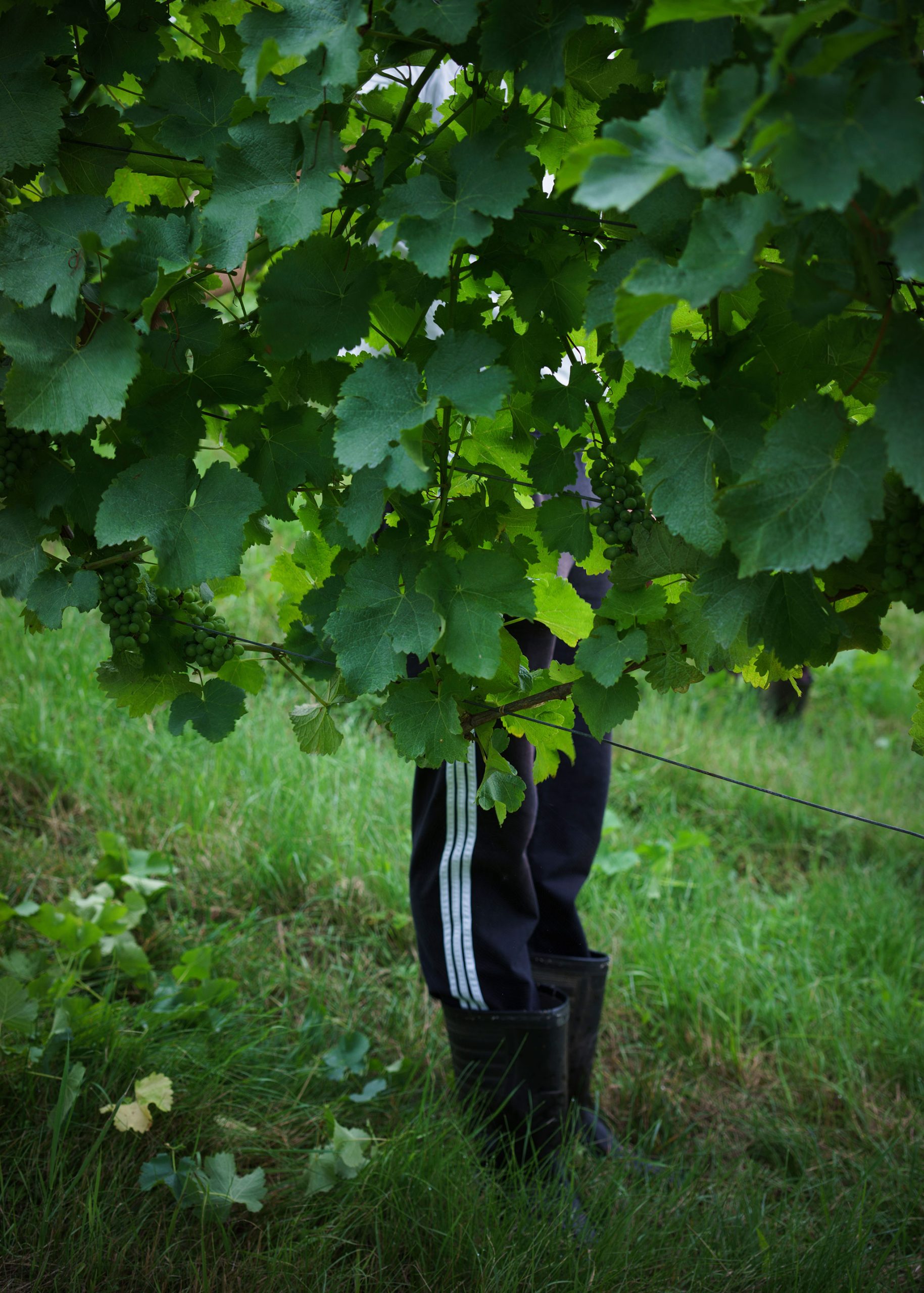
Photography
Long-term, holistic & elaborate. This philosophy runs like a red thread through the work of the Neumeister winery. In keeping with the nature of the winegrowing family, the aim is not to push to the fore and be the loudest, but to take up nuanced themes such as terroir, soil, landscape, etc. and link them to their philosophy. Nevertheless, the wide variety of products and cooperations requires a playground that can emphasize the respective characteristics in a nuanced way. Whether with illustration, imagery or refinement, every point of contact should be coherent in itself.
Credits:
Creative & Art Direction: Kurt Glänzer, Josef Heigl • Illustration: Max Guther • Photography: Erwin Polanc & Ina Weiss
• Creative & Art Direction: Kurt Glänzer, Josef Heigl
• Illustration: Max Guther
• Photography: Erwin Polanc & Ina Weiss