Carpentry since 1951
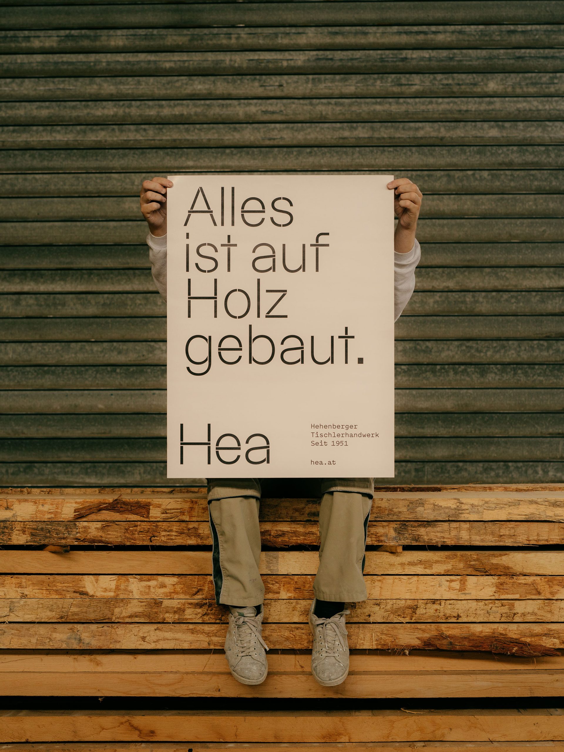
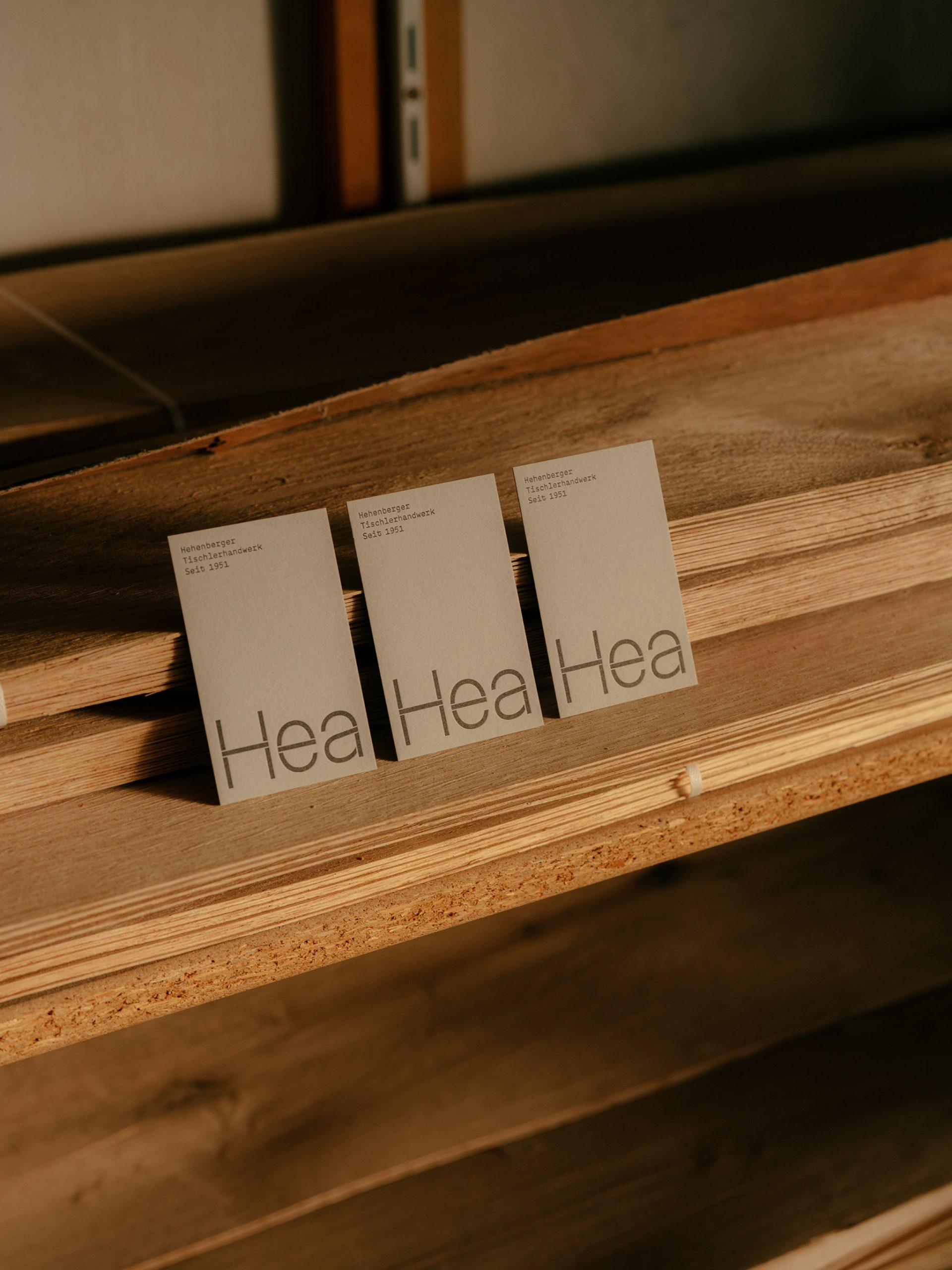
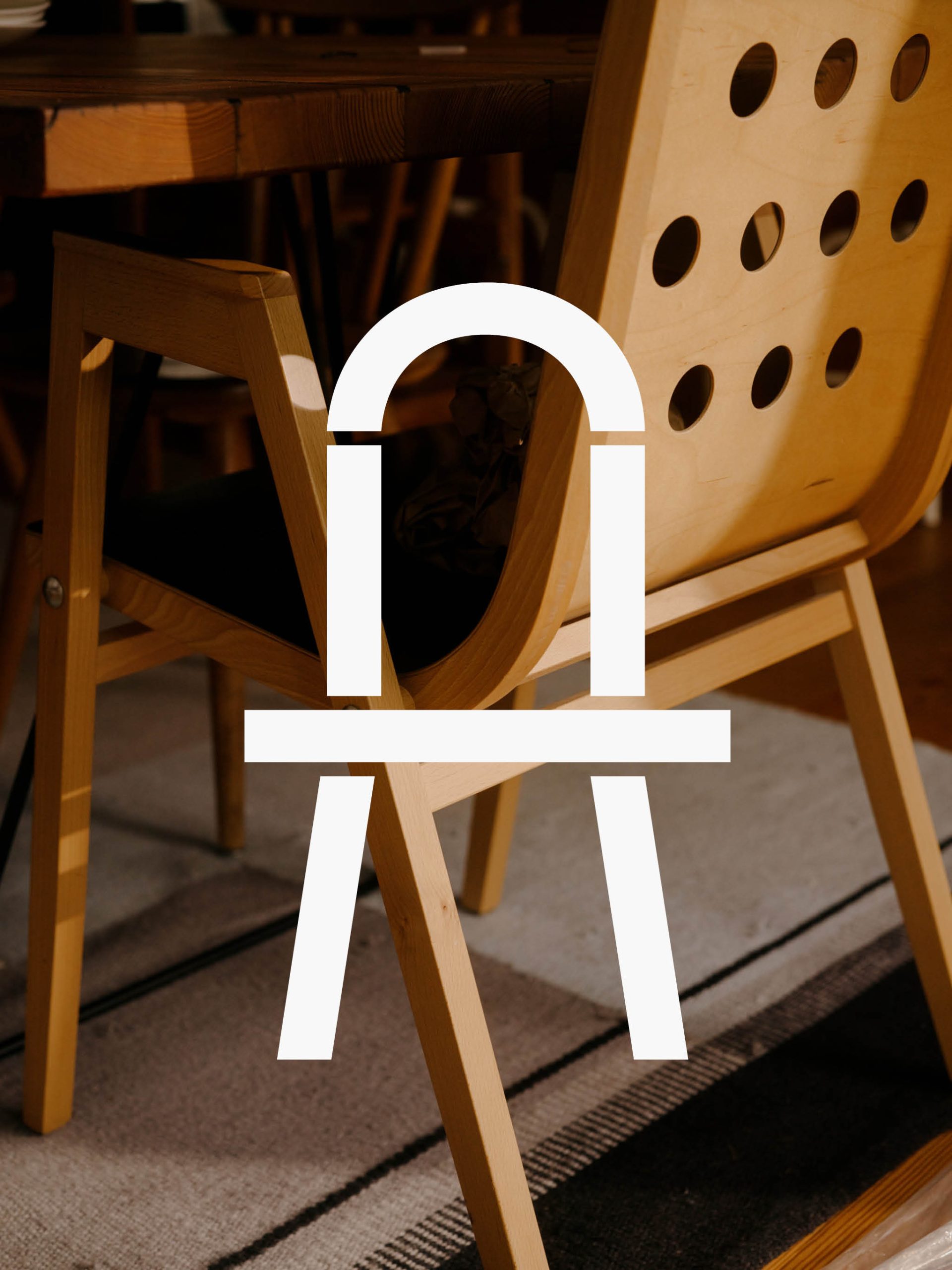
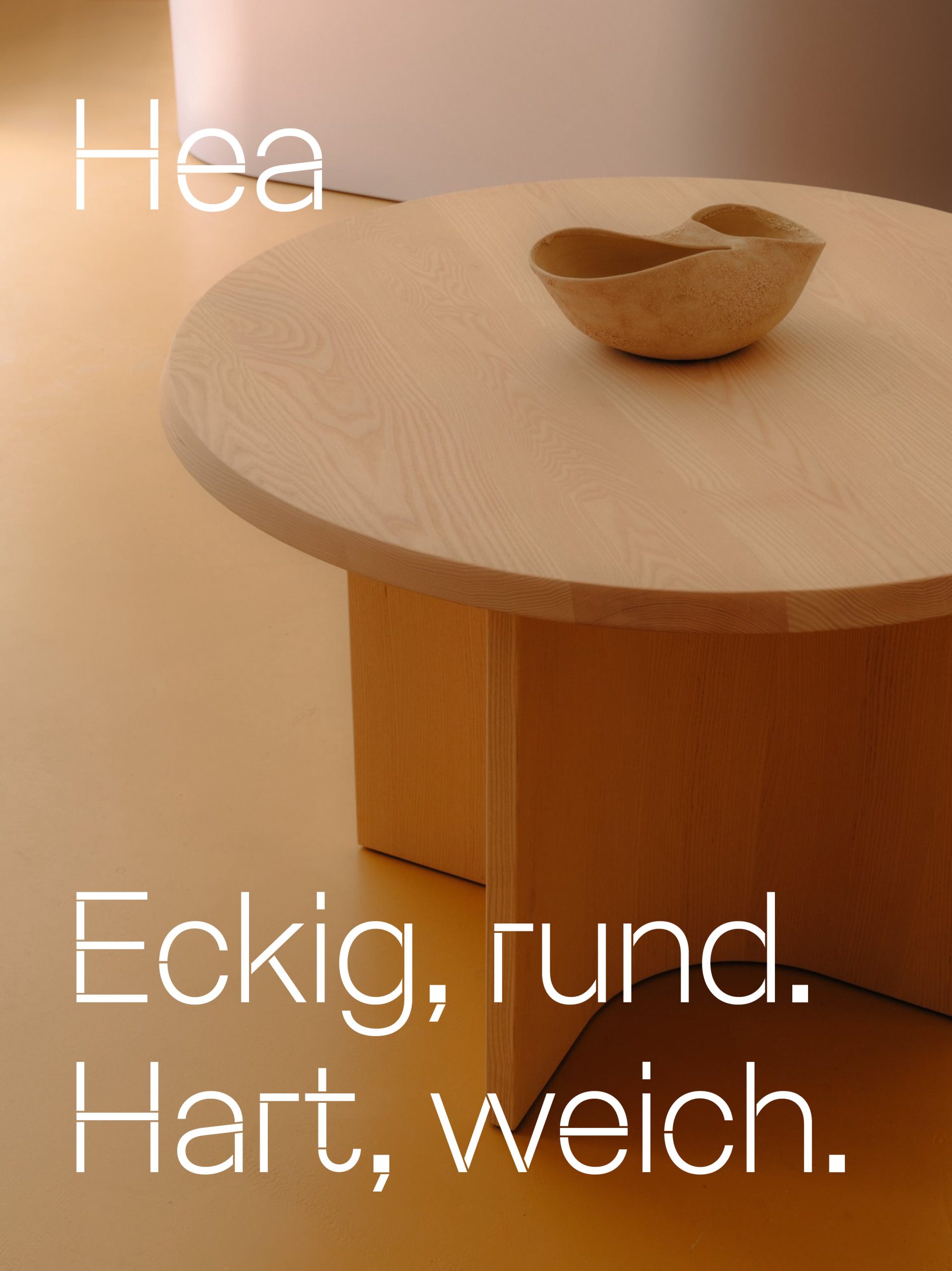
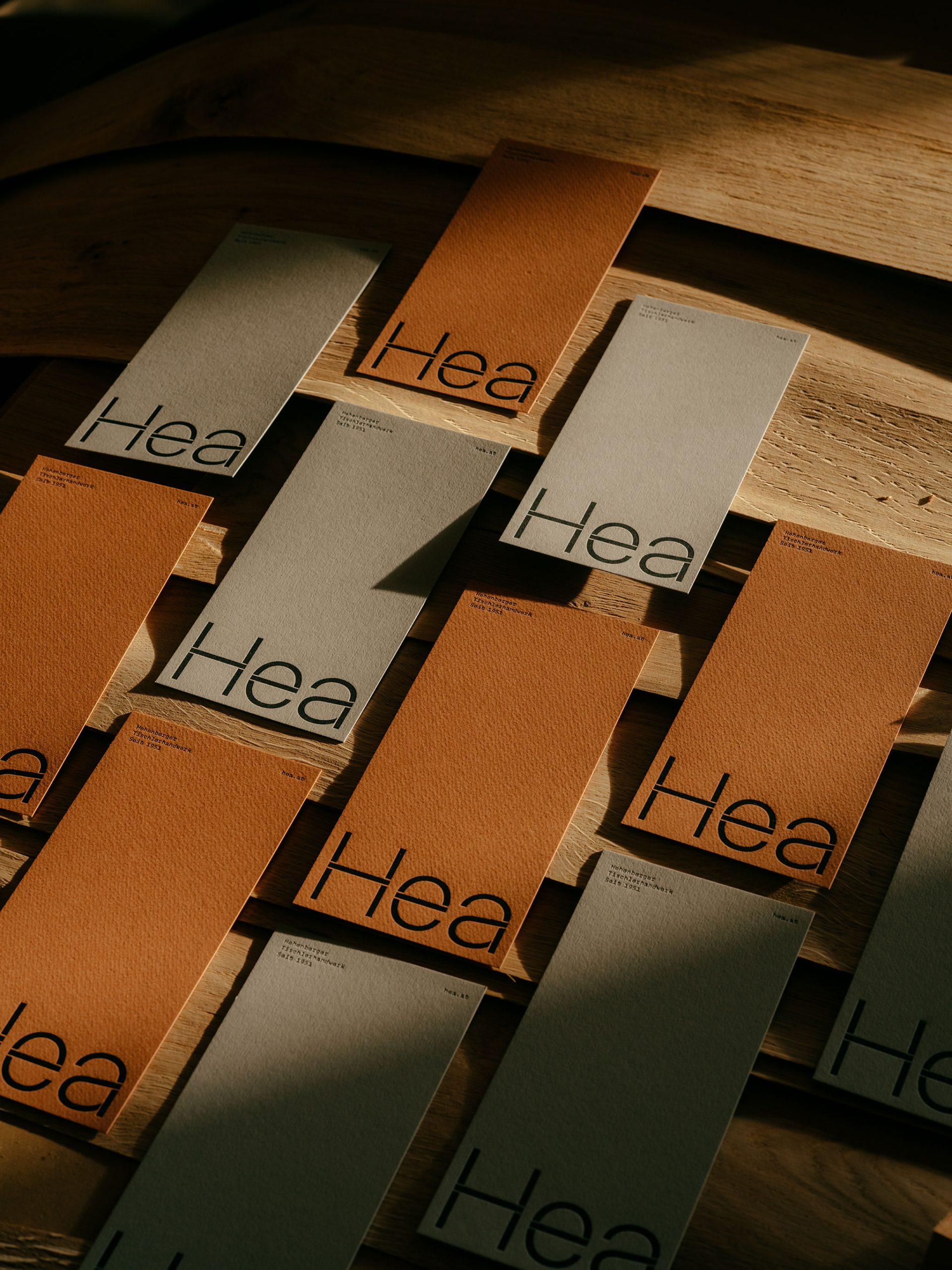
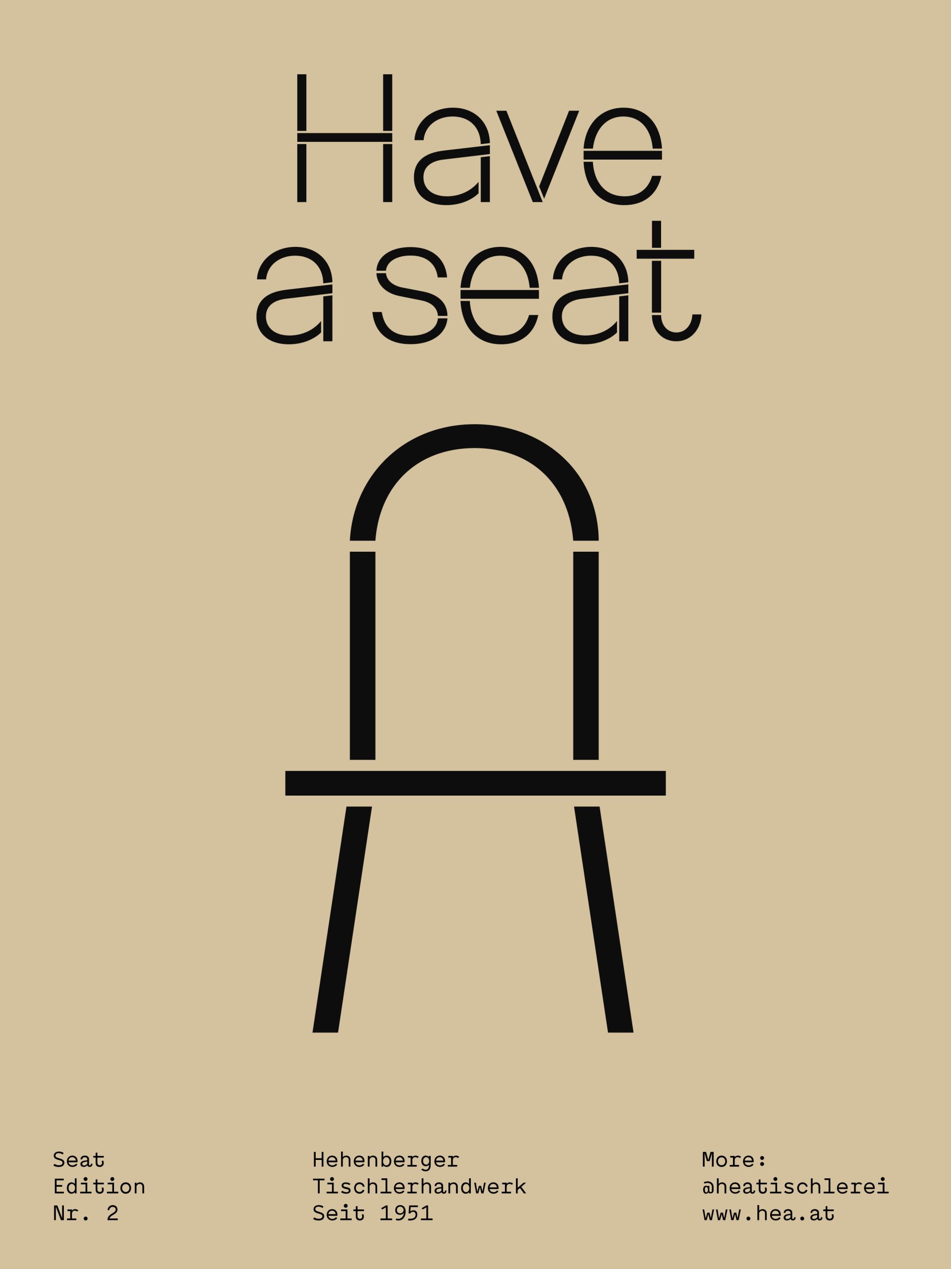
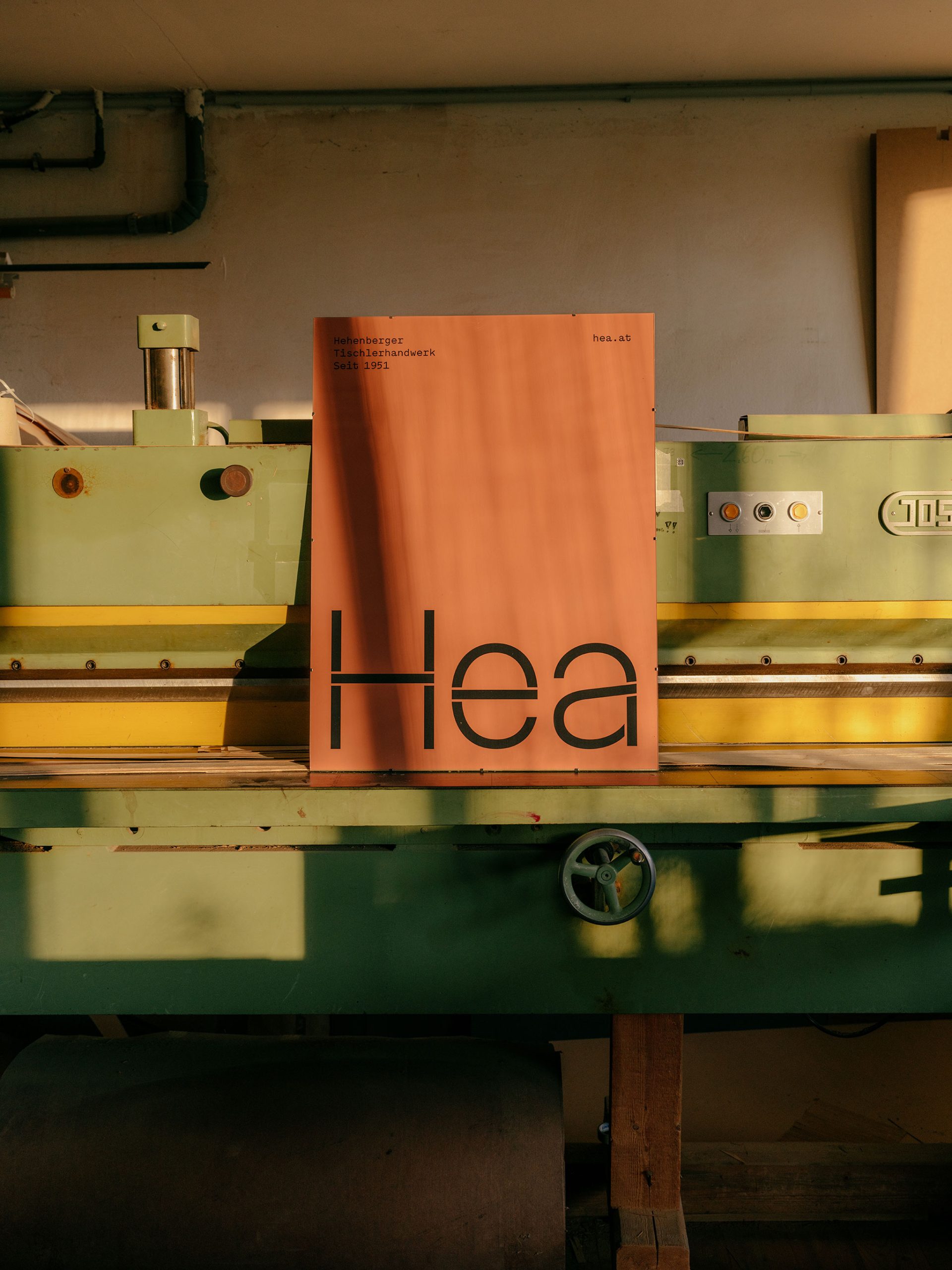
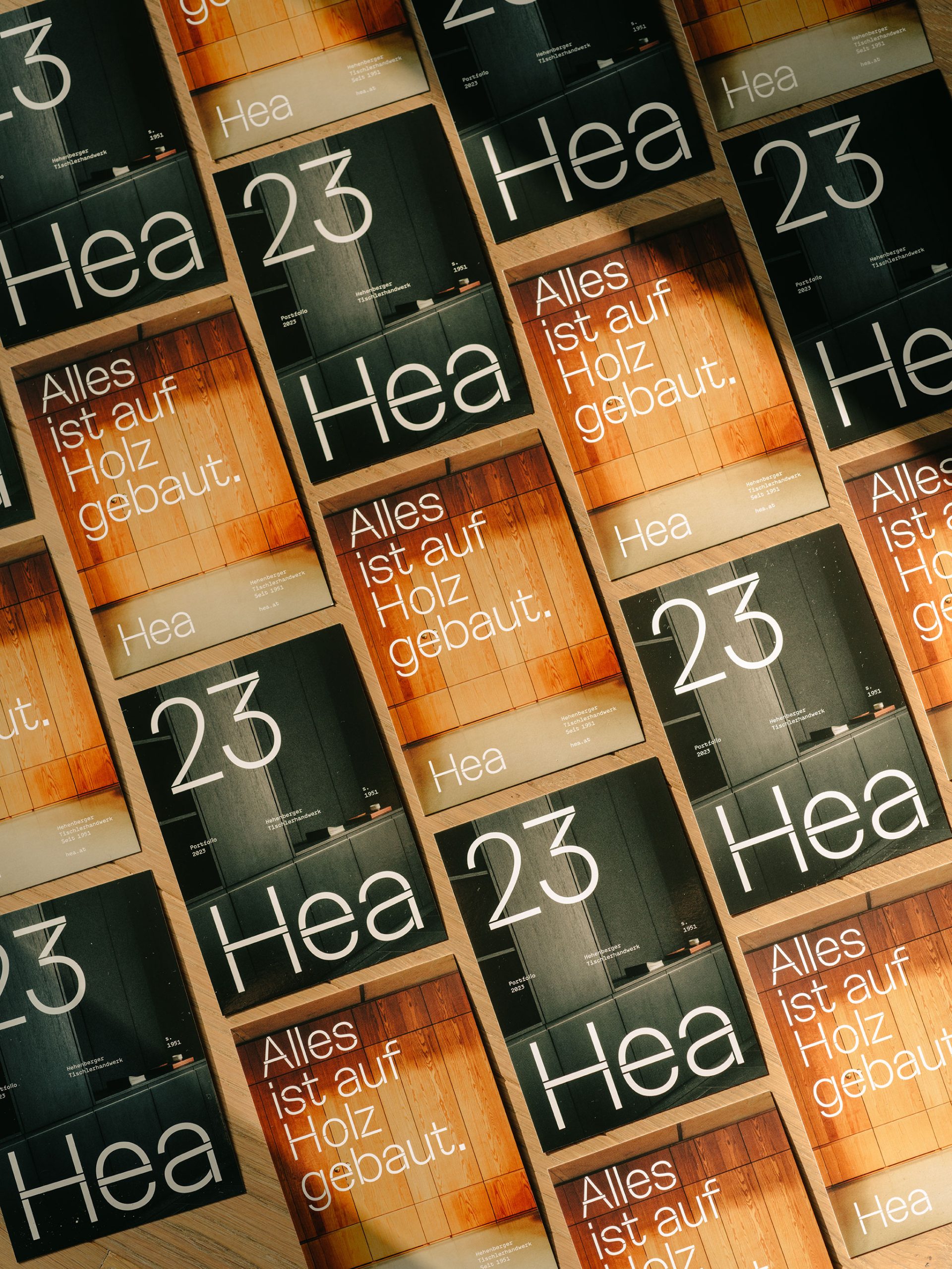
Angular and round, hard and soft – as contradictory as these may sound, they have been coming together harmoniously in Hea’s joinery since 1951. The newly developed and tailor-made font is also intended to span these opposites.
Angular and round, hard and soft – as contradictory as these may sound, they have been coming together harmoniously in Hea’s joinery since 1951. The newly developed and tailor-made font is also intended to span these opposites.
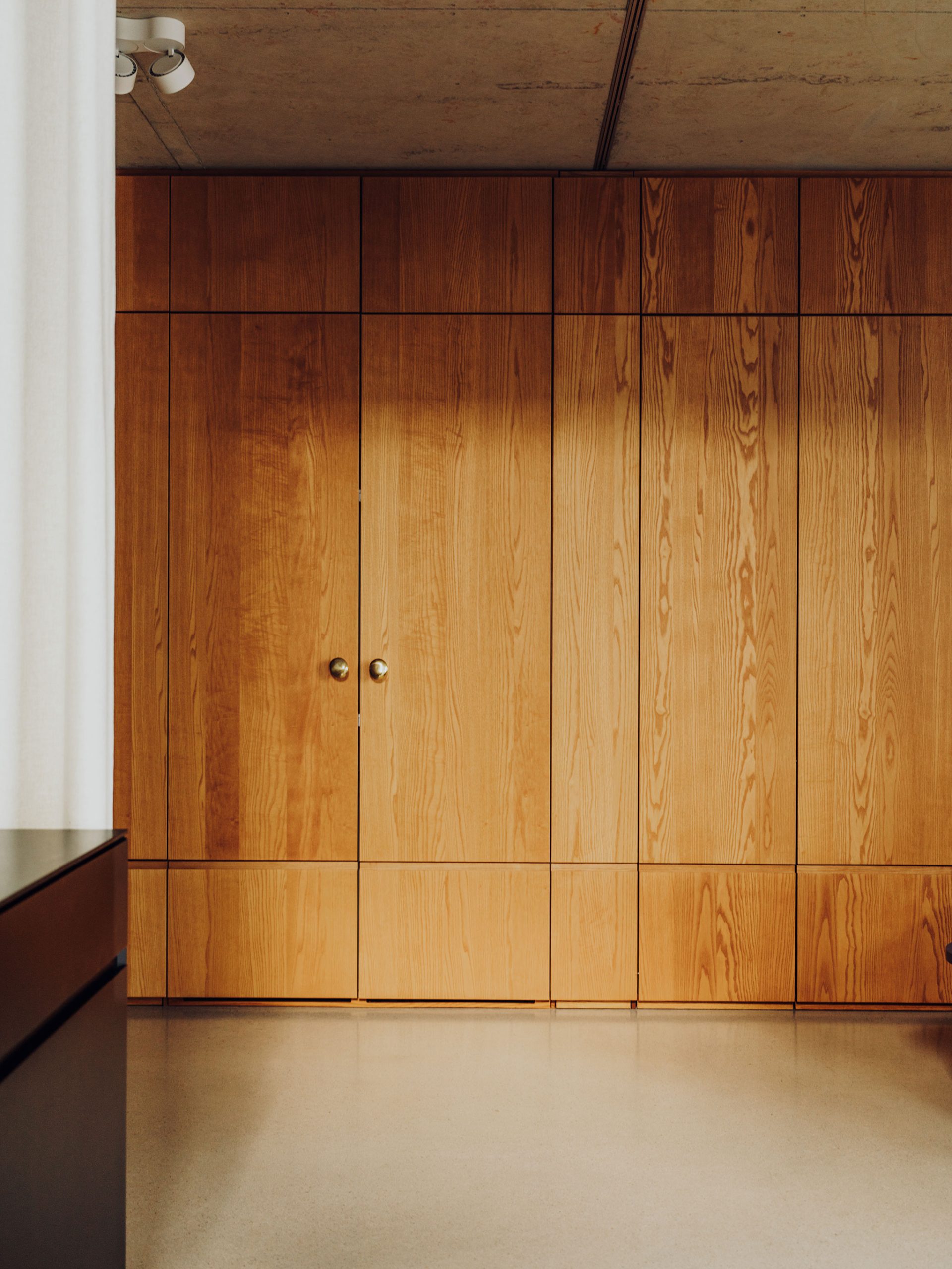
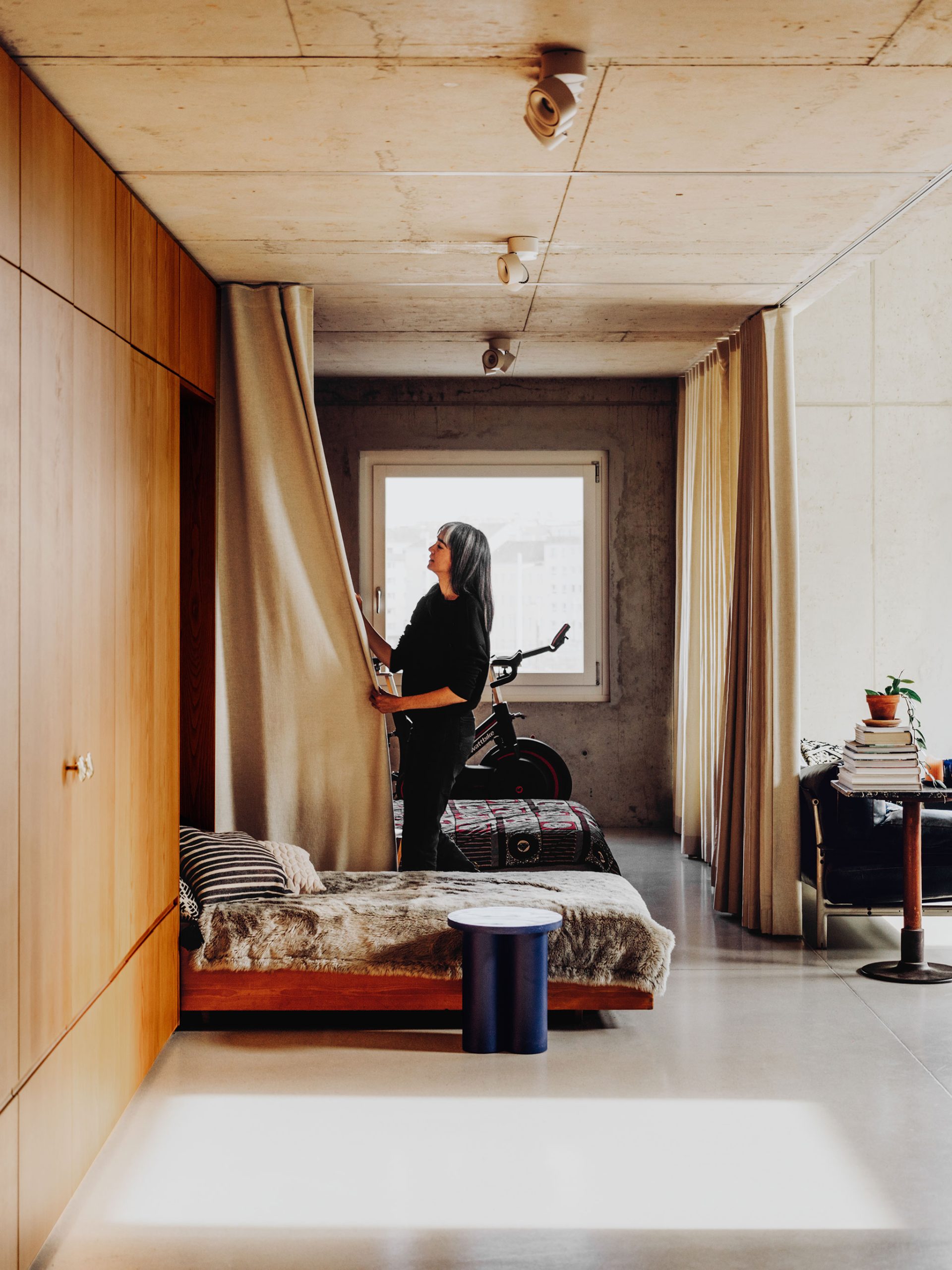
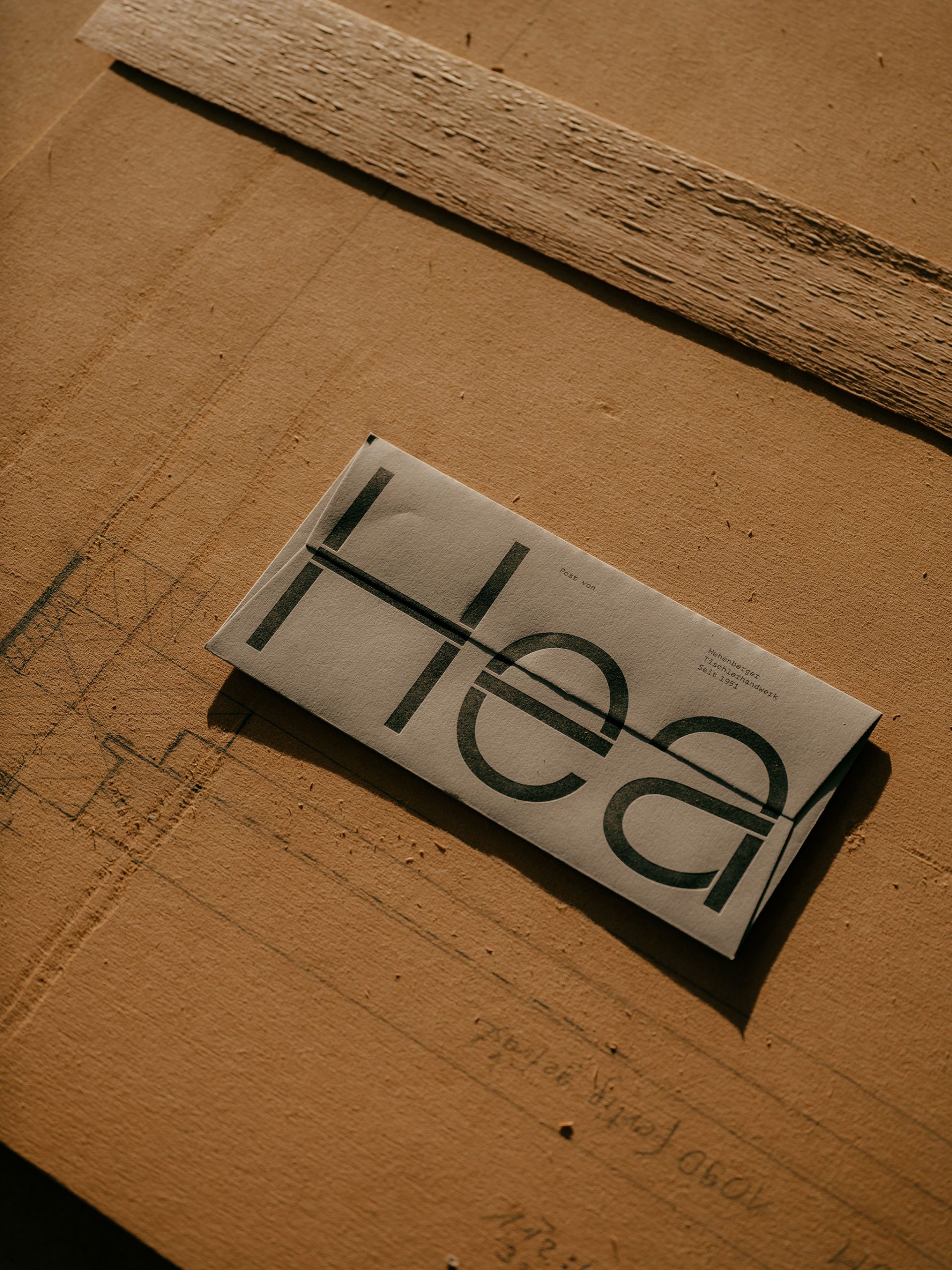
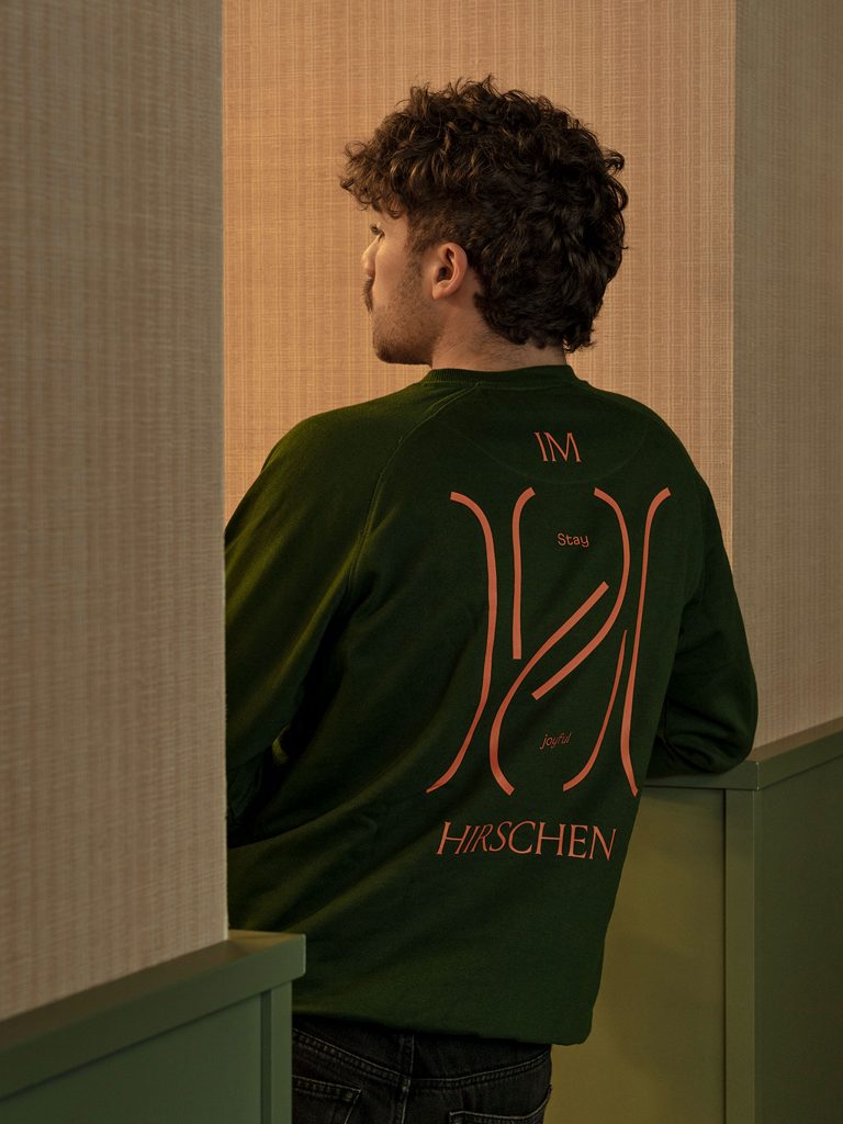
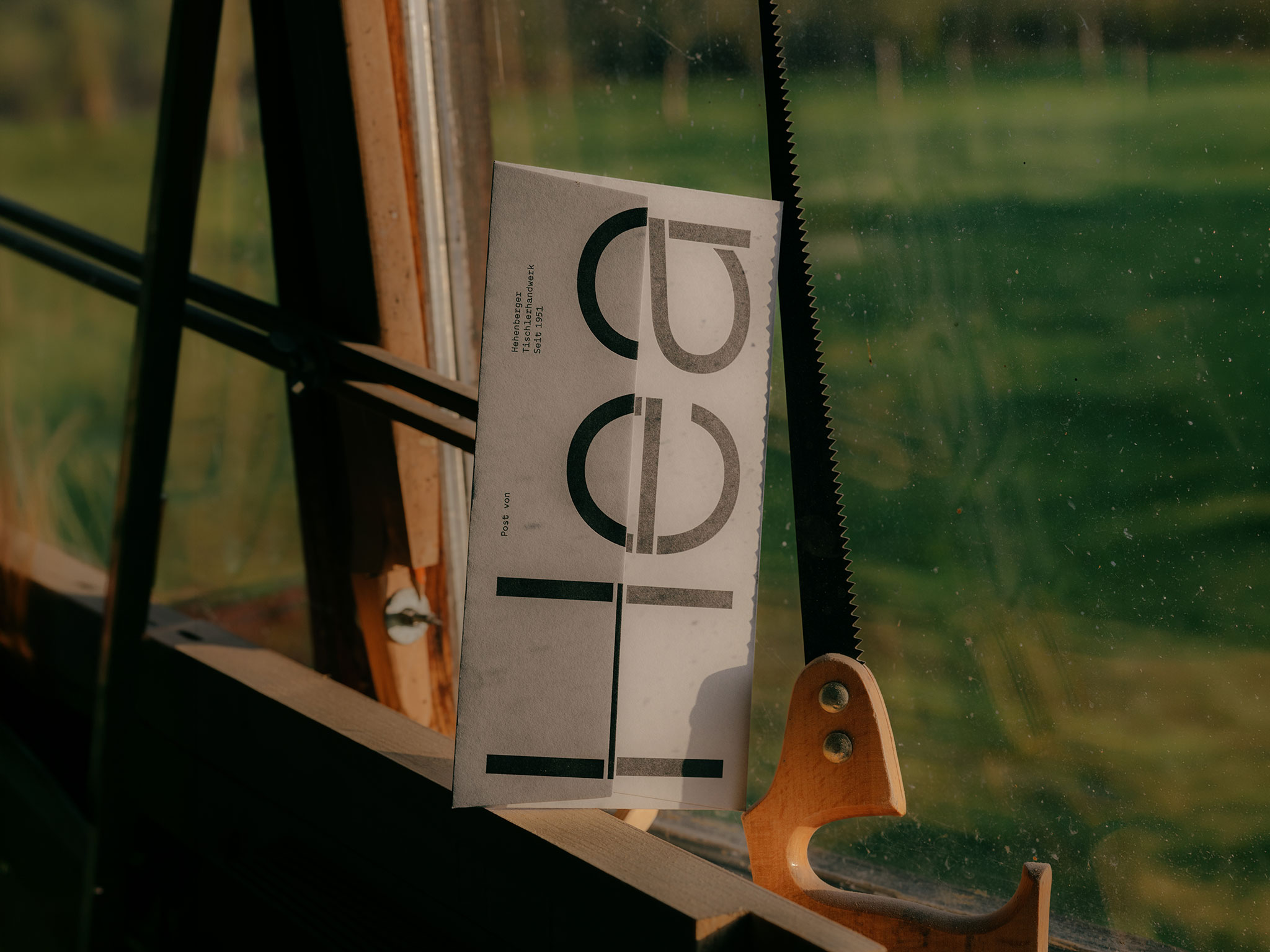
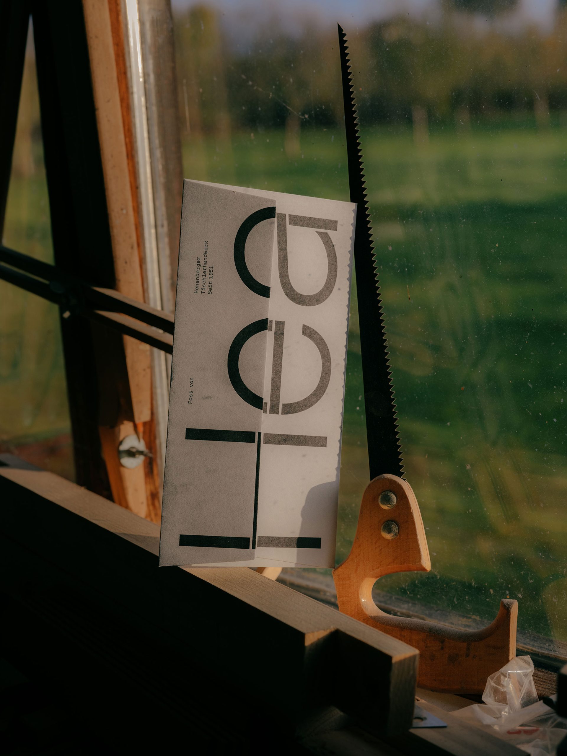
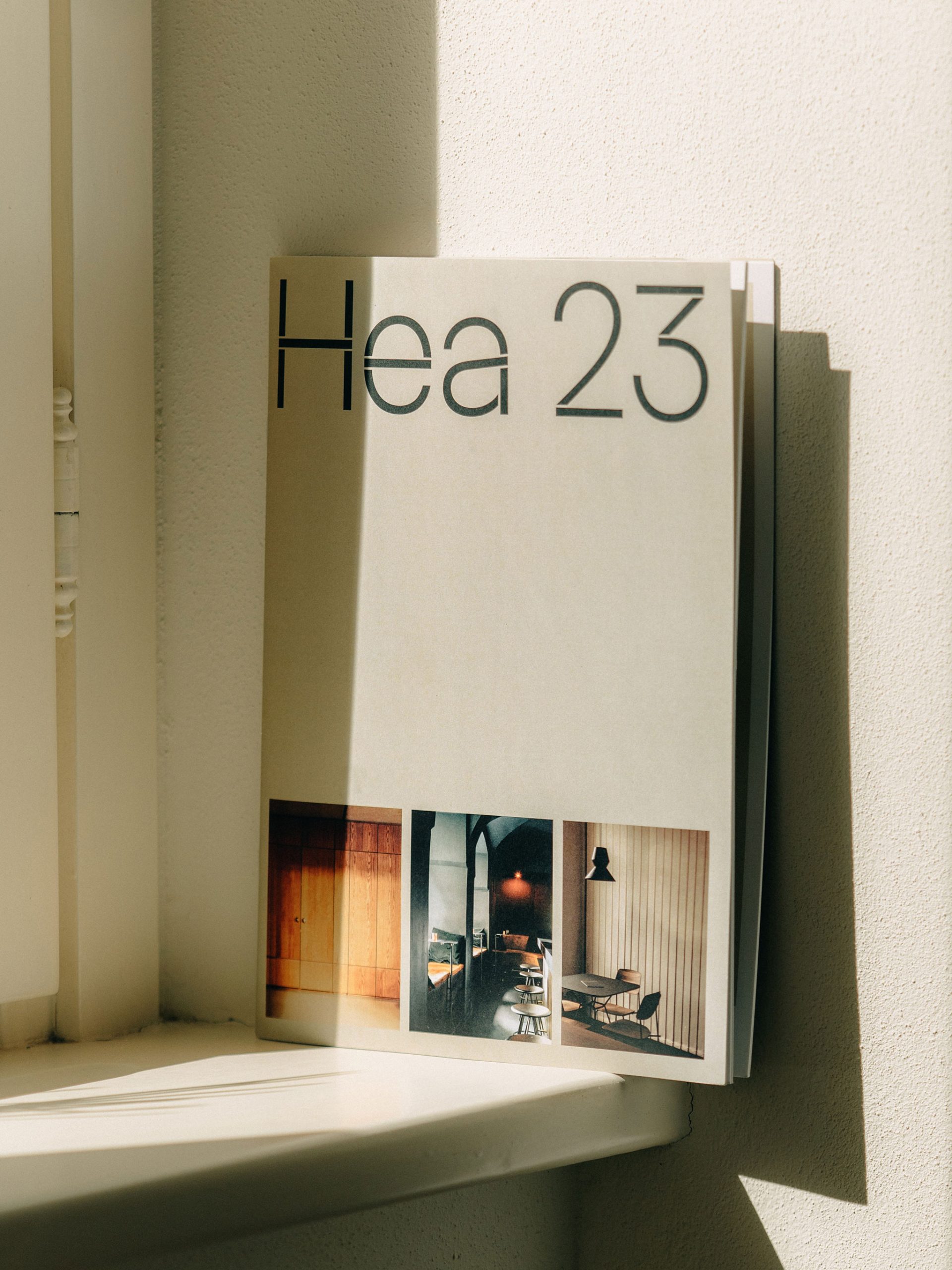
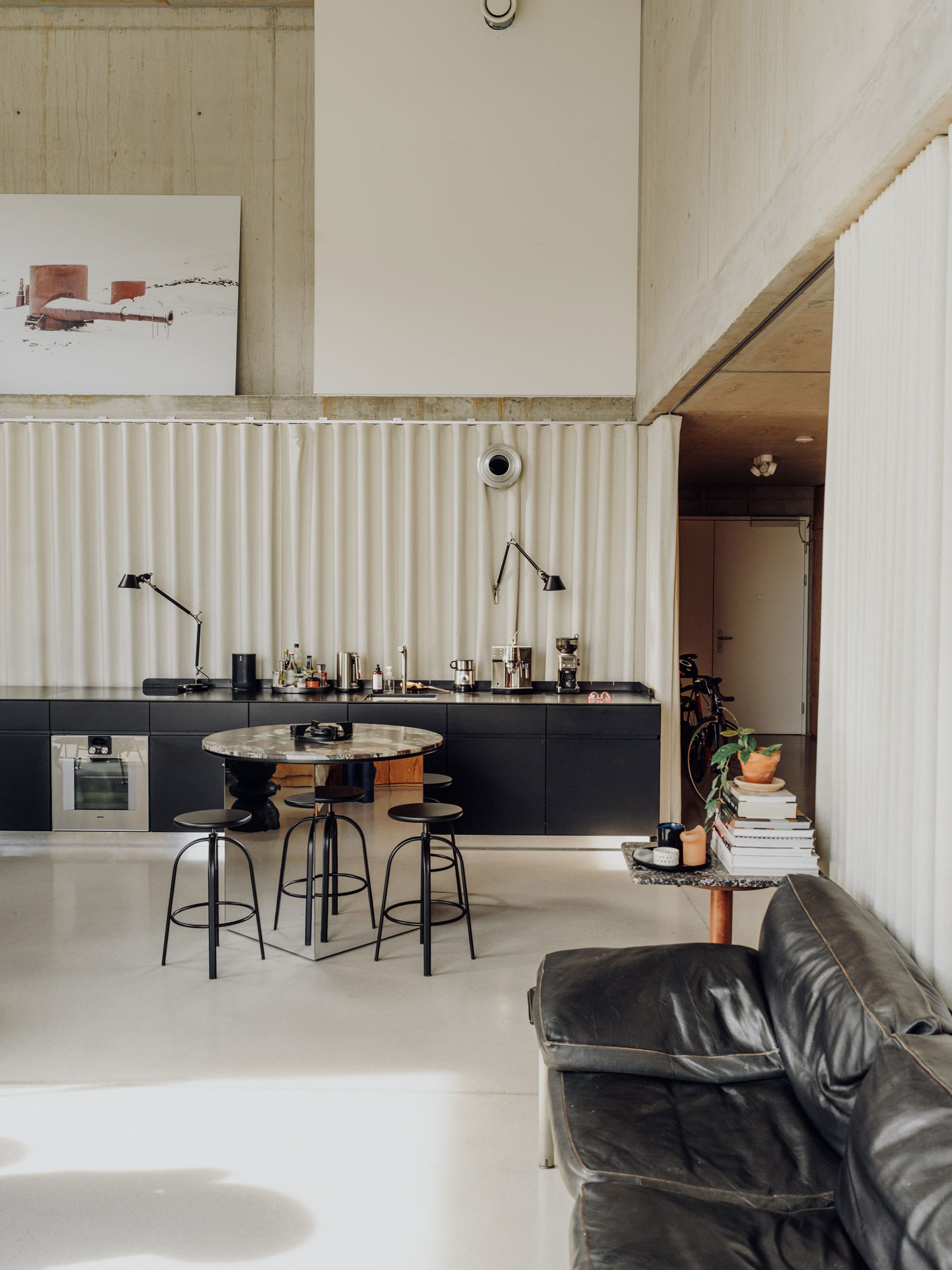
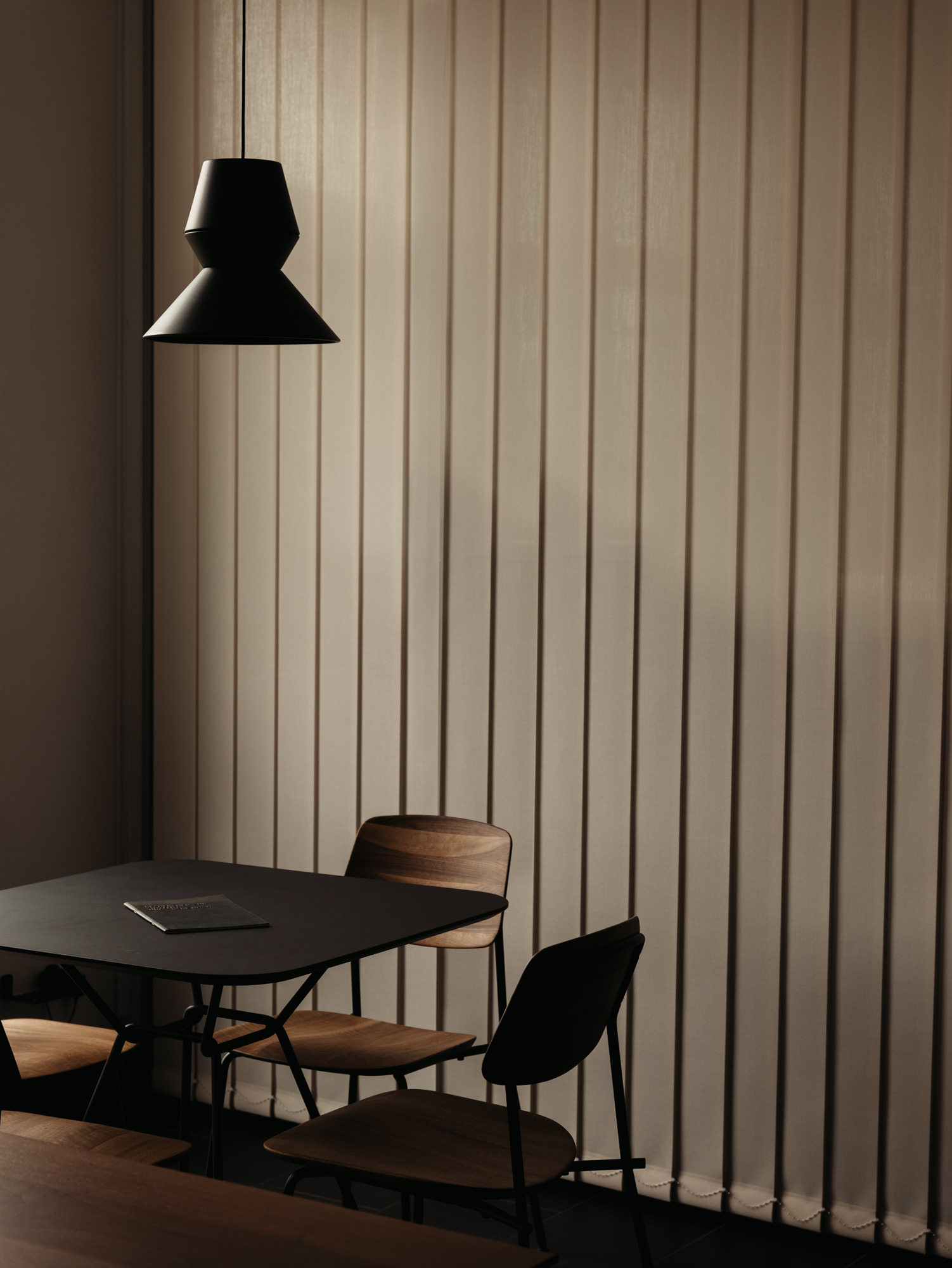
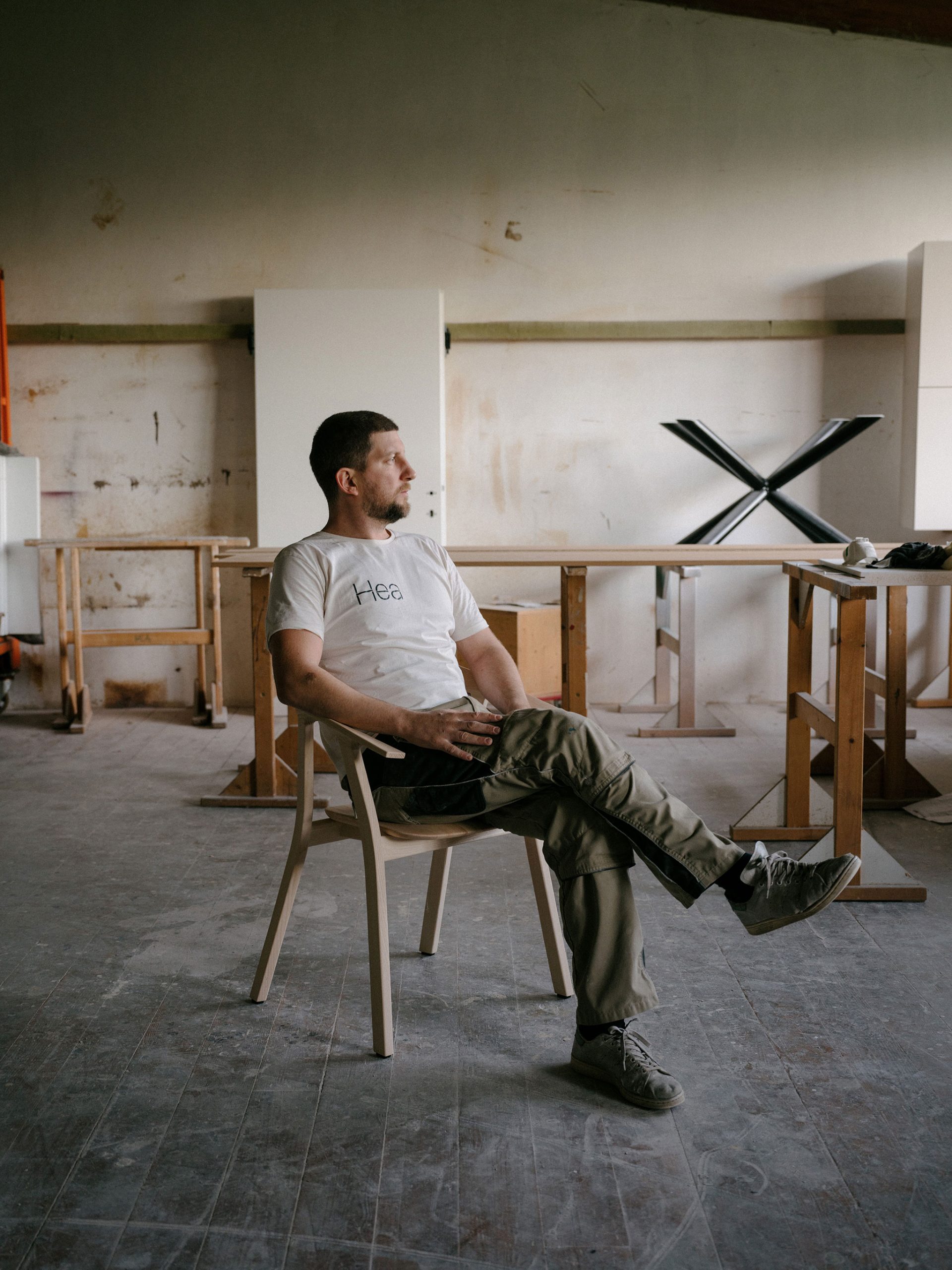
In combination with the atmospheric imagery by Julius Hirtzberger, this creates a clear, high-quality and memorable image.
Project Details
Awards
ADC* Europe Silber
Creativ Club Austria Silber
TDC New York
Scope
Branding
Digital
Photography
Typedesign
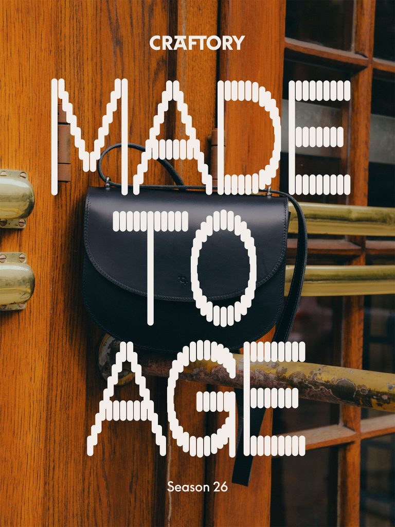
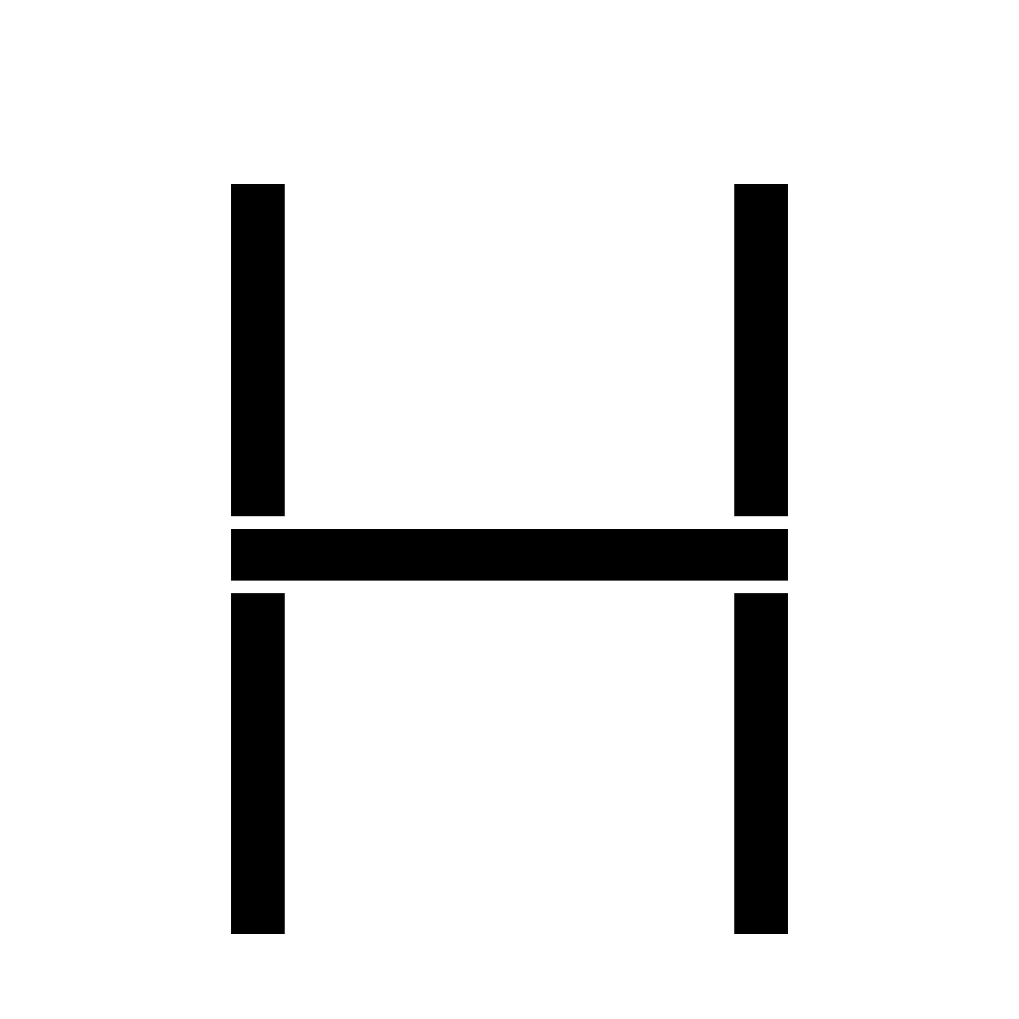
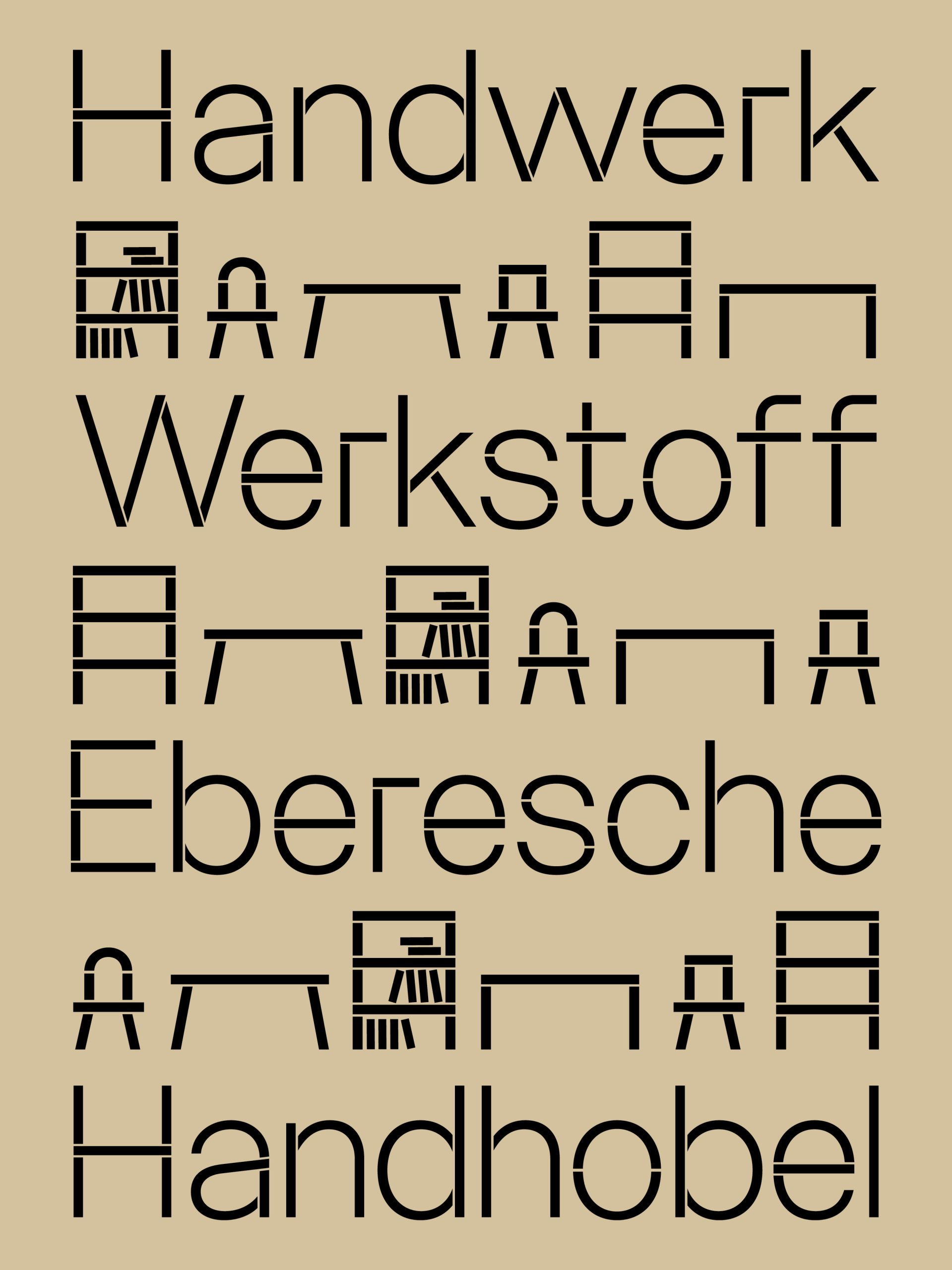
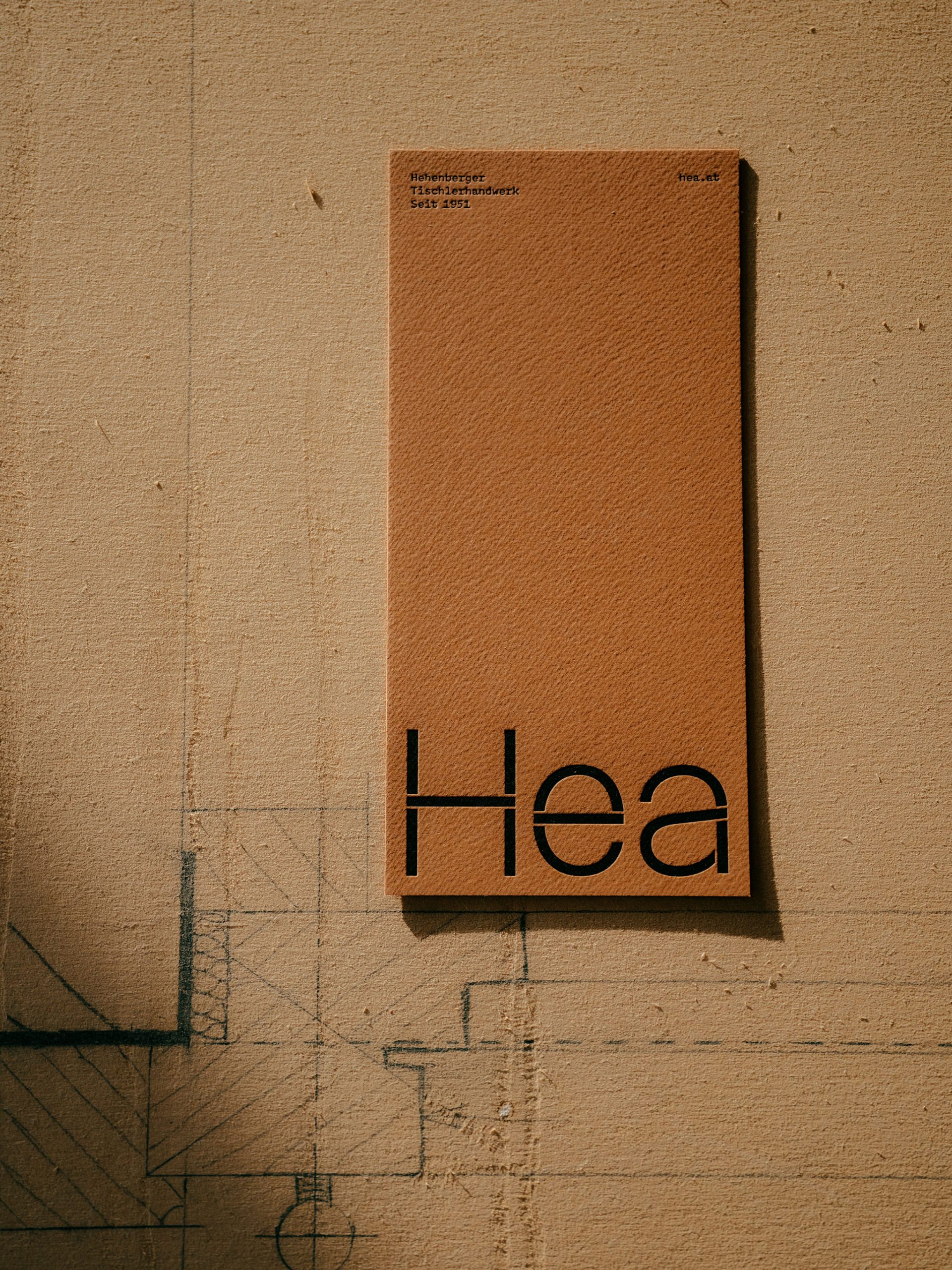
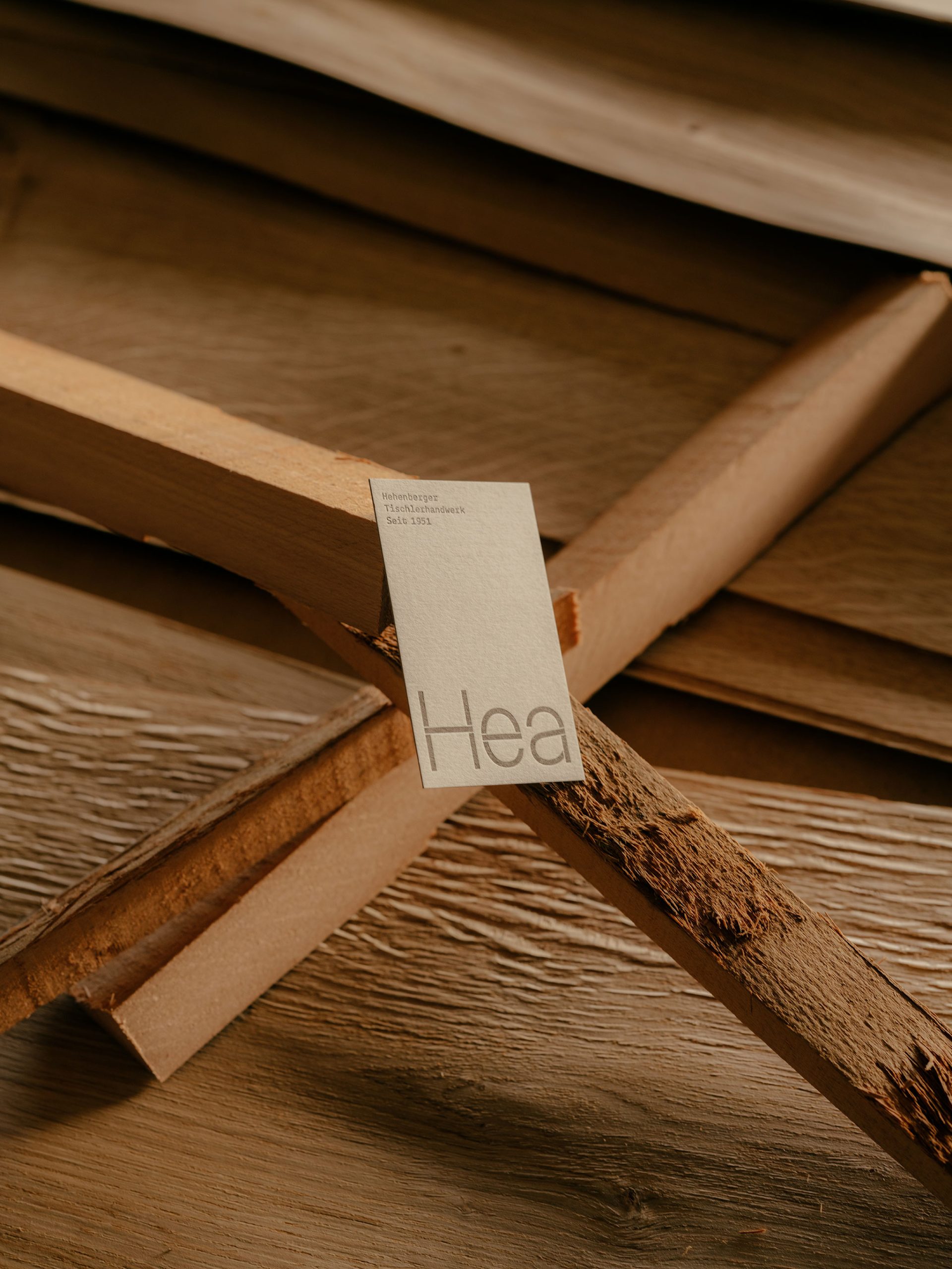
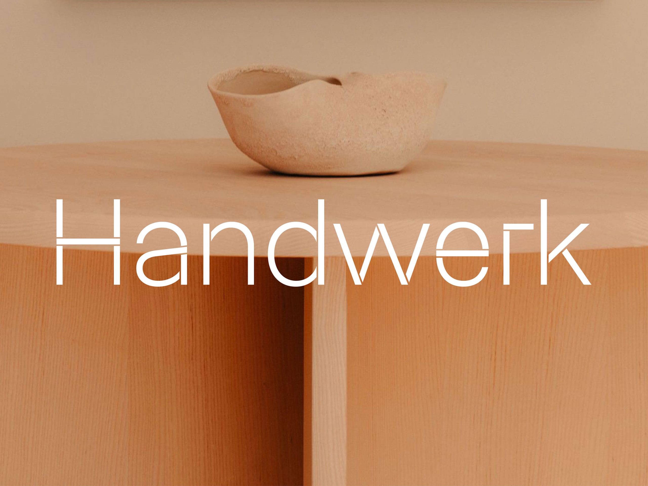
Angular and round, hard and soft – as contradictory as these may sound, they have been coming together harmoniously in Hea’s joinery since 1951. The newly developed and customized typeface is also intended to span these opposites. Wood is a creative material. Working with wood is an interplay of form, material, color and use with a wide range of applications. True to the claim “Everything is built on wood”, a simplified wooden board forms the basis for the look and feel of the font.
Credits:
Creative & Art Direction: Kurt Glänzer, Josef Heigl – Photography: Julius Hirtzberger – Text: Matthias Alber
• Creative & Art Direction: Kurt Glänzer, Josef Heigl – Photography: Julius Hirtzberger – Text: Matthias Alber