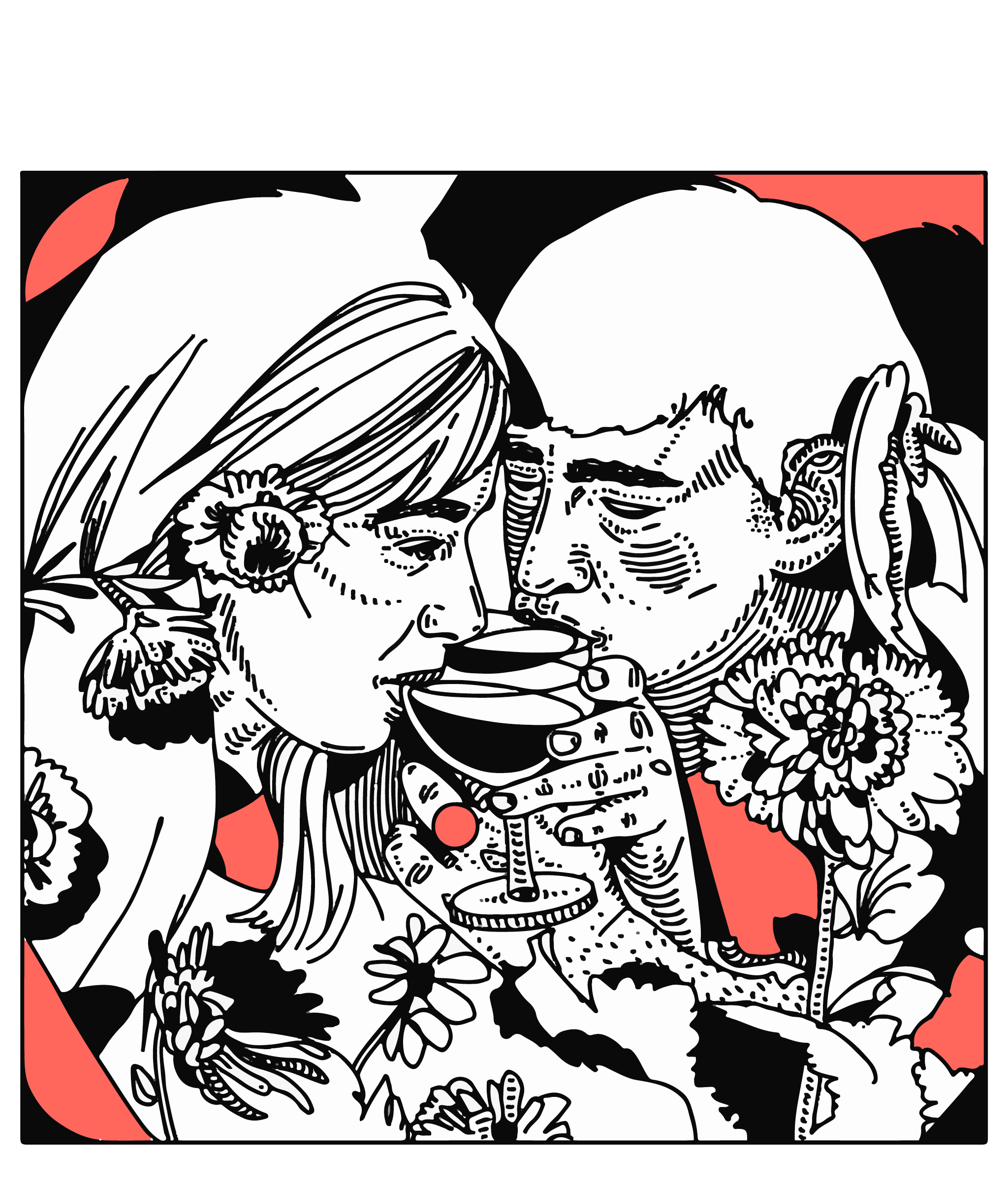
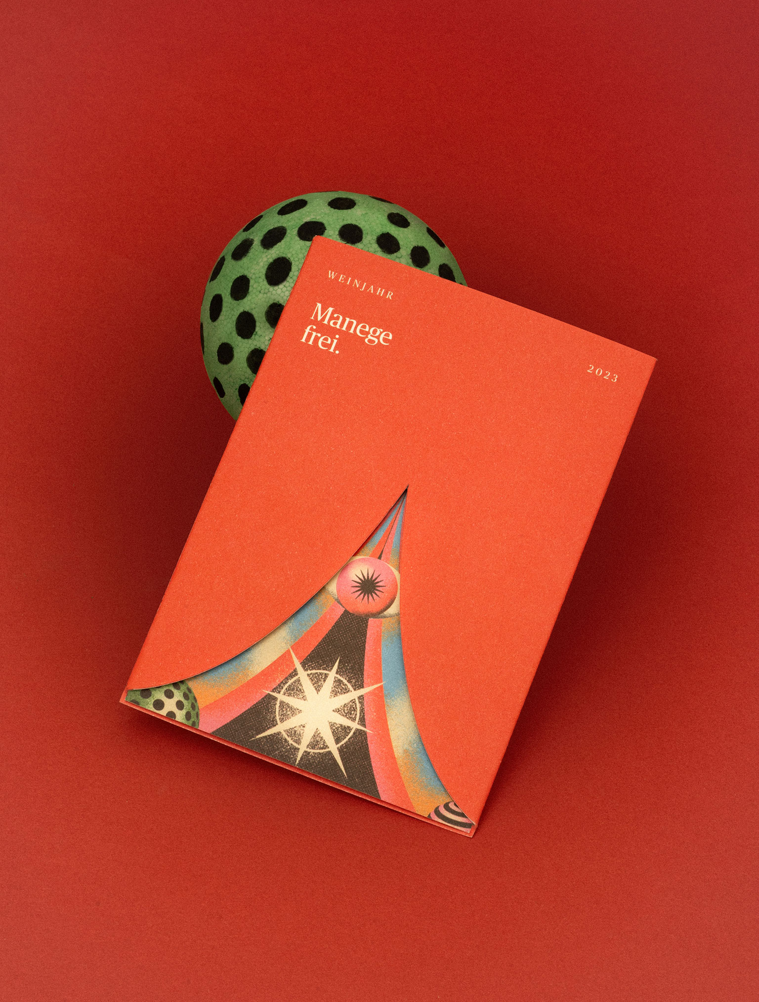
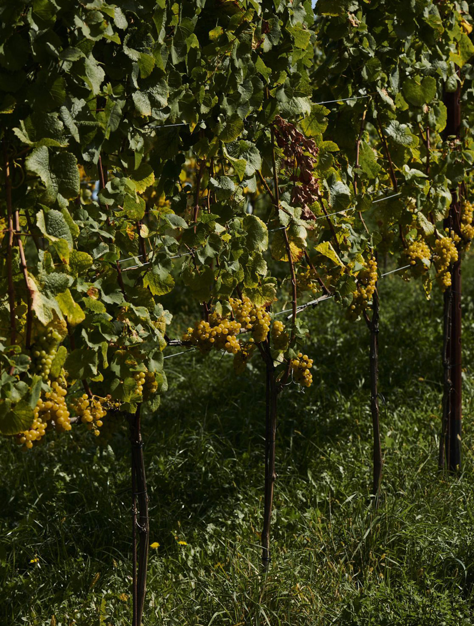
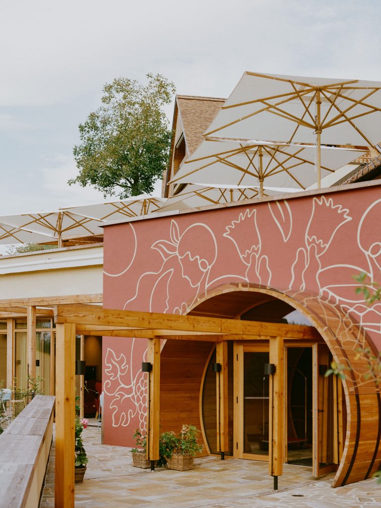
A place as a stage
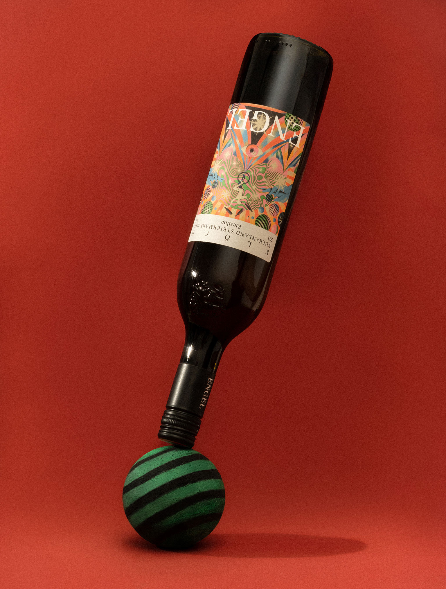
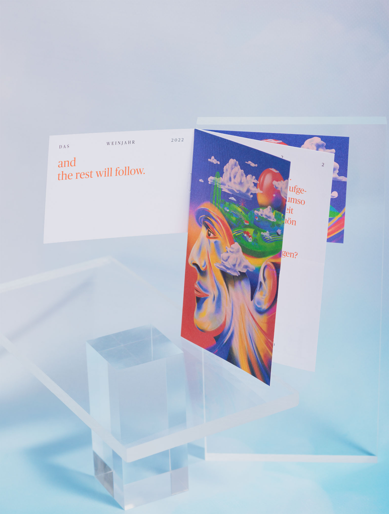
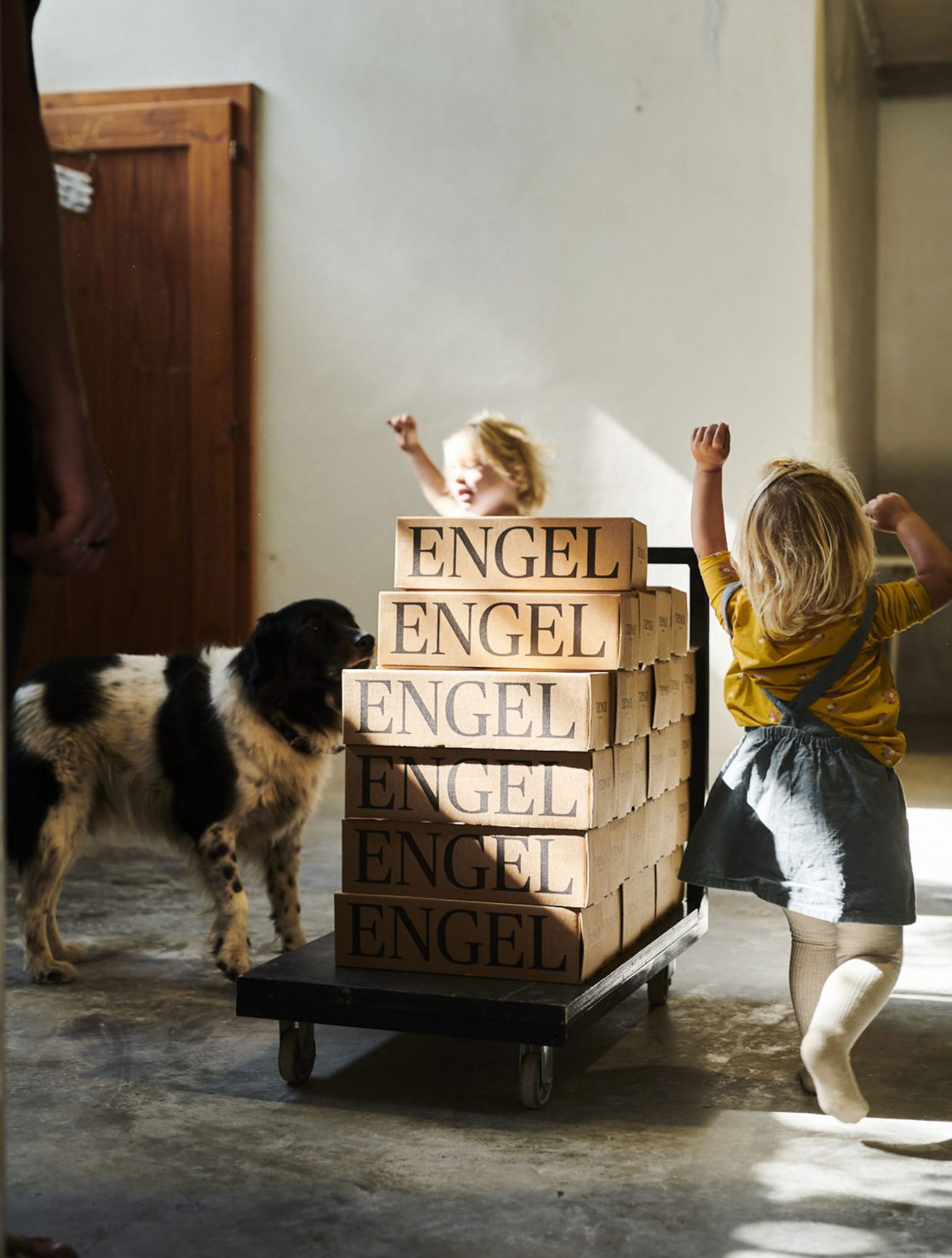
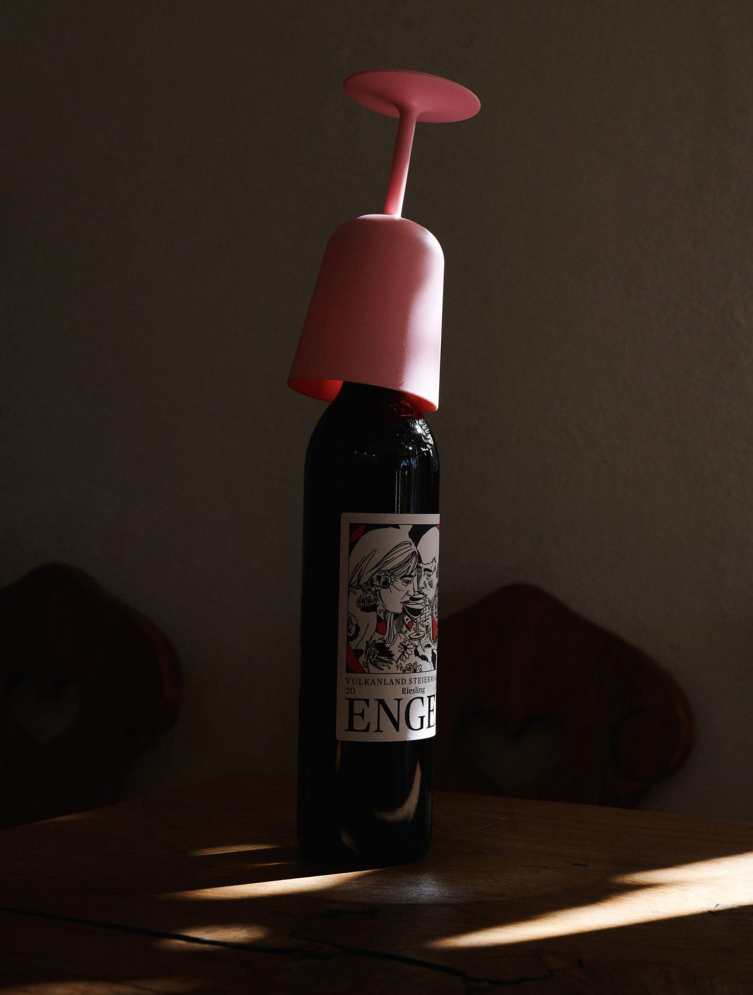
There is always something going on at the Engel winery. People celebrate, laugh, work and develop here. This stage of life is also reflected in the design world. The label provides the stage for an annually changing visual playground, which is intended to show the defining themes of the respective vintage. Wines bottled as snapshots.
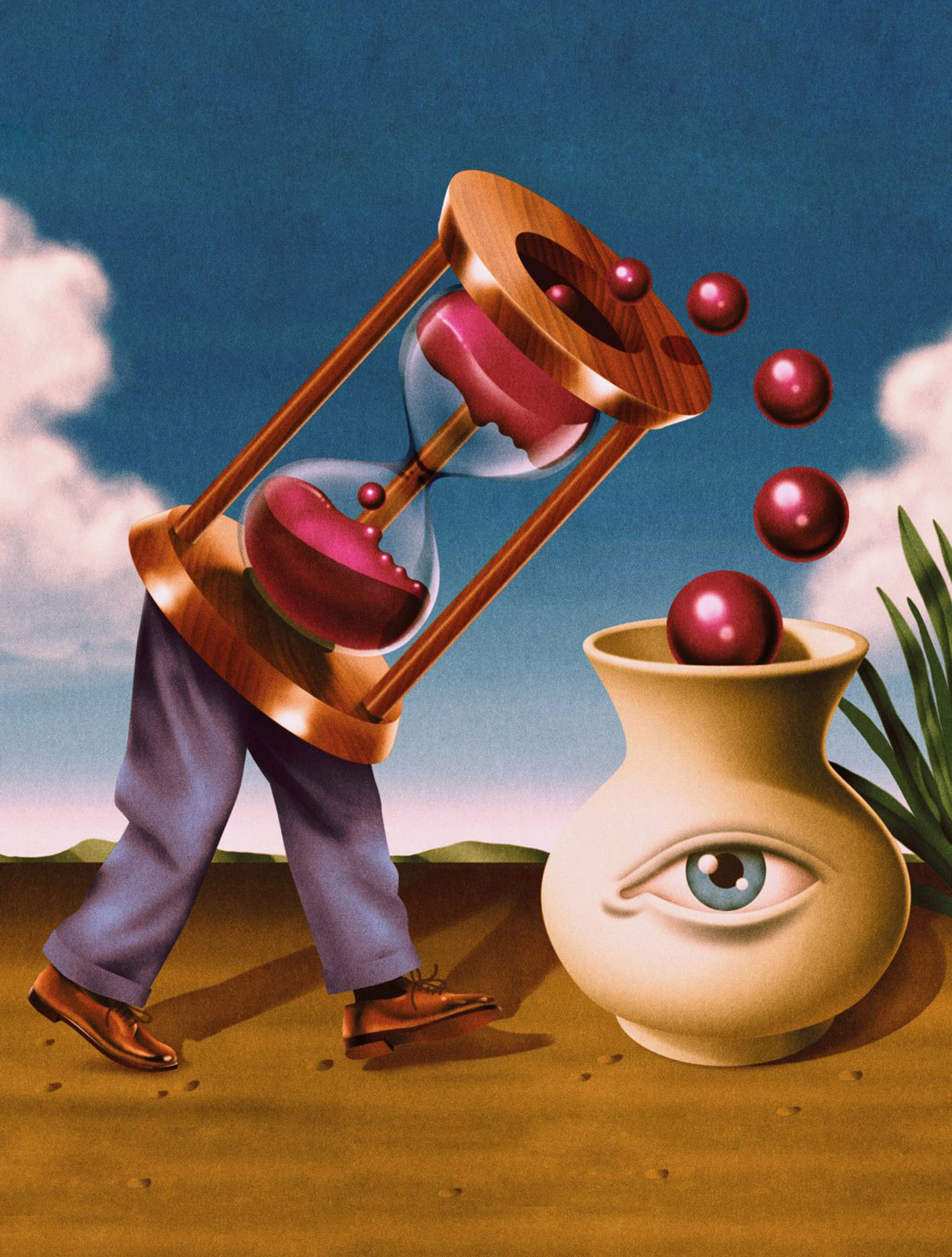
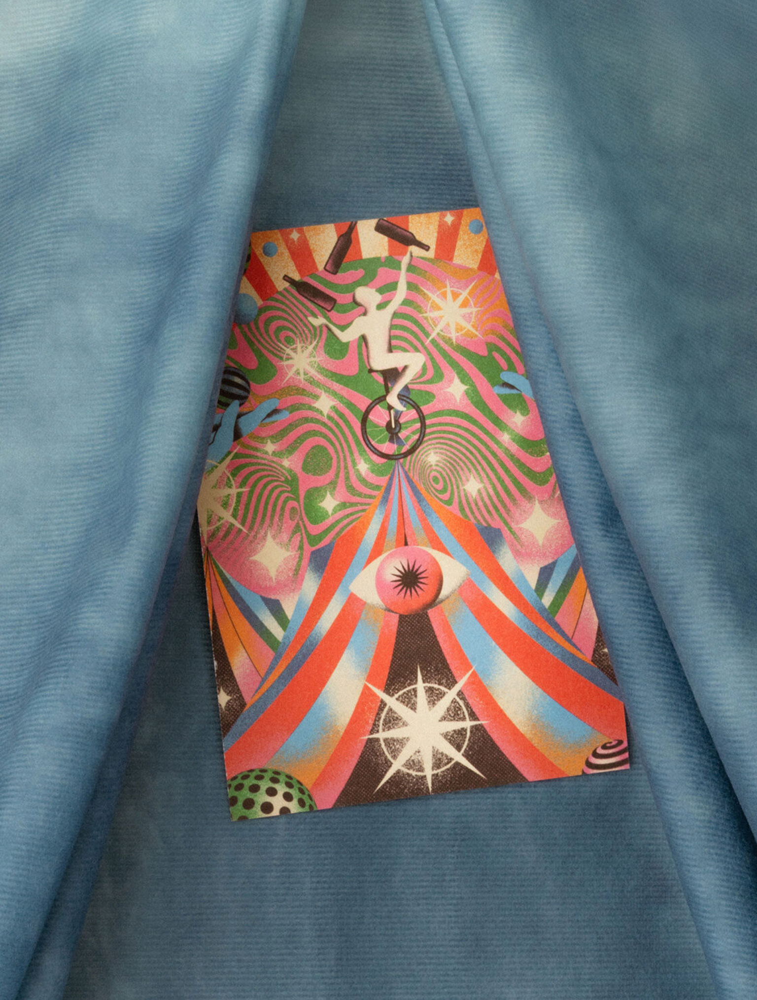
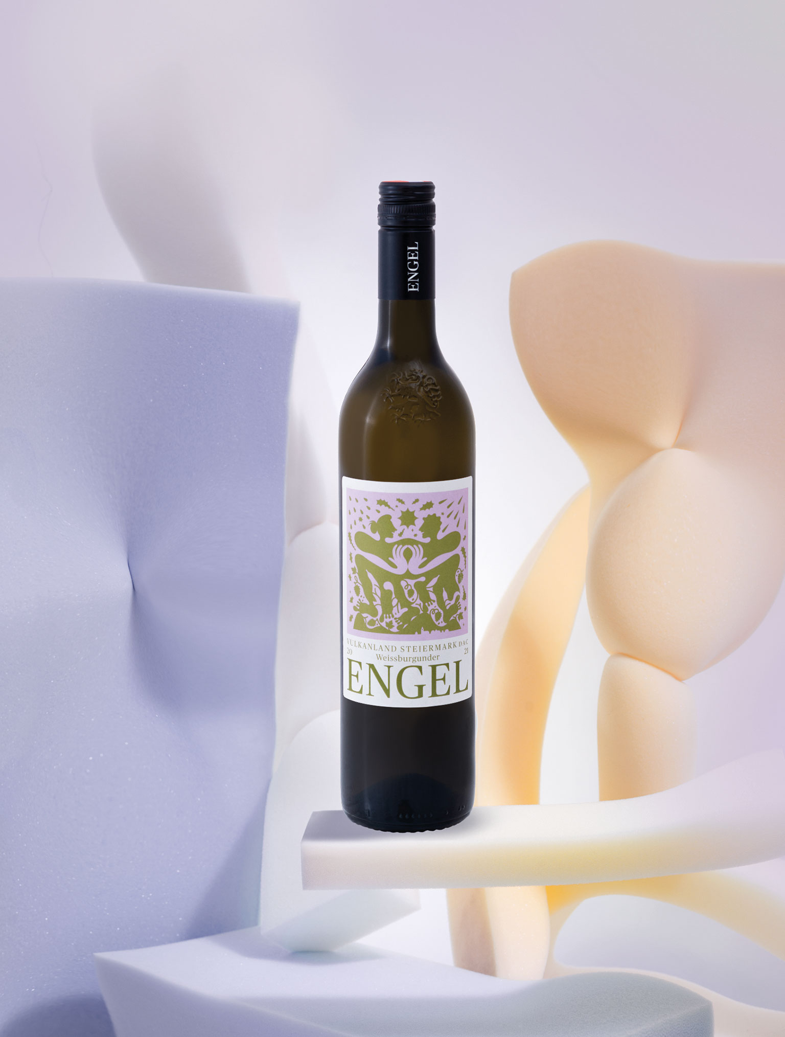
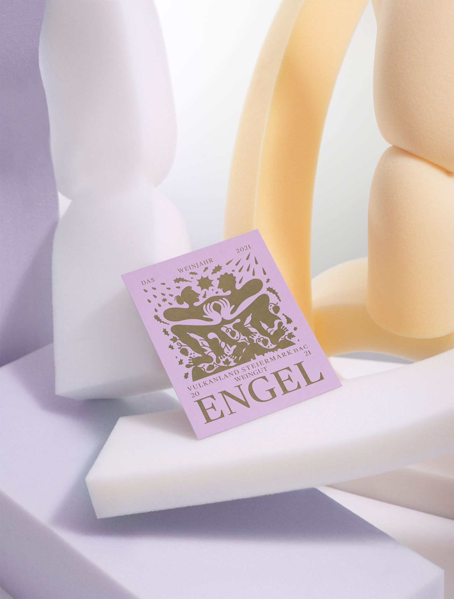
The wine year and life at the Engelhof have a lot in common with the circus. There are tightrope acts with breakneck risks, alongside moments of the greatest lightness. One would be nothing without the other. Making wine is a real circus, rewarded by the applause of the people who drink it.
Capricious weather, ups and downs, extreme conditions that barely allowed for normality – it was nerve-wracking. In between, you’re up in the air, no longer knowing exactly where from and where to. Life is not a straight line, and certainly not a smooth flow, but rather a spiral. But all is well in the end.
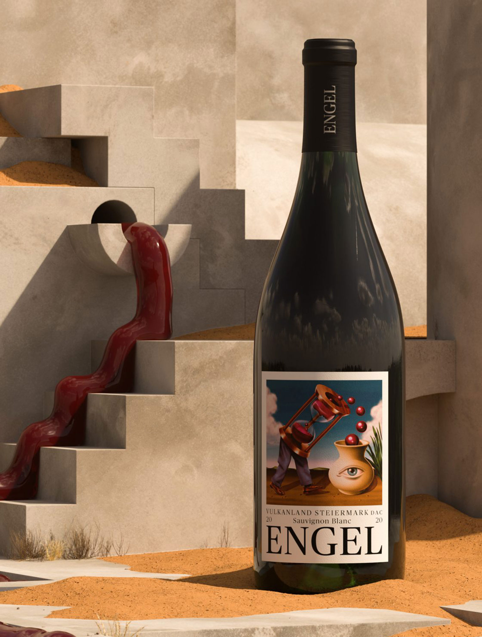
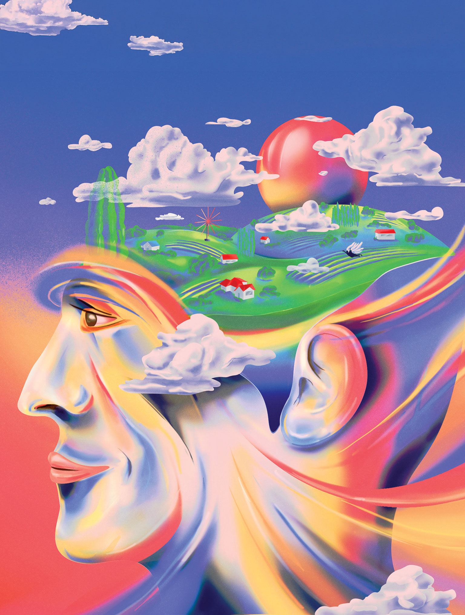
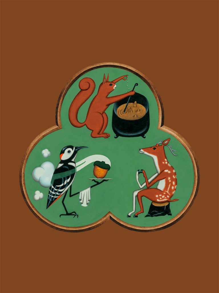
Vintage 2021 Illustration: Benedikt Luft
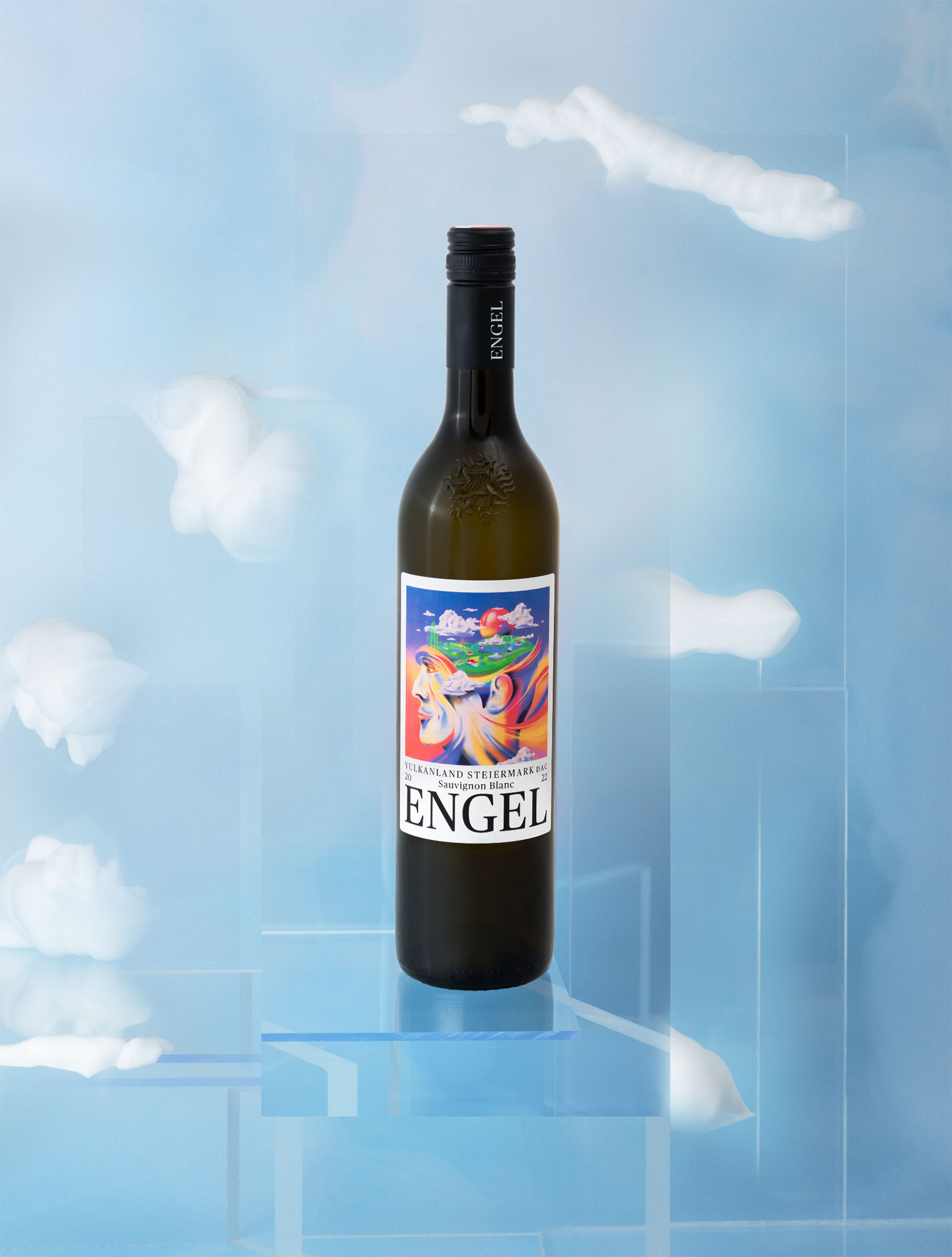
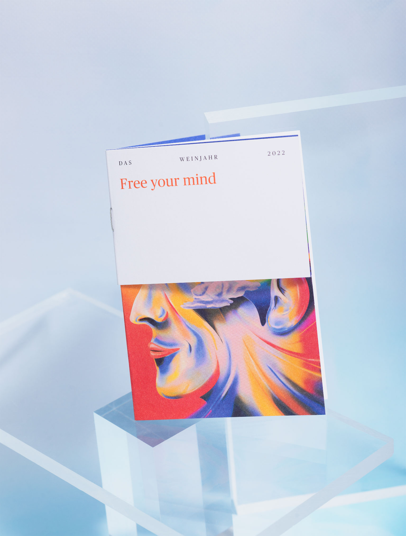
Can one breath change your thinking? Can letting go be a beginning?
We say: Yes! And in all clarity.
Life is celebrated at the Engel winery, nothing stays the same and the annually changing wine labels provide a lively contrast to the familiar.
Project Details
Awards
Creativ Club Austria Bronze
Scope
Art Direction
Illustration
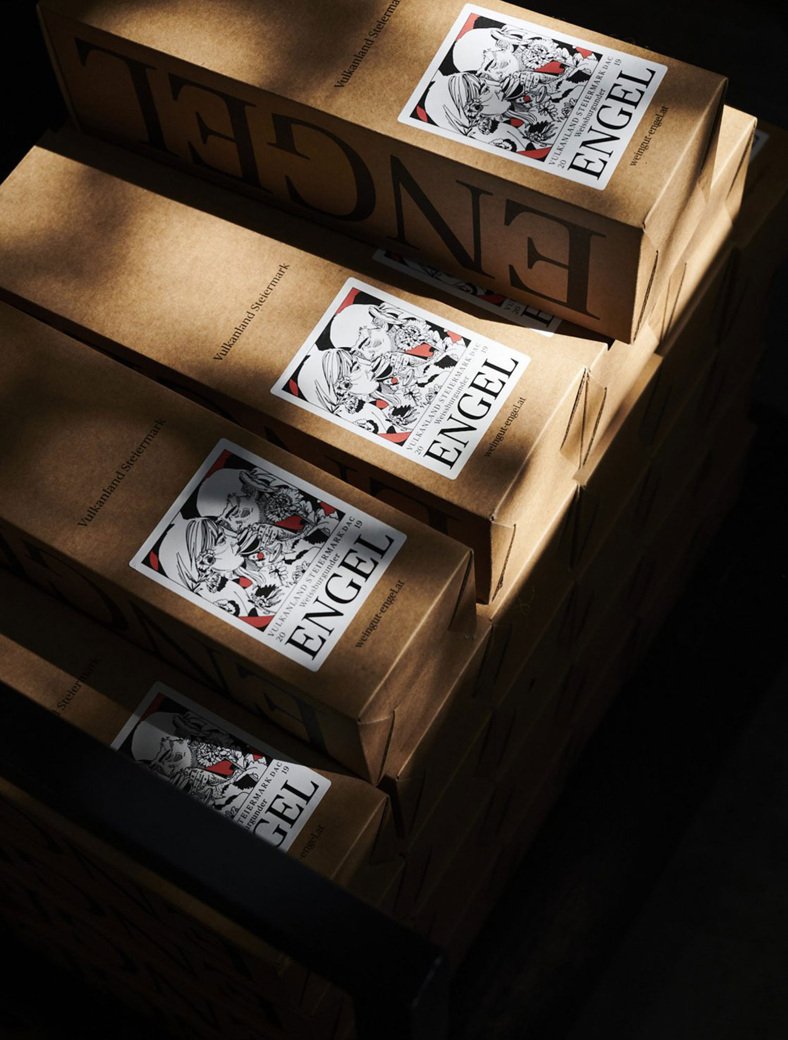
Package Design
There is always something going on at the Engel winery. People celebrate, laugh, work and develop here. This stage of life is also reflected in the design world. The label provides the stage for an annually changing visual playground, which is intended to show the defining themes of the respective vintage.
Wines bottled as snapshots.
Credits:
Creative & Art Direction: Kurt Glänzer, Josef Heigl – Illustration: Max Löffler, BLUMOO, Benedikt Luft, Jose Berrio & David Leitner – Animation: Vincent Wagner – Text: Weißes Papier – Photography: Medium Large – Photography Portfolio: Ina Weiss & Marlene Mautner
• Creative & Art Direction: Kurt Glänzer, Josef Heigl – Illustration: Max Löffler, BLUMOO, Benedikt Luft, Jose Berrio & David Leitner – Animation: Vincent Wagner – Text: Weißes Papier – Photography: Medium Large – Photography Portfolio: Ina Weiss & Marlene Mautner
Related Projects:
 More
More
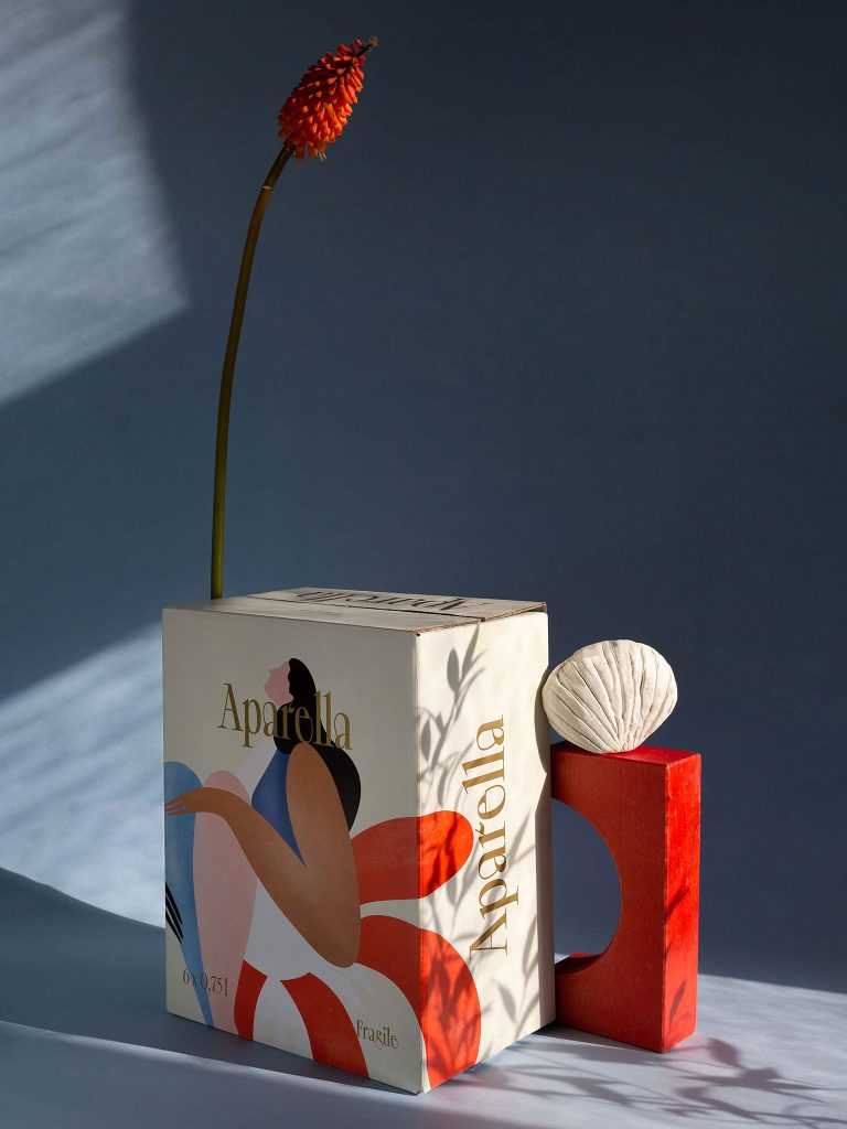
Aparella
 More
More
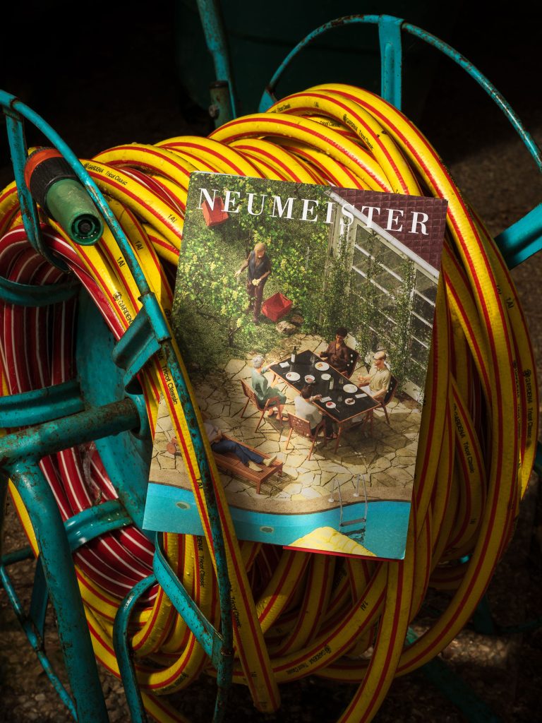
Neumeister
 More
More
Aiche Restaurant
 More
More
Leni Hotel
 More
More
Blü Hotel