When Katharina Richter-Wallmann and her husband Nikolaus took over the traditional Zum Hirschen hotel, modernity moved in with them: with contemporary architecture, natural materials, vegetarian cuisine and curated art throughout the hotel. No one in Salzburg city center would expect that.
And the branding also has surprises in store.
Bruch Katharina, you and your husband Nikolaus opened the Hotel Zum Hirschen in December 2023. When you walk through the hotel now, how do you feel?
Katharina I still think it’s so beautiful and if you ask me, it’s getting even more beautiful. Especially because our garden is only now really developing. Overall, everything feels coherent. There’s a recognizable line throughout the house – and you helped us with that, too.
Bruch We were lucky that interior designer Pia Clodi recommended us.
Katharina Pia said that interior design and branding belong together. They have to speak the same language. That’s why we got you on board straight away.
“It was important to us
Katharina Wallmann, Zum Hirschen
that the Hirsch becomes a place
that is fun for everyone,
not just the guests.
Bruch Would branding otherwise not have been such an issue?
Katharina As you know, I used to work in the start-up business in Berlin. Marketing was my world. I think that’s also the reason why I have a great understanding of how important branding is. That a project has a solid foundation. That you also take advantage of a long history, like ours. The Hotel Zum Hirschen is a place with soul. It was clear to me that we wanted to tell people about it.
Bruch The house has been in your family since 1830. You are now the 11th generation to run it. But it was never planned that you would take it over.
Katharina That’s right. My parents did ask me to come back to Salzburg from Berlin to take over the business, which was still leased at the time. But it wasn’t necessarily about me running the hotel myself, but about me dealing with what would happen to the hotel after the lease. They said: “Do what you want, but take care of it.” During the process, I realized, well, I actually want to run the hotel myself.
Fracture Why is that?
Katharina There was just so much potential. The creative freedom in a hotel is really enormous, especially if you start from scratch like we did.
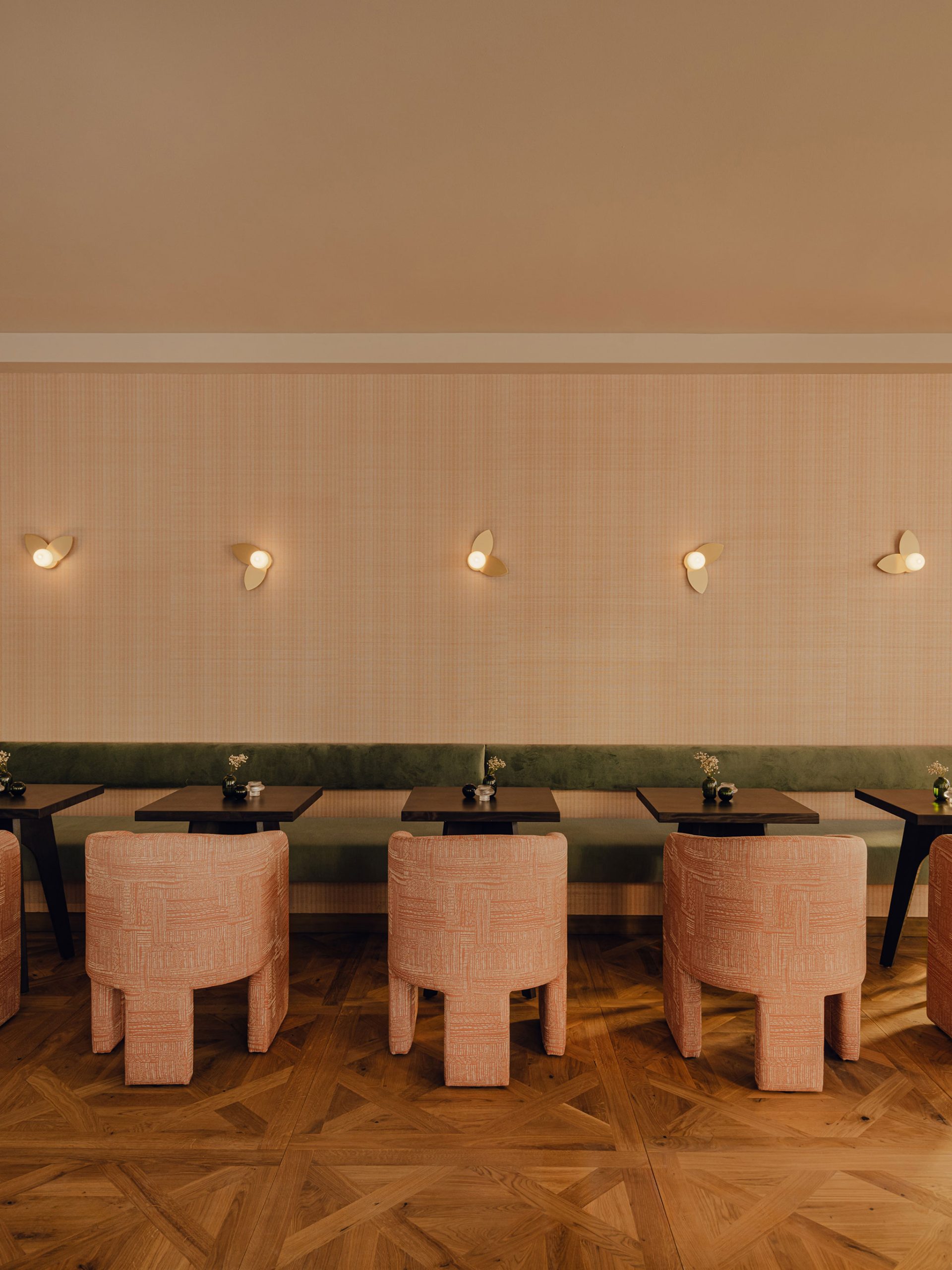
Bruch You completely gutted and modernized the historic part of the building and then added a modern timber construction.
Katharina Exactly. It’s not just the Hotel Zum Hirschen. My husband and I have created a new quarter in the middle of Salzburg with the entire Am Hirschengrün project. With apartments that we are selling and the large garden in the inner courtyard. The hotel is part of it.
Bruch What was your vision for the hotel?
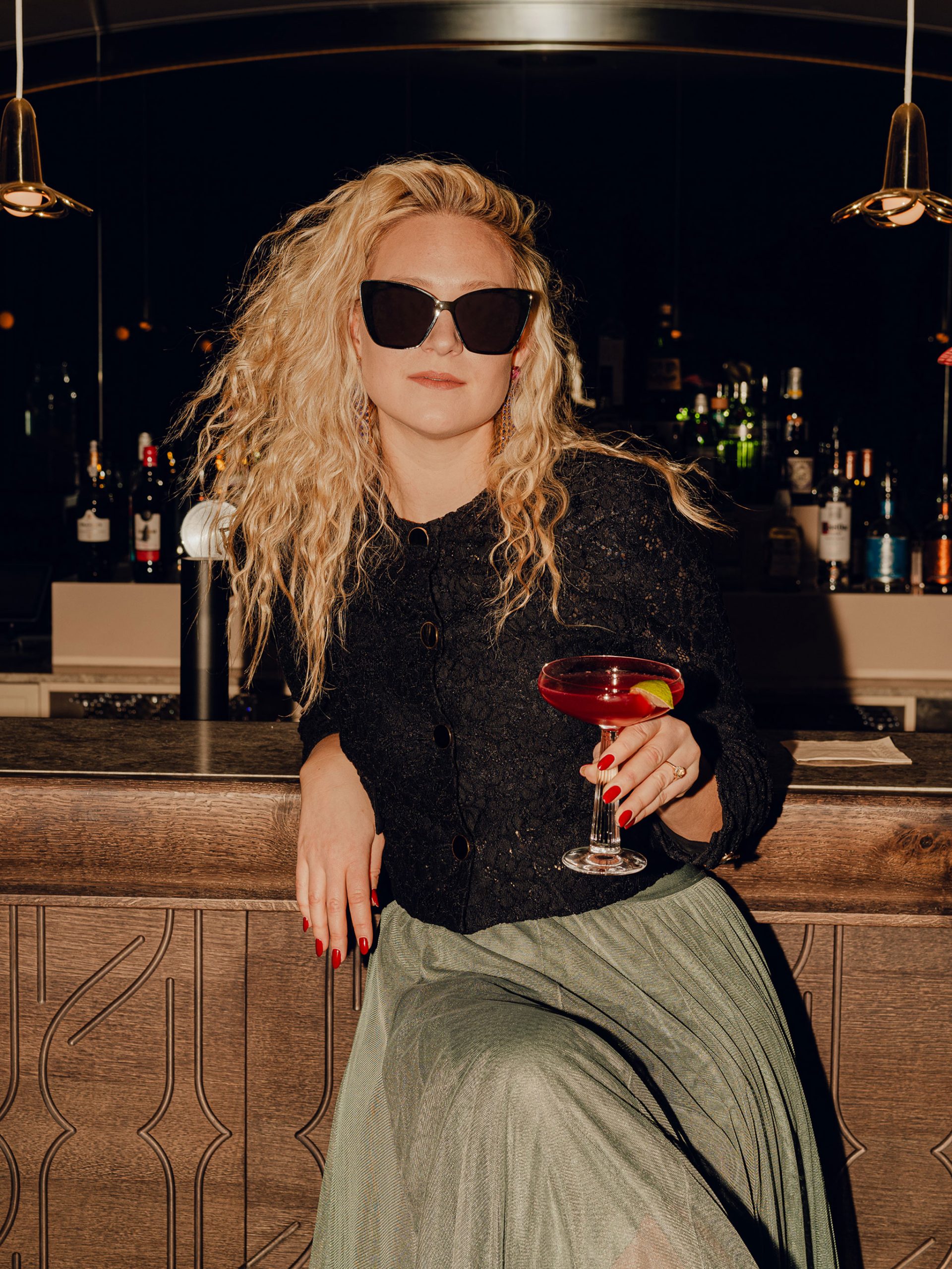
Katharina It was very important to us that Zum Hirschen becomes a place that is fun for everyone, not just the guests. My husband and I work here almost every day. We want to feel comfortable here, our employees should feel comfortable. It should also be a place where service is important. Where quality is important – at all levels. And: we wanted the hotel to be more urban and convey the modern Salzburg without playing with the stereotypes of the city. The aim was to go for contemporary Salzburg.
Bruch We still remember well that you emphasized this in your briefing with us, that you wanted to dust off old traditions to make room for new ones.
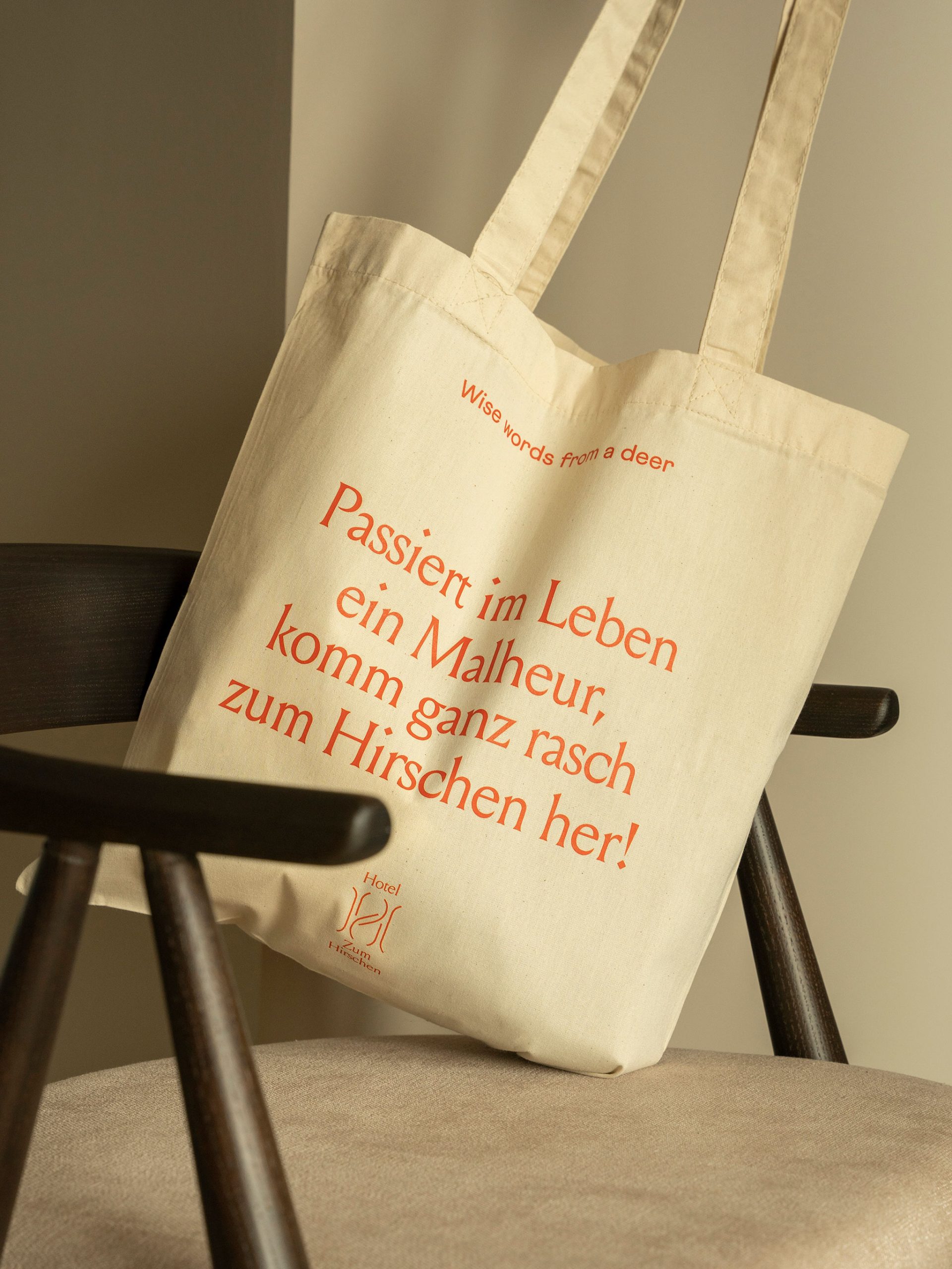
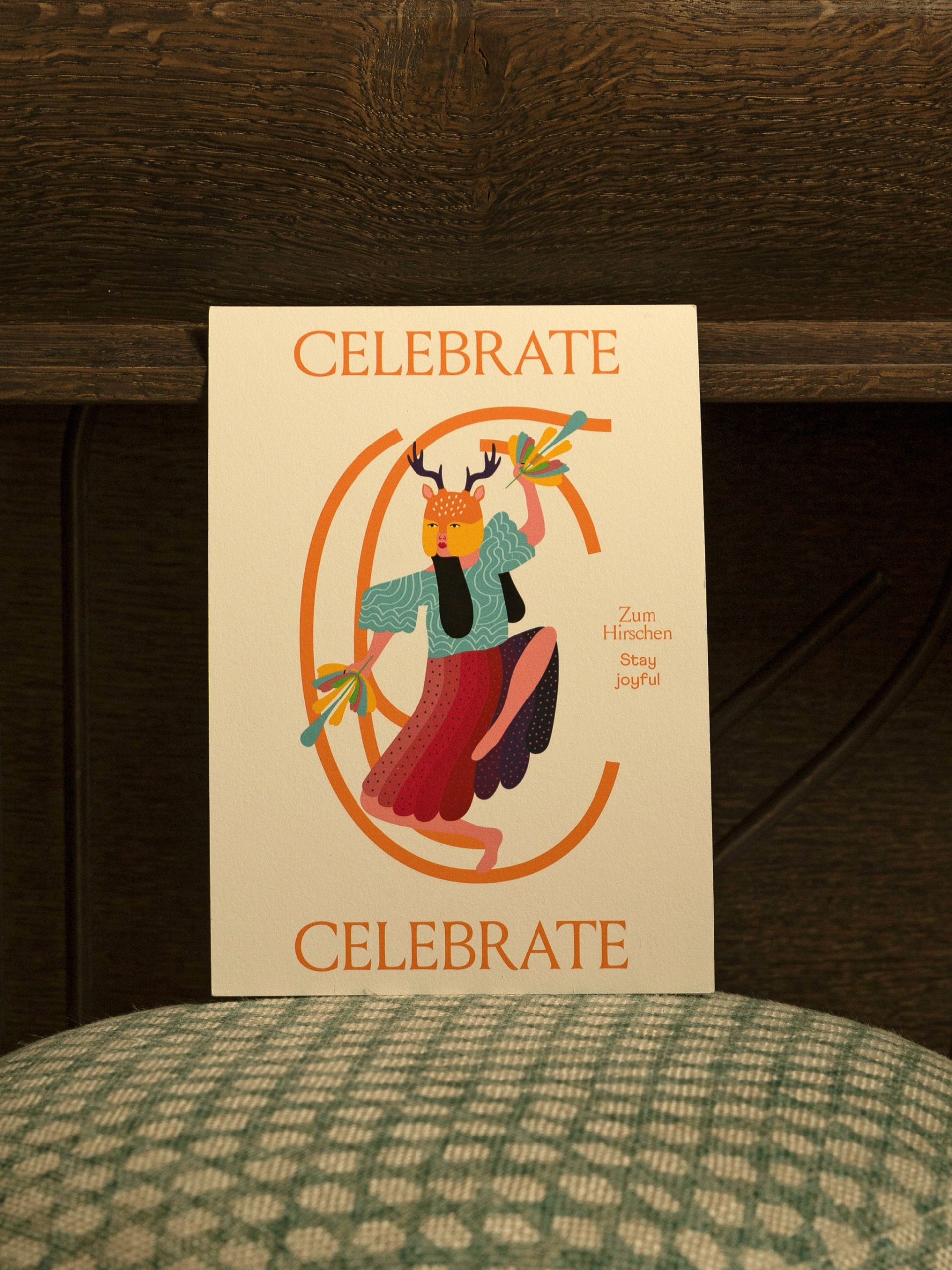
Katharina Basically, your work was very free. The guidelines I gave were more born out of the story: that everything should be more feminine, have a feminine touch. And yes, that our stag shouldn’t be seen in such a traditional way. This is not the stag that is depicted on a traditional costume. Our stag is a different stag. You had to translate that into the branding.
“This is not the stag that
Katharina Wallmann, Zum Hirschen
depicted on a traditional costume.
Our stag is a different stag”
Bruch Our idea was to take up the stag as a symbol, but to interpret it in a contemporary way. In other words, the stag no longer appears as an animal. Instead, it takes the form of a mask worn by a woman. This allowed us to use it in a playful way.
Katharina That hit the nail on the head. Especially because you already had the reference to the architecture and the interior in your design. It was all coherent from the start and from a single source. There was no need to go back and say “please do it again”. I was really surprised at how quickly the right result emerged.
Bruch That’s not something we take for granted either. What helped us with the Hirschen was simply that you had these clear ideas. Why was it so important to you to emphasize a female approach in the brand identity?
Katharina In general, women have always had power in the Austrian hotel industry. Women have always run these businesses. Sometimes because they were the only ones who could take over, but perhaps also because being a host was traditionally attributed more to women. In any case, they were very adept at combining business and family. But this was overlooked and underestimated for a long time. Male owners and managers were often simply louder and still are today. But they are not necessarily the more successful hoteliers. The hotel industry is an example where equality – at least for female owners – happened earlier than in other businesses and sectors. It was the same here at the Hirschen.
Breakage In what way?
Katharina In our history, which goes back 300 years, there have been more female owners than male owners. These women didn’t just get the hotel because they were the only ones, but because they were the best.
Bruch Just like you are now. Nevertheless, the brand is not completely tailored to you. This is also shown by the mask we have illustrated. It can be worn by anyone, not just you. It’s meant to make everything a little freer, not so fixed.
Katharina A lot of our work is personality-driven – by my husband and me. At the same time, however, we try not to impose anything on anyone. Our employees bring their own personality and style to the table. I don’t run around like a dictator and tell someone to tuck in their shirt or put on different music. Of course, you also have to think very hard about it: what does the guest want? They should also find themselves in our brand. That’s why it’s good that we’re not too pointed.
“We want to use the
Katharina Wallmann, Zum Hirschen
branding to appeal to as
appeal to as many people as possible.
Bruch That we don’t offend, you mean?
Katharina Exactly. It shouldn’t appear exaggerated or exclude anyone. We want to appeal to as many people as possible with our branding. That’s why we’re neither overly young nor overly classic, but somewhere in between. In my opinion, the branding is still special enough to stand out in a positive way.
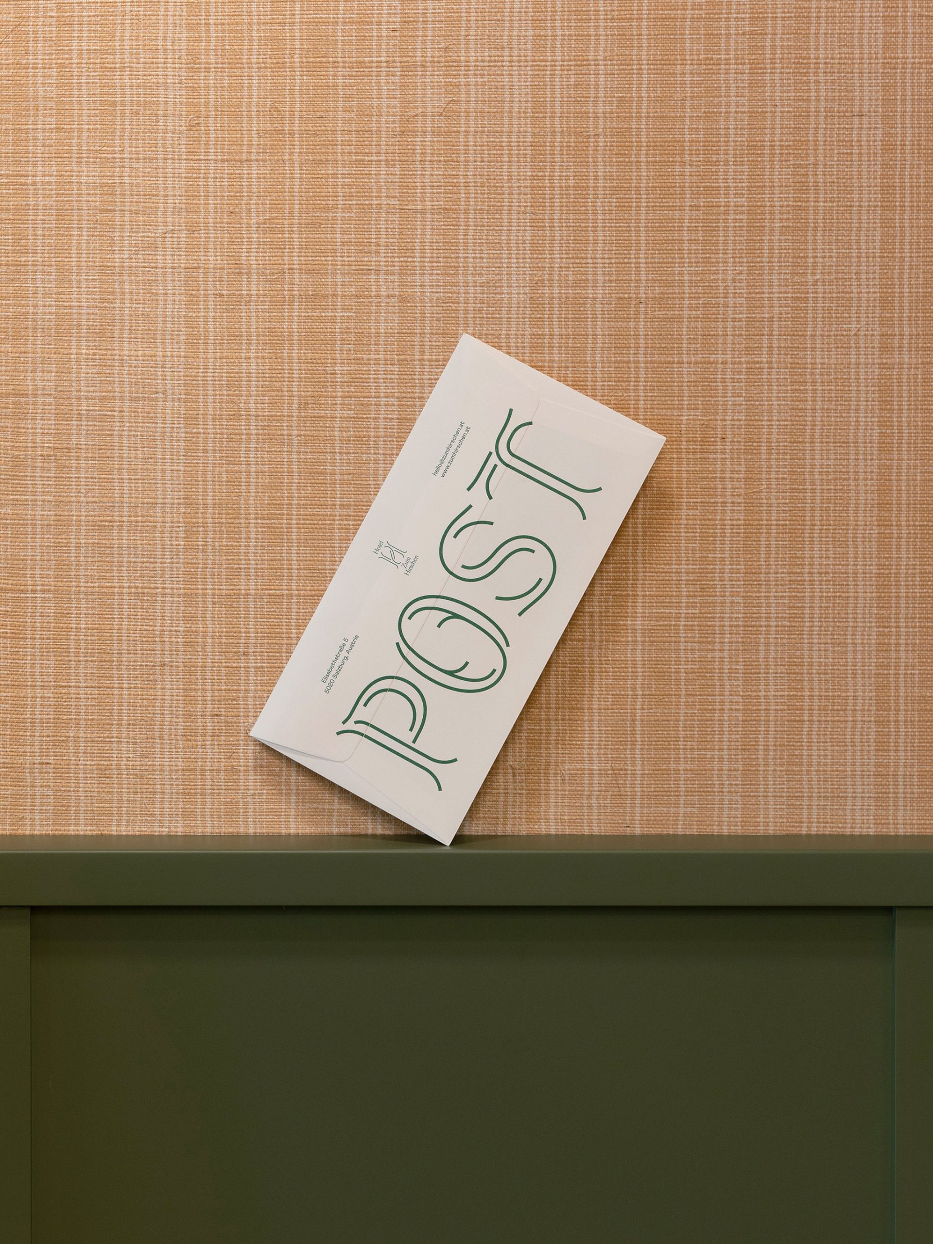
Bruch What makes it so special in our eyes is the corporate font that we created for you. It also playfully picks up on the deer theme – the branches are representative of the branches and shrubs in your garden.
Katharina The Hirschen font is an essential element that gives the whole thing its character. We were also able to incorporate elements from individual letters into the furniture design. For example, we milled a deconstructed H into our bar, which creates a pattern. However, it is only recognizable at second glance.
Bruch A brand can often only be experienced in these many small details that gradually become apparent.
Katharina You should notice that we’ve put a lot of thought into it. It should be clear that you can take a deep breath when you walk through our door, that you are in good hands here. It is important to us that the feeling in your heart is right.
Bruch What makes your heart beat faster?
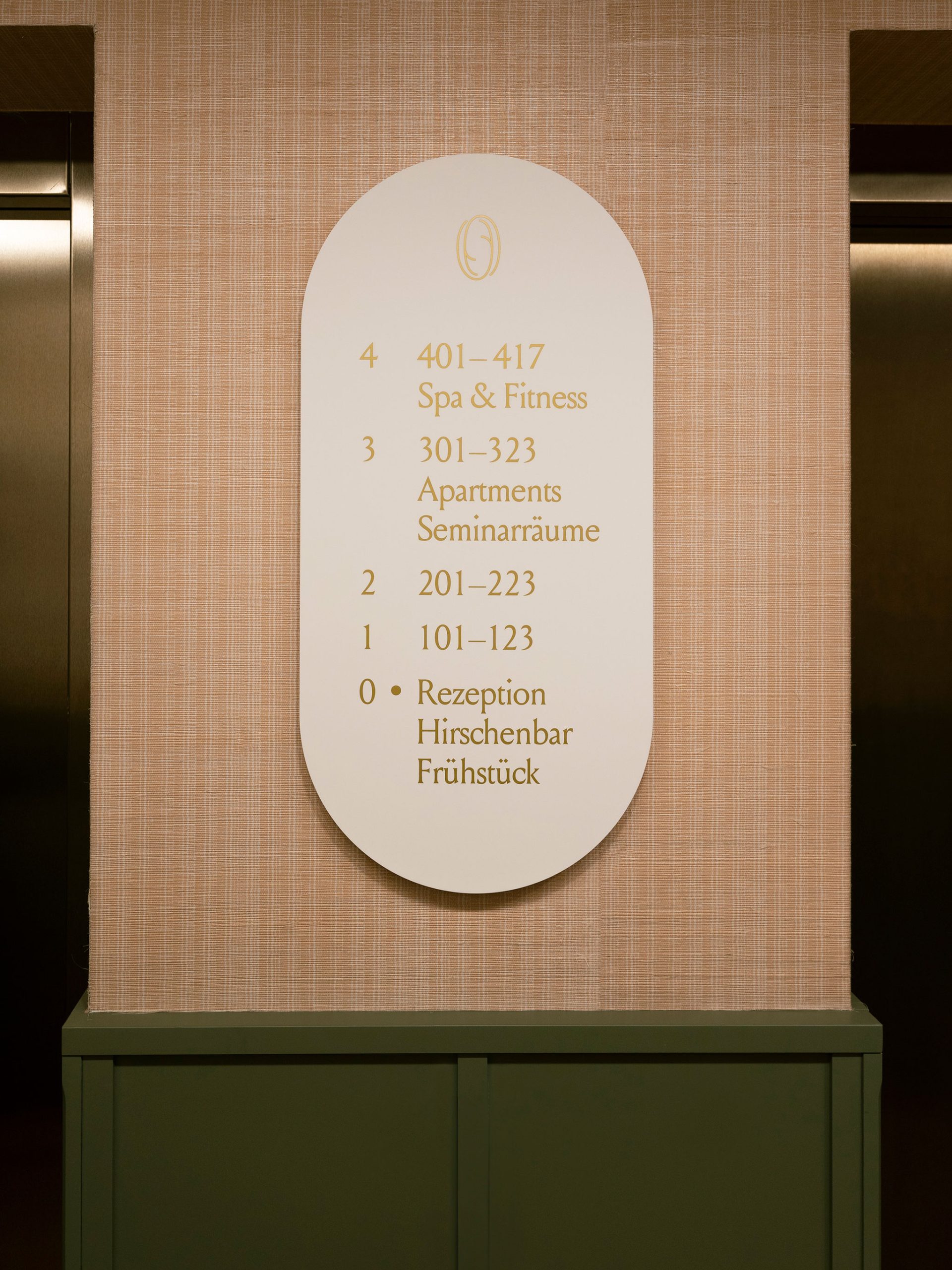
Katharina I really like the routing in the house. Simply because you were so inspired by the interior design. There are so many elements in the signage system: there are the oval signs, where the curves of the furniture come from. Or the golden lettering that picks up on our lamps. It’s all very harmonious. Of course, the room cards are also delightful.
Bruch What was the most difficult decision you had to make in the design process?
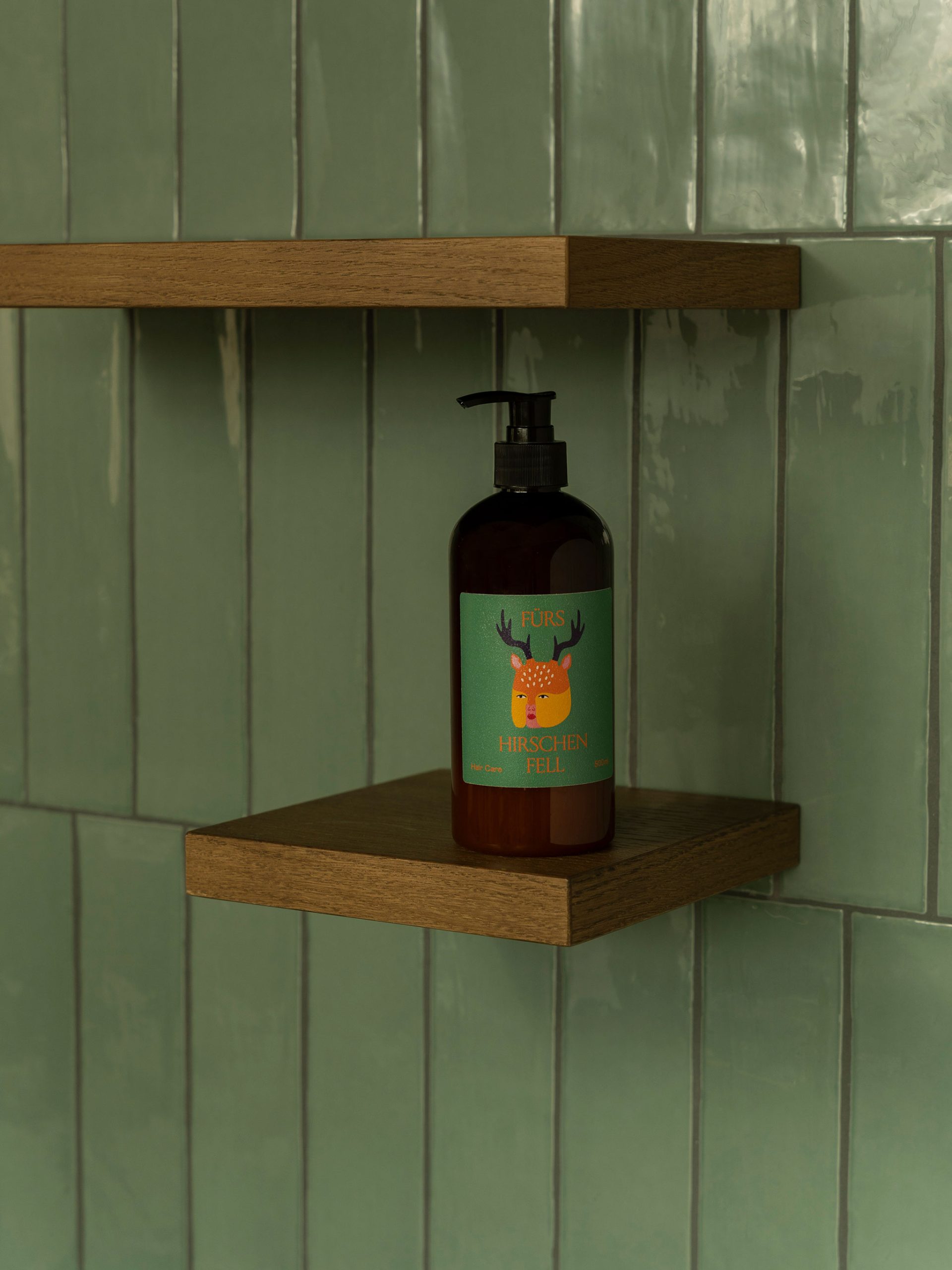
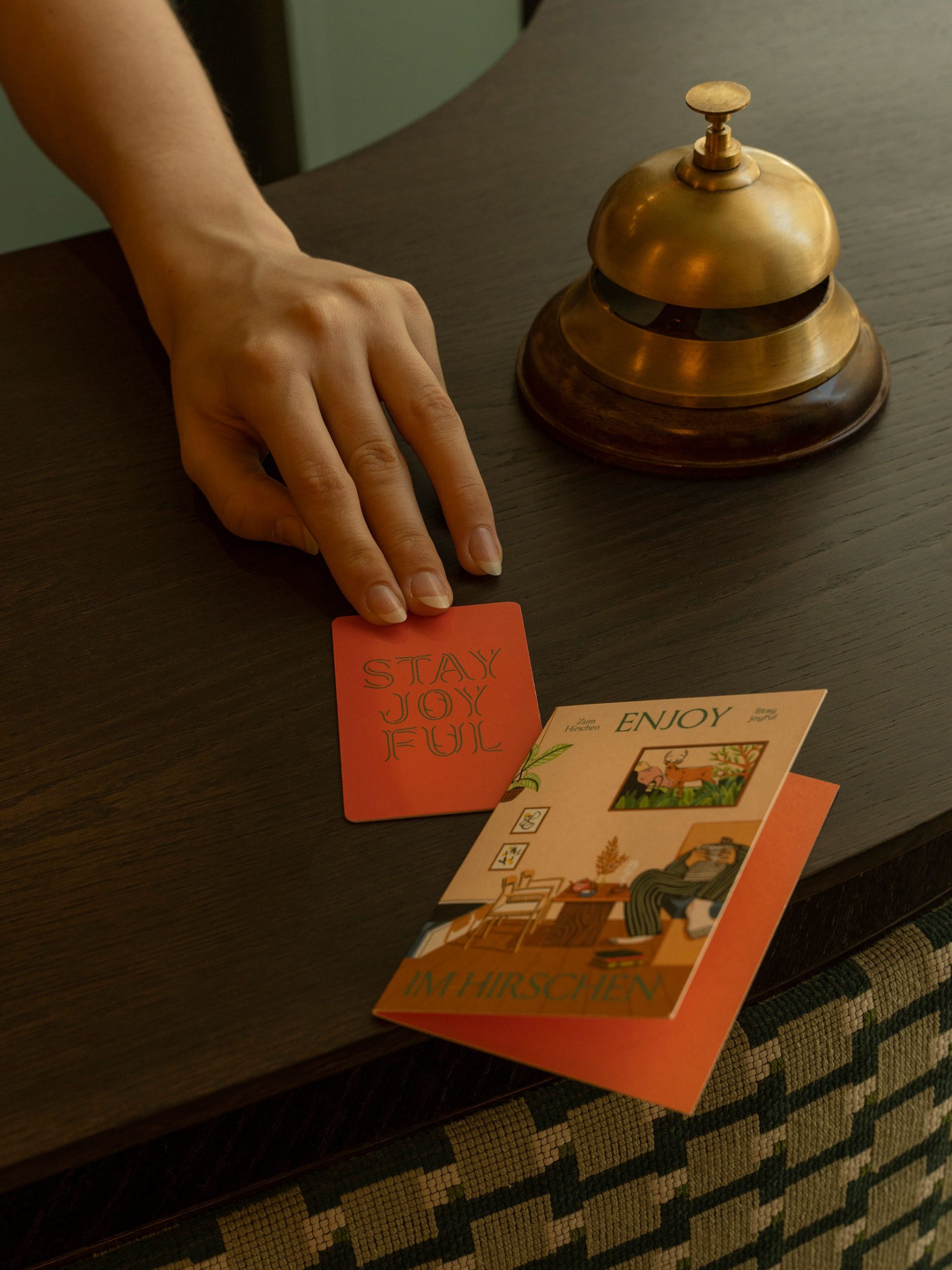
Katharina The most difficult decisions are those when the budget is insufficient. What do we leave out? What do we make simpler? We decided together with you that we take the topic of illustrations very seriously. But illustrations are of course a cost factor. That’s why we’re now commissioning new illustrations from time to time and building up a small collection over the years. Not everything can happen at once. For this reason alone, branding is a process for us that never really ends.
Bruch That’s actually exactly how we see it. Do you feel that the efforts are paying off?
Katharina I am 100% convinced that good branding makes a difference. I can’t put it into figures. What we notice at the Hirschen: We get a lot of bookings via certain platforms, where you basically only have pictures to tell a story. We have also invested heavily in images on your recommendation. Otherwise, branding is reflected in the reviews.
“I am 100% convinced
Katharina Wallmann, Zum Hirschen
that good branding makes a difference.
Breakage What are the ratings?
Katharina The reviews we get are really good – and they are only good if the hotel is something special. At the latest when they are here, guests realize how special it really is. We are not just a 08/15 star hotel, we are different.
Bruch How do people notice that when they are with you?
Katharina On the surprising moments. You walk into the elevator and say, “Wow!” Because you didn’t expect it to be covered in wallpaper and playing music. Or you open the door to the garden and didn’t know there were 2,000 square meters of greenery in front of you.
Bruch Where can this surprise factor be found in branding?
Katharina In the language and how you used it. Language played an important role in radiating cheerfulness. To convey that we don’t always take ourselves quite so seriously. For example, the “Doo-bee-doo-be-doo what makes you happy” on the writing pads in the room. Or on the do-not-disturb signs on the doors: “Jeeedermann bitte reinkommen.”
Bruch You can’t do it without Salzburg traditions after all. Thank you very much for talking to us, Katharina.
Project Details
Awards
ADC* Europe Silber
Creativ Club Austria Bronze
D&AD
TDC New York
Interviews
More Stories.