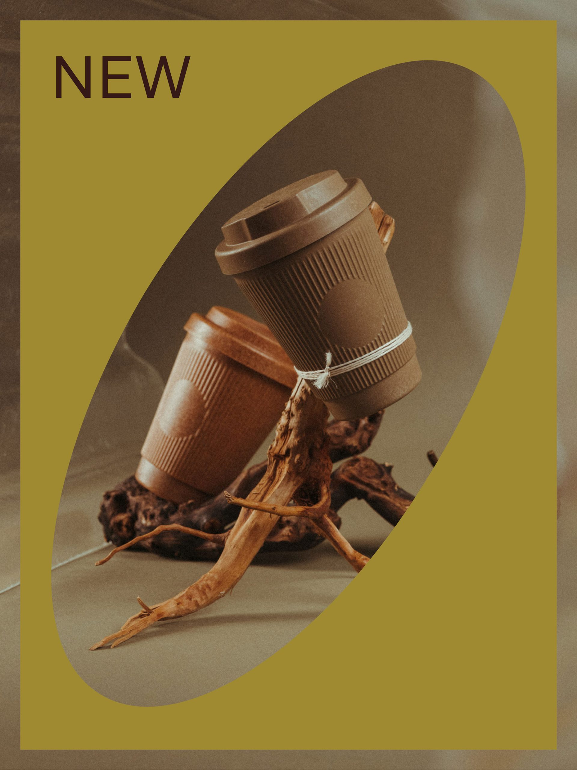
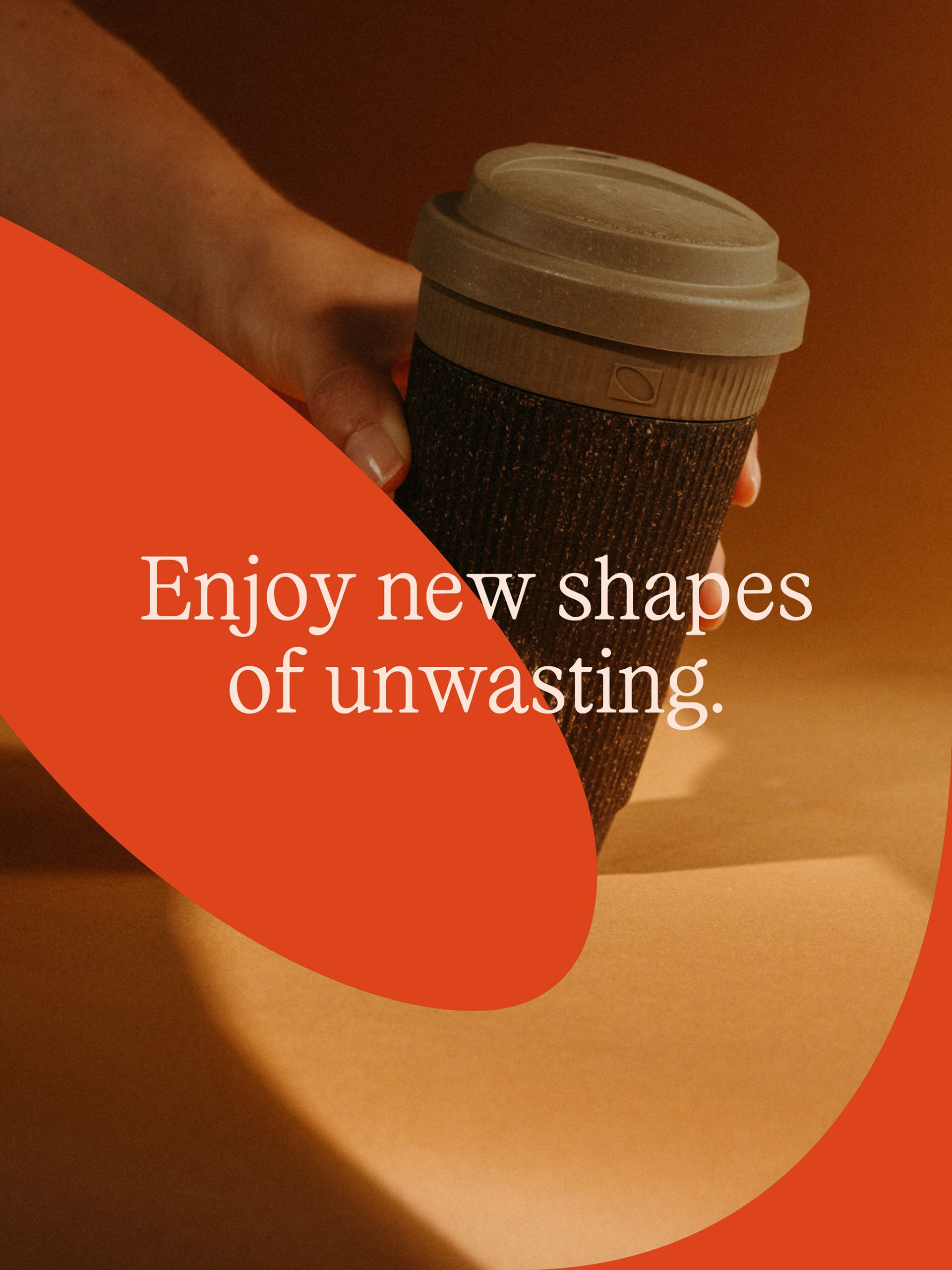
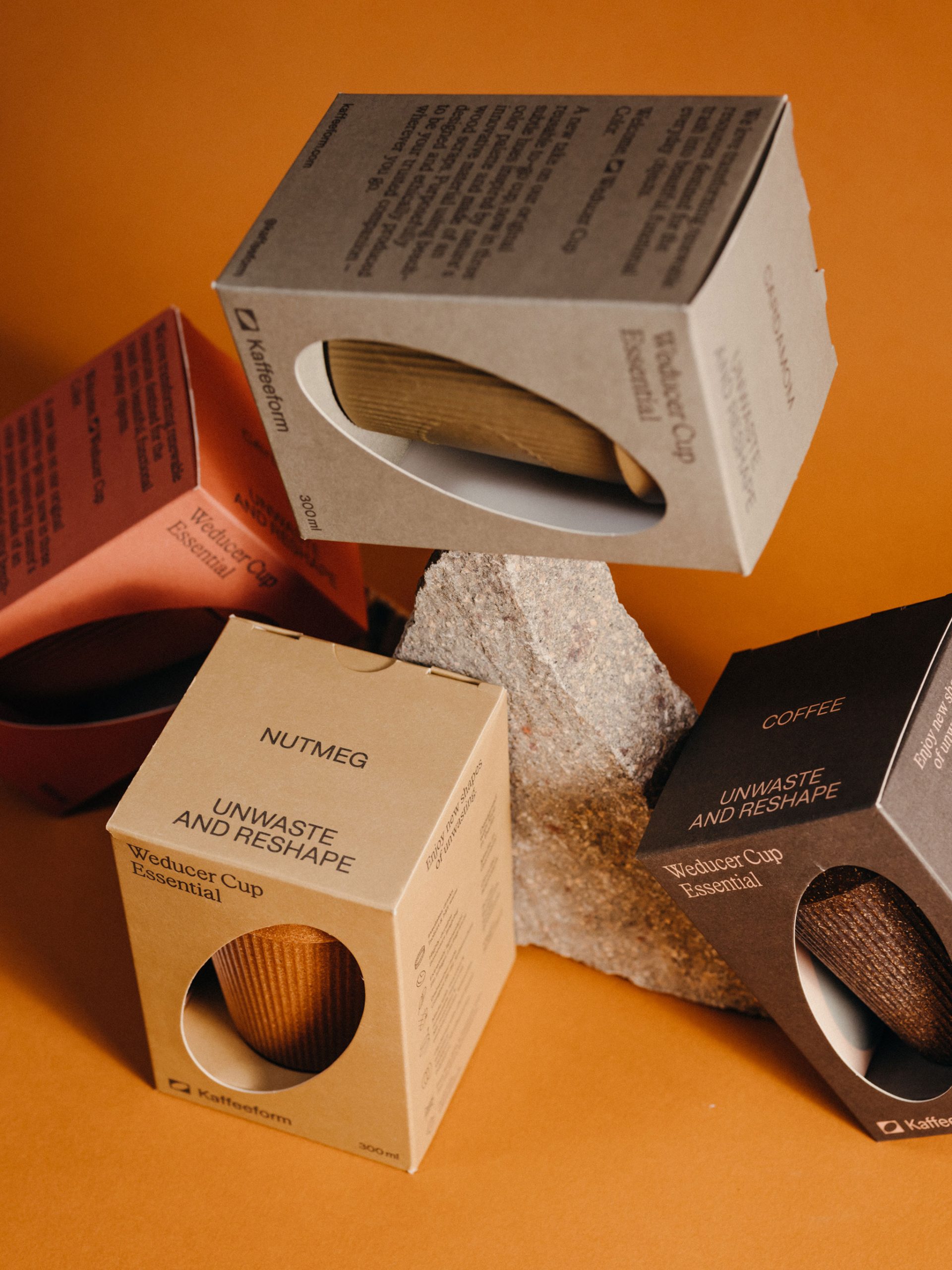
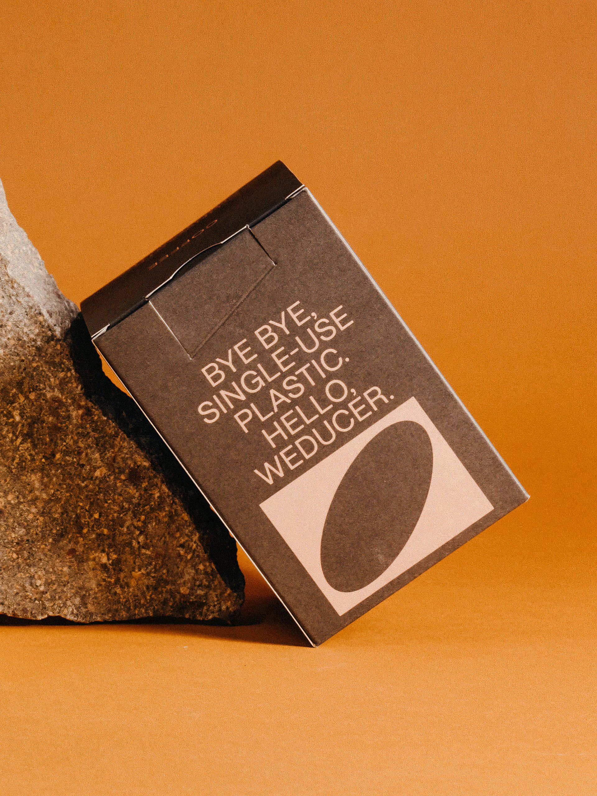
Unwaste and reshape
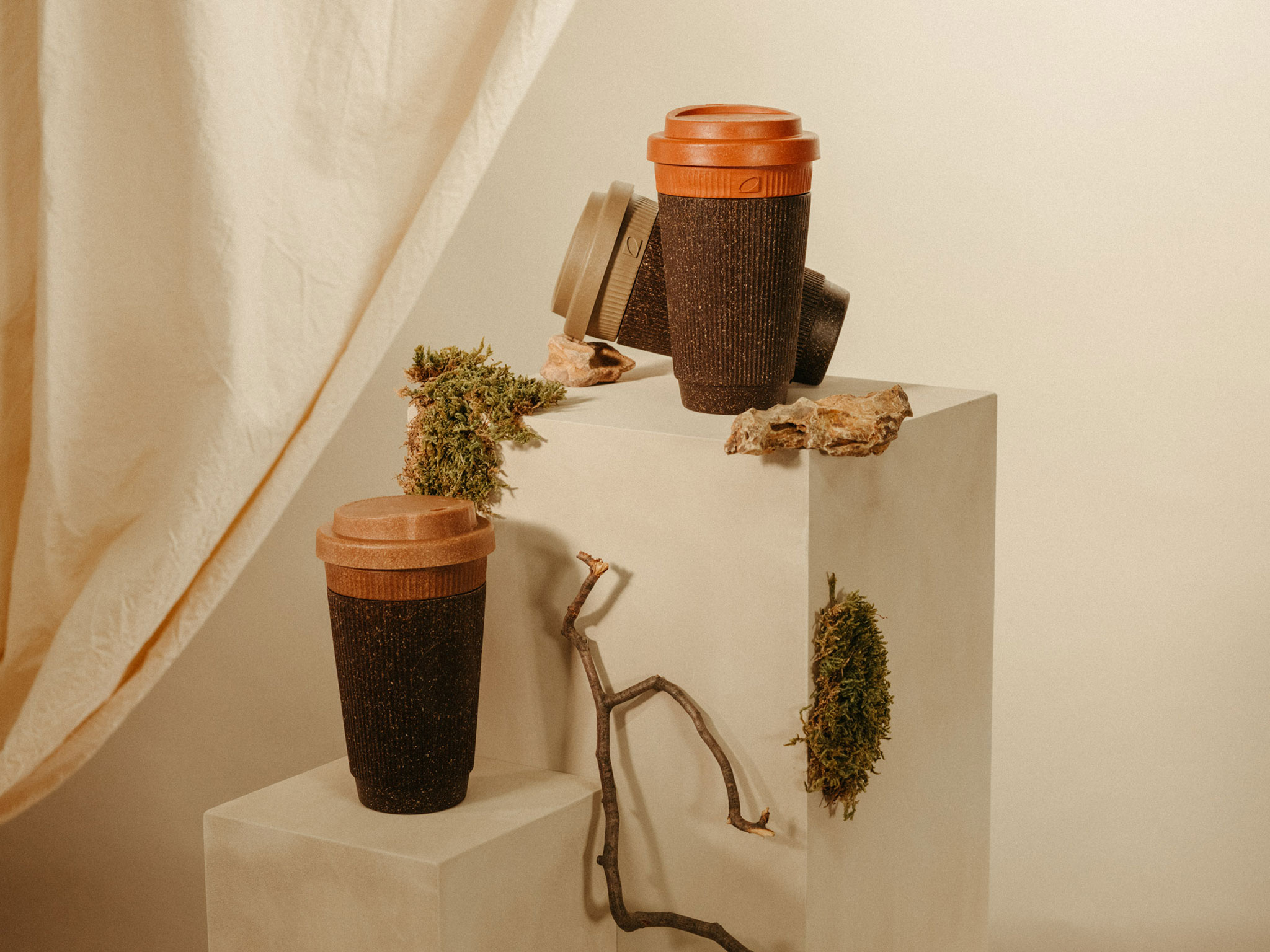
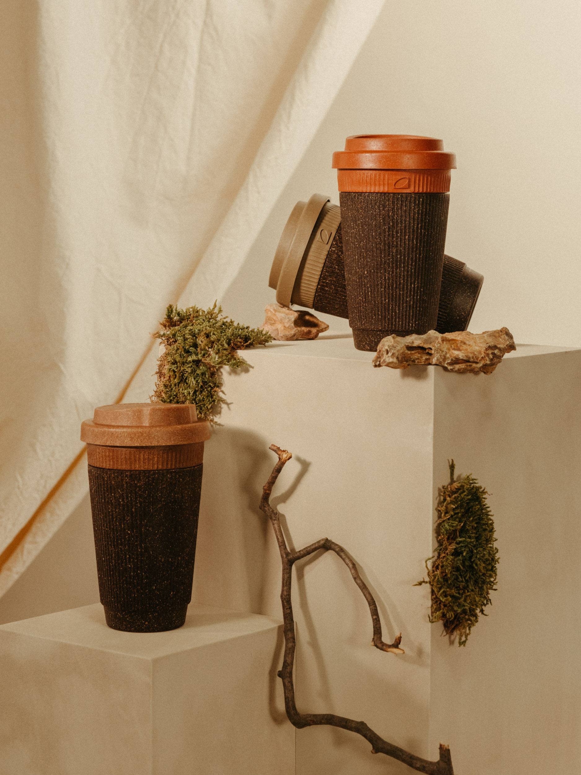
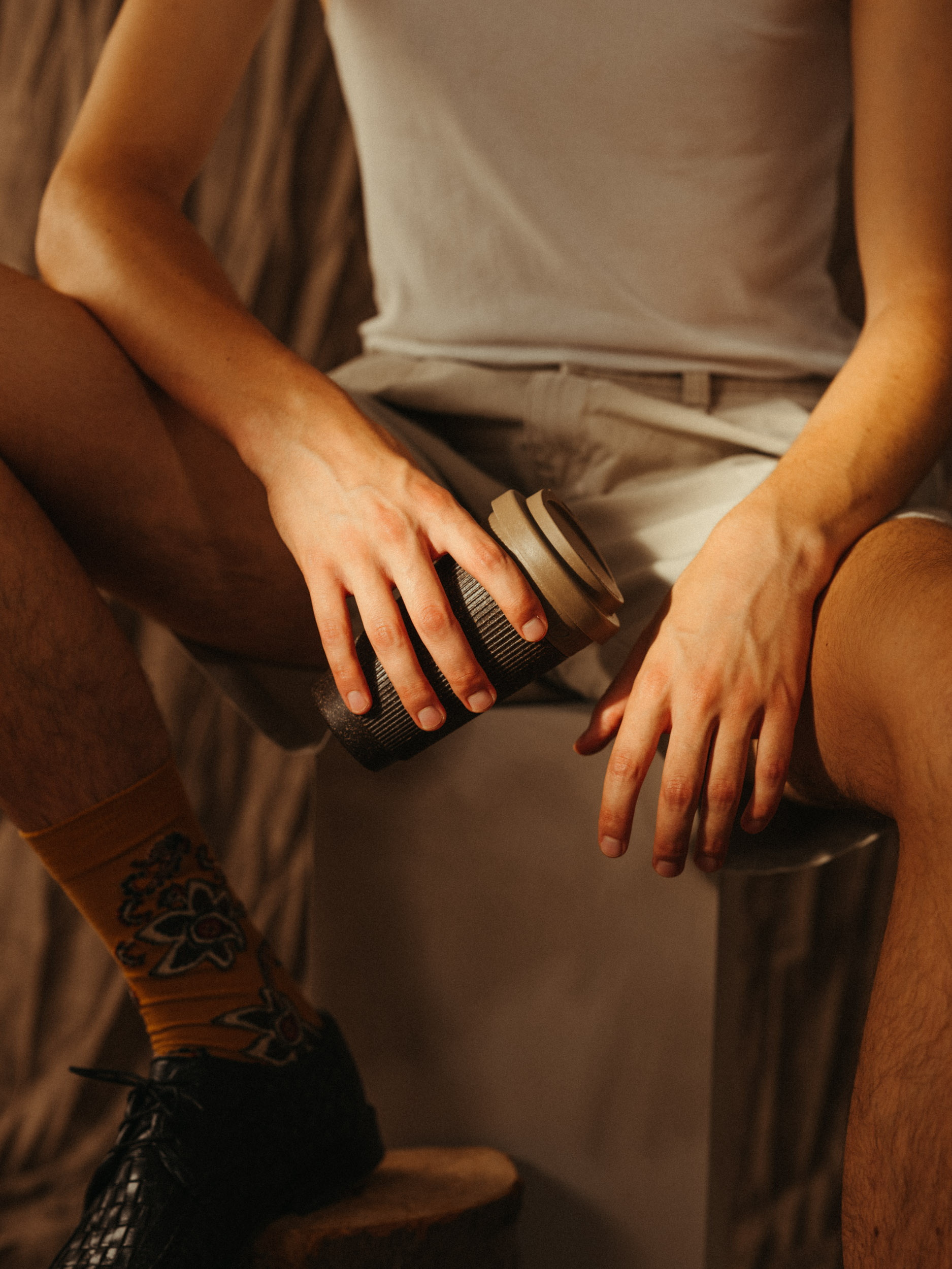
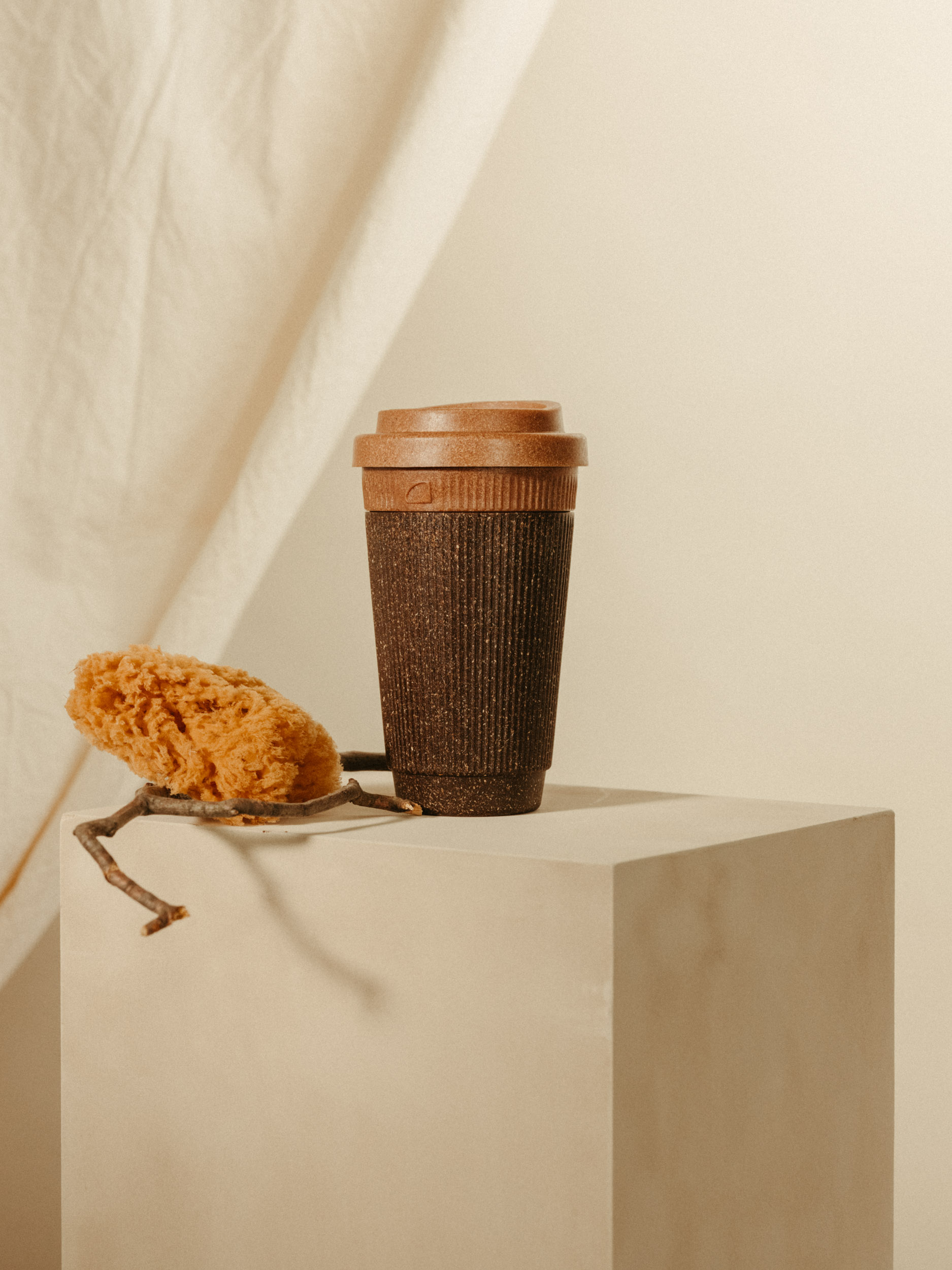
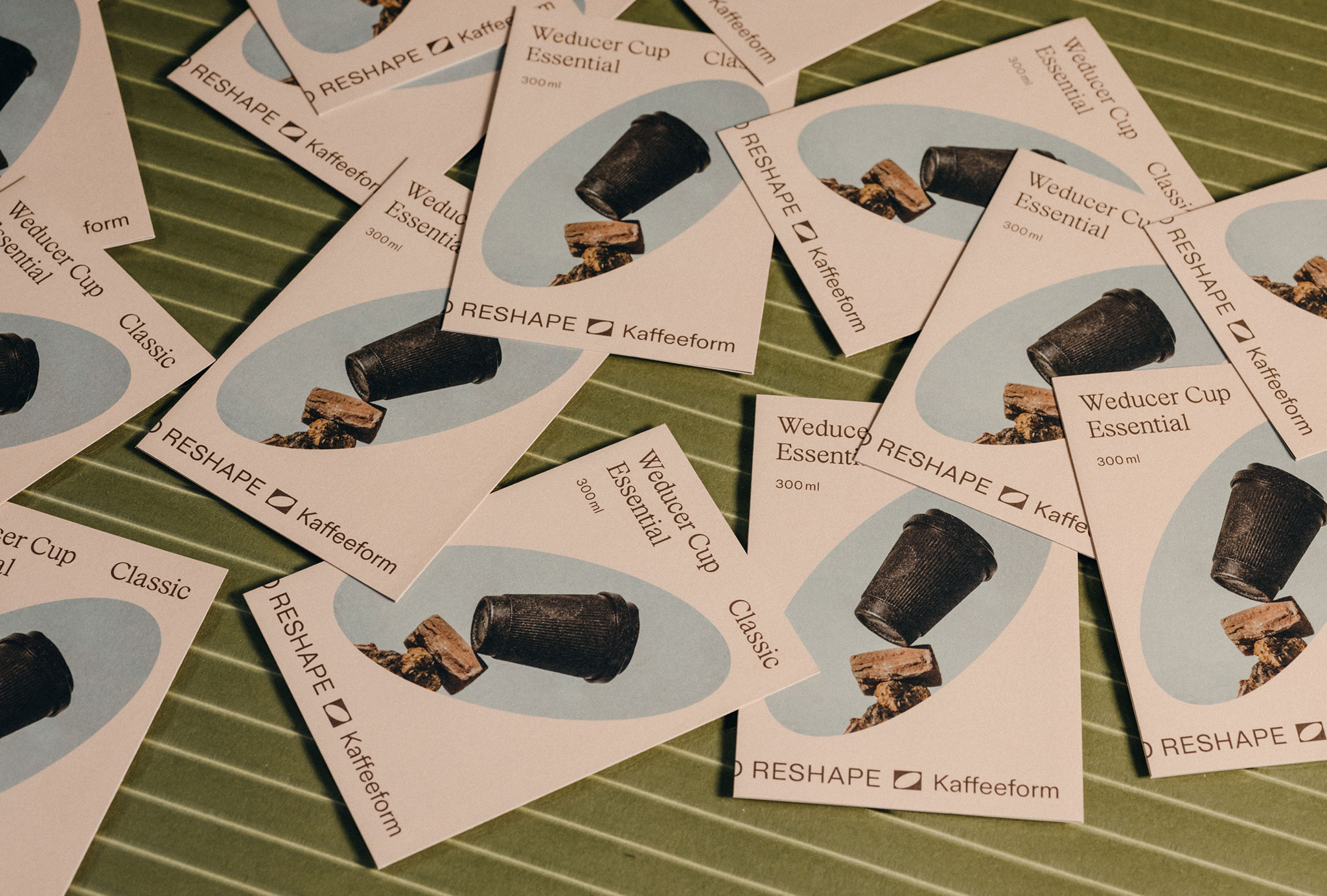
Kaffeeform takes the reusable concept a step further and brings renewable raw materials, which would otherwise have been thrown away, back into the cycle. Recycled coffee grounds are turned into a durable and robust material composition that creates the basis for a new and, above all, sustainable product world.
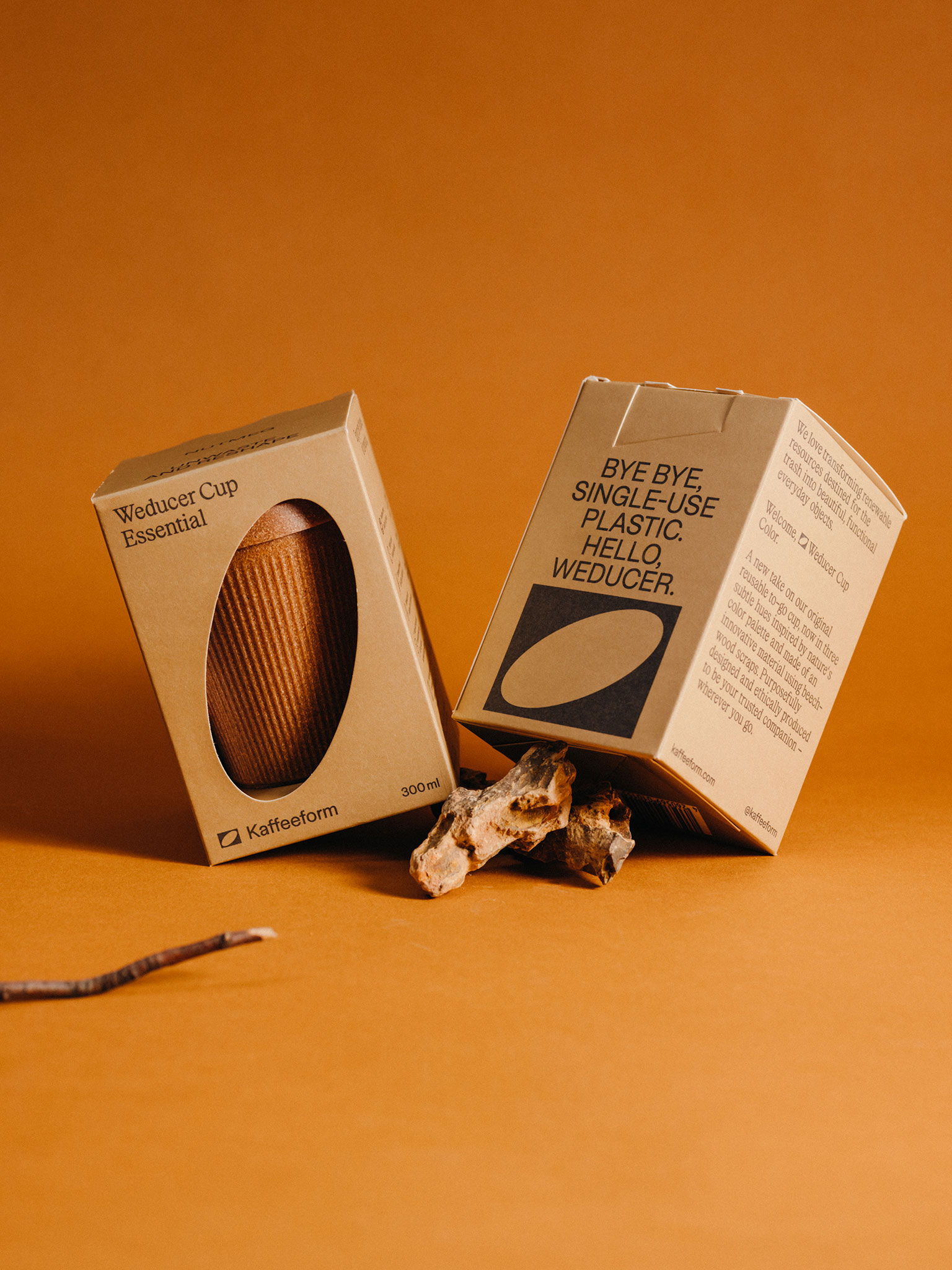
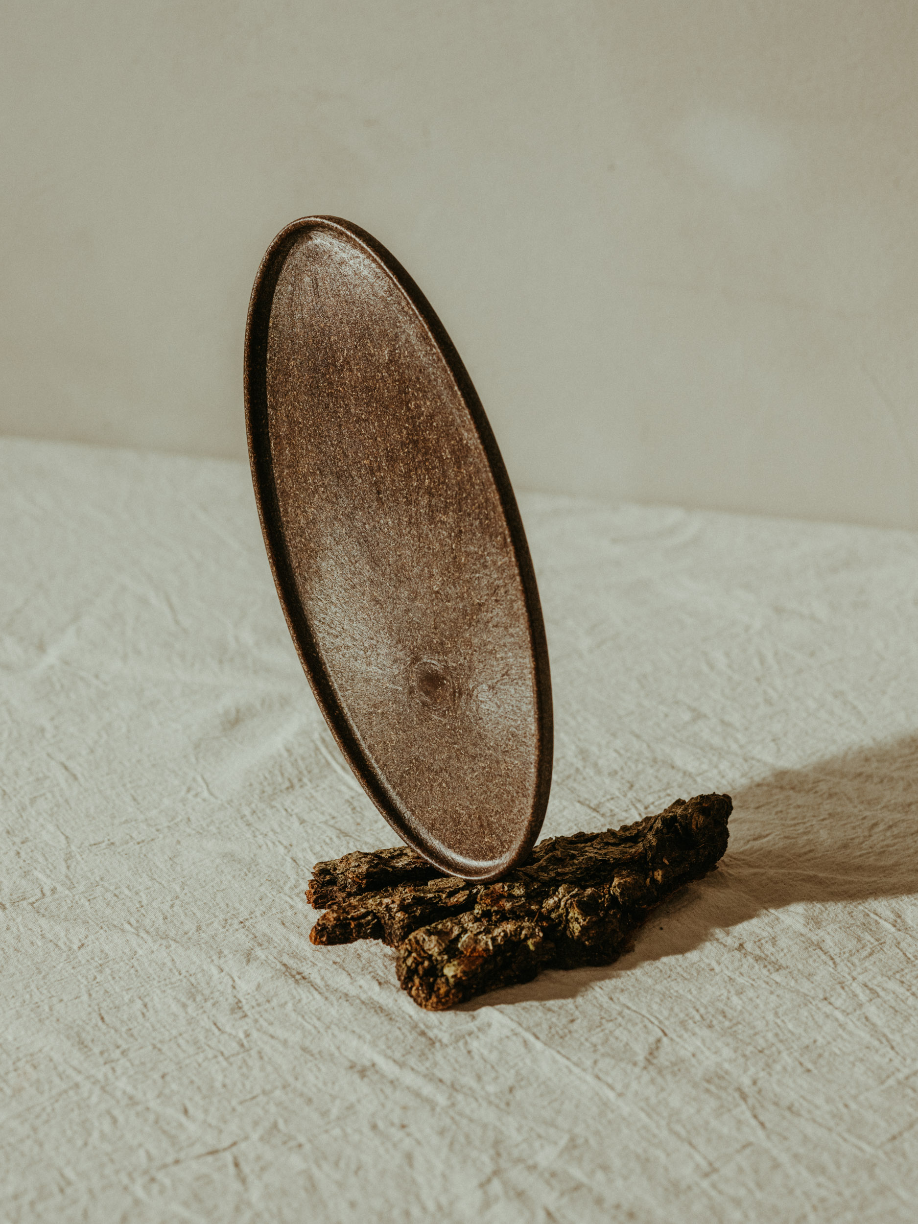
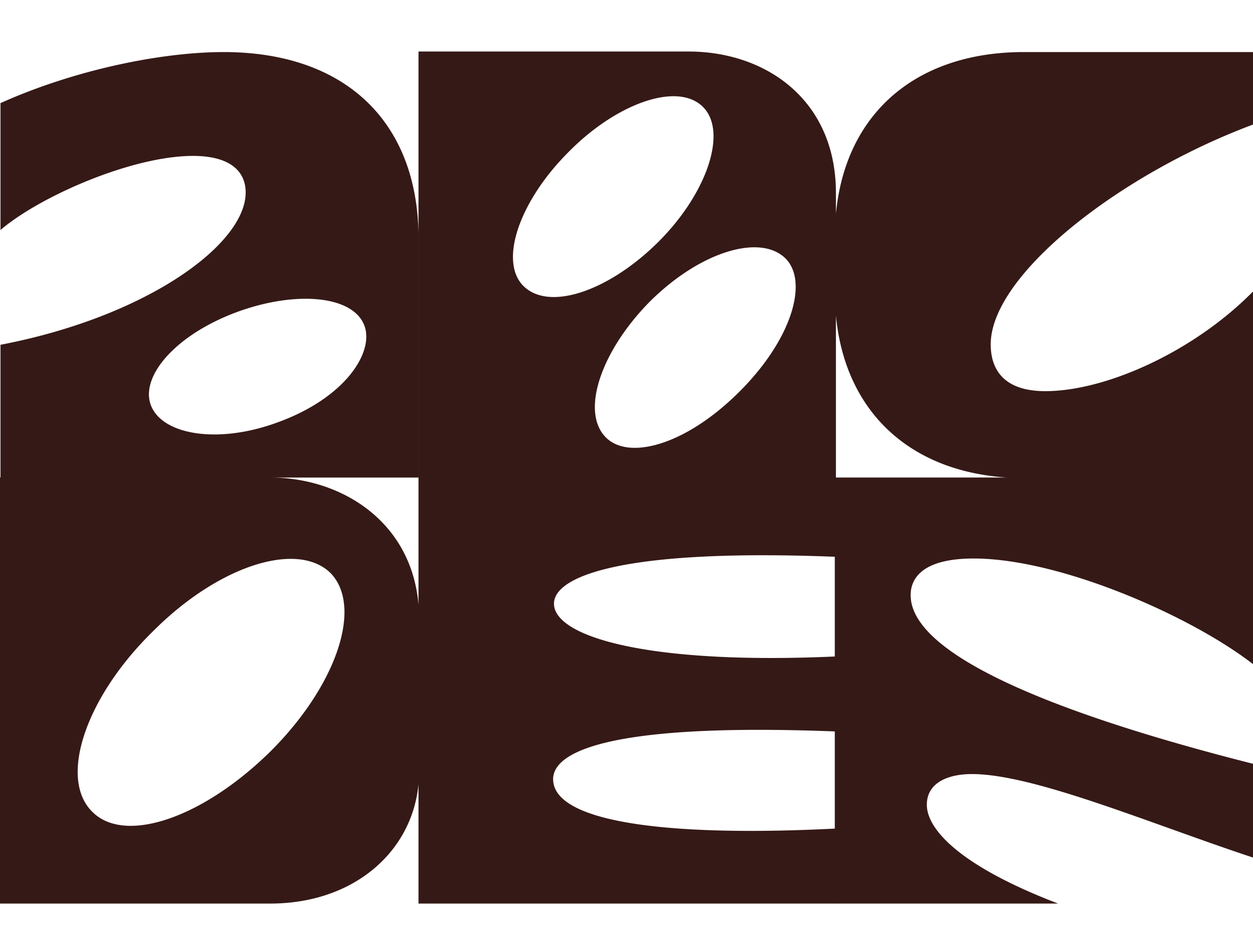
This was precisely the aim of the new brand identity. To create something new from something existing. A reduced coffee bean shape – the basis of the Kaffeeform products – in a negative representation communicates the re-use or reshape idea in its most concentrated form.

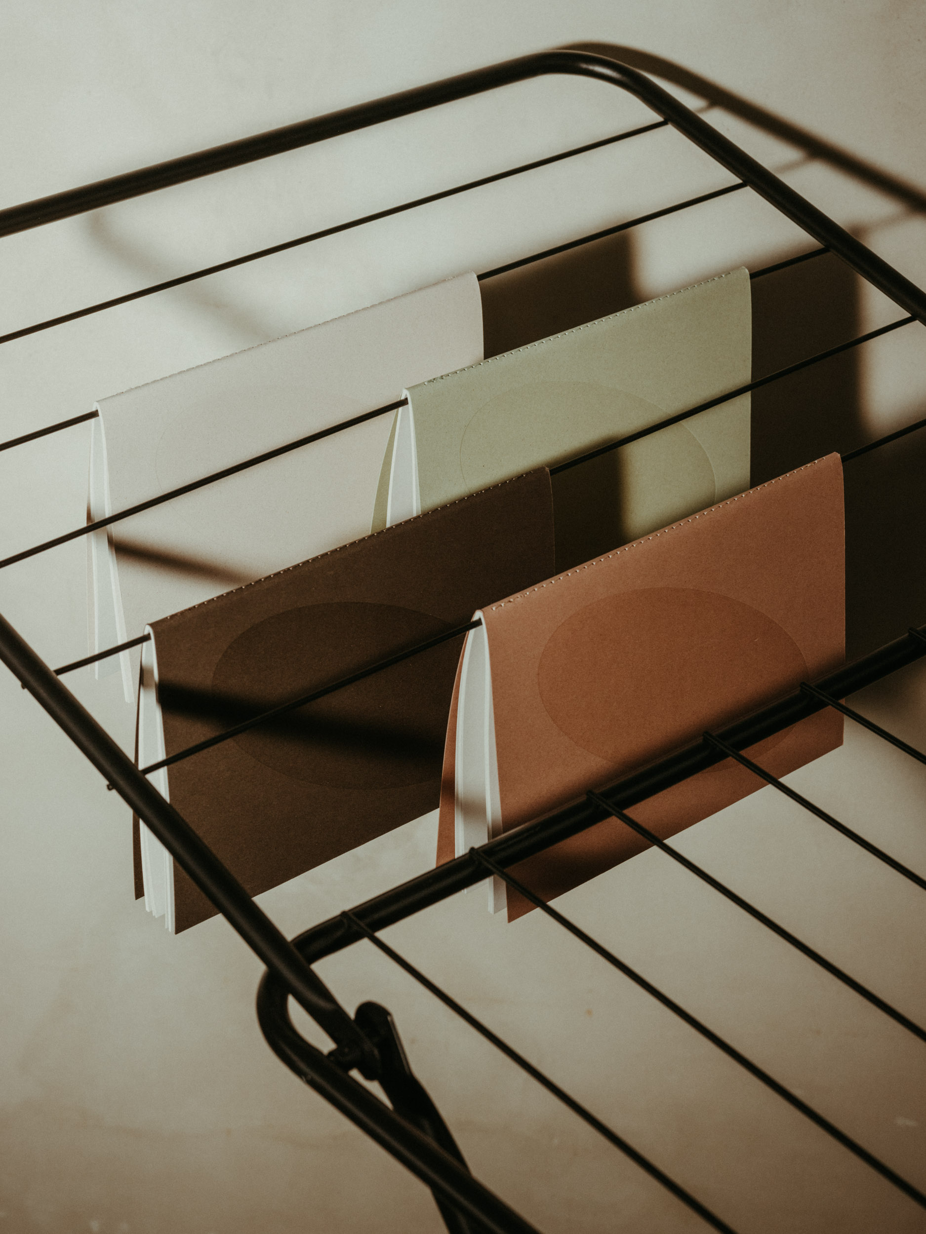
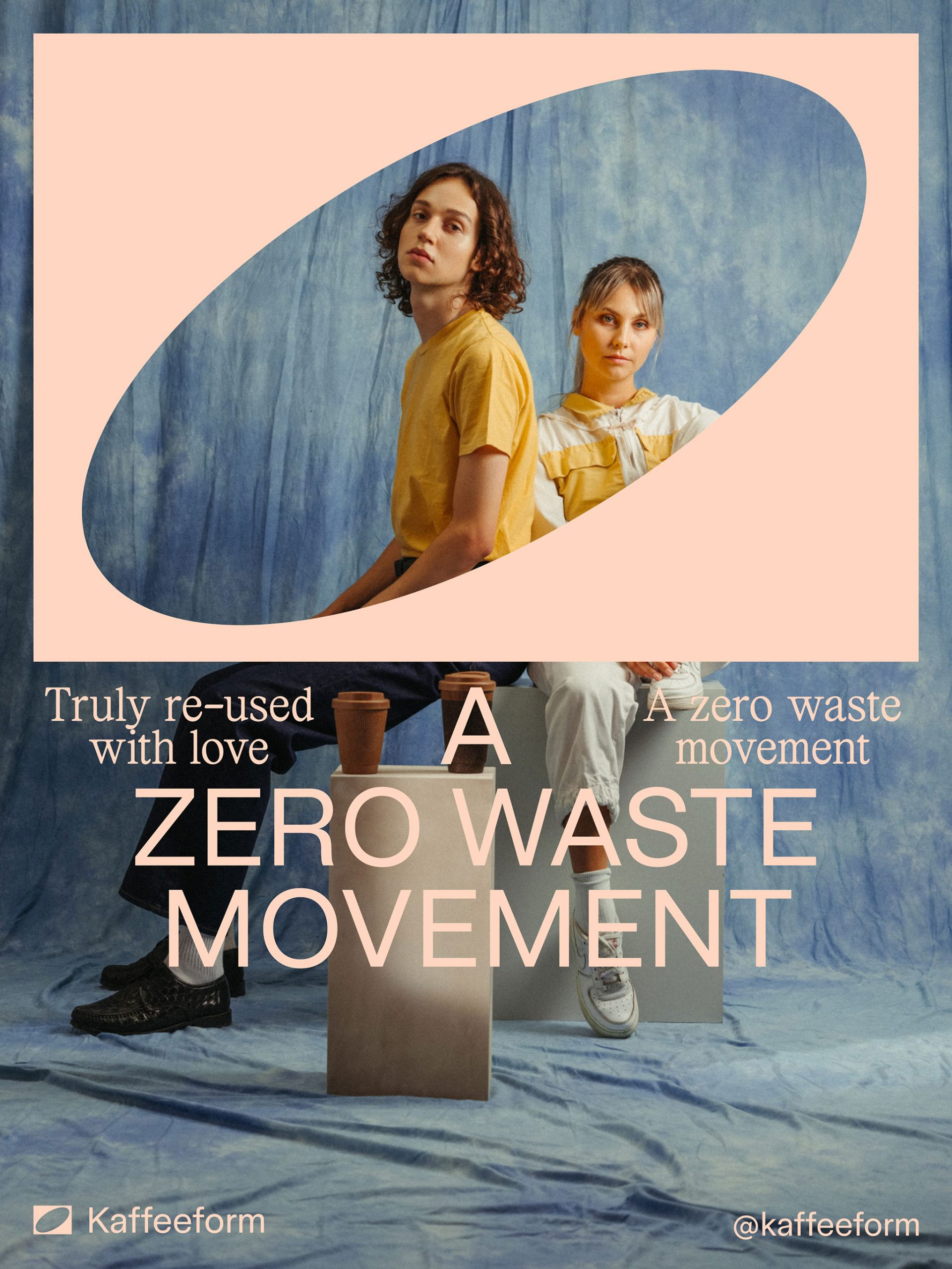
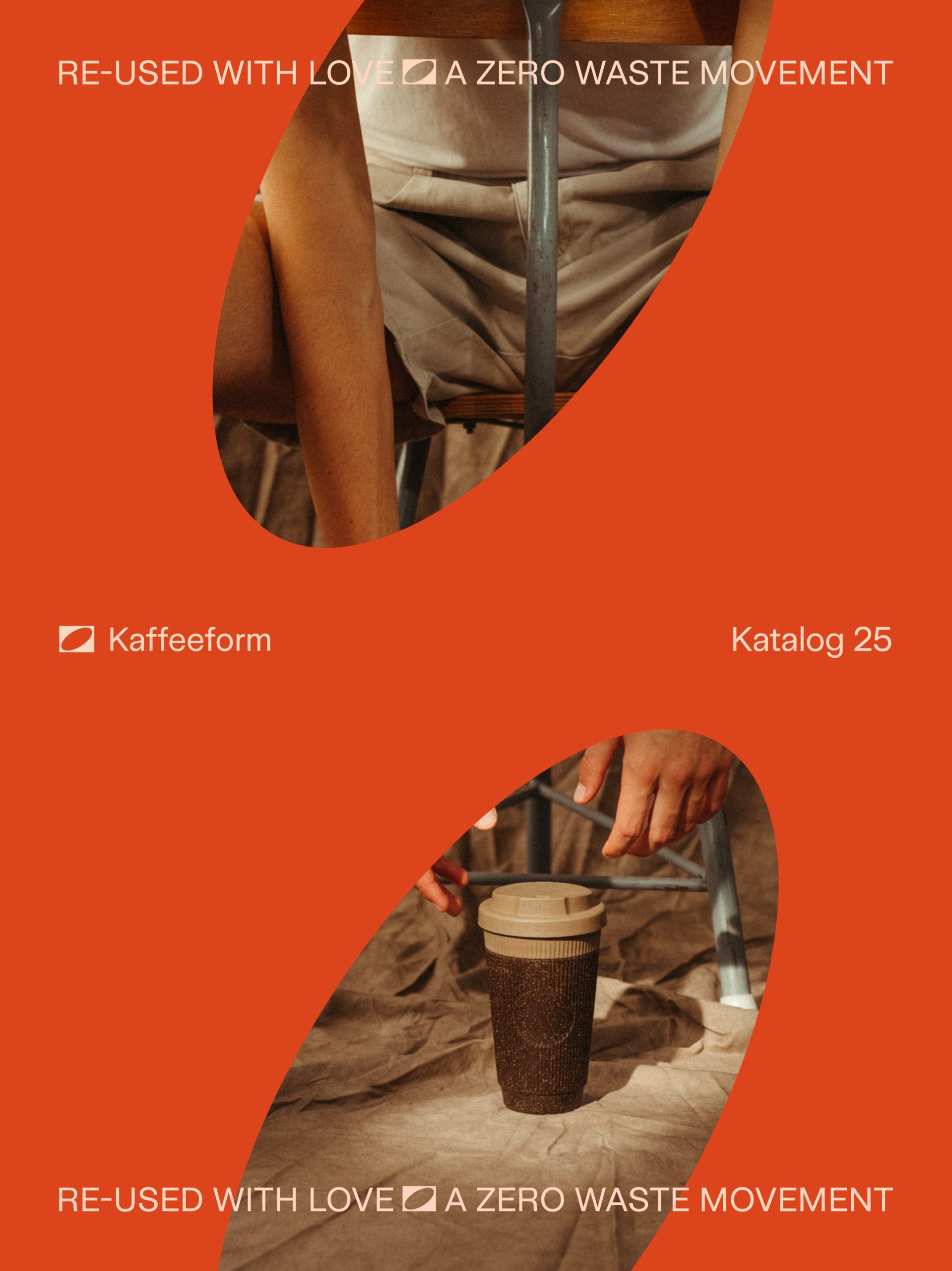
Earthy colors, a contemporary mix of typography and form, as well as the identity-creating imagery create a characteristic and varied appearance that matches the clear and modern product world.


Project Details
Scope
Art Direction
Branding
Digital
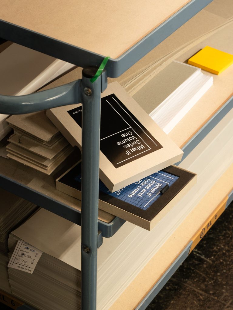
Package Design
Photography
Kaffeeform takes the reusable concept a step further and brings renewable raw materials that would otherwise have been thrown away back into the cycle. Recycled coffee grounds are turned into a durable and robust material composition that creates the basis for a new and, above all, sustainable product world. This was precisely the aim of the new brand identity. To create something new from something existing. A reduced coffee bean shape – the basis of the Kaffeeform products – in a negative representation communicates the idea of reuse and reshape in its most concentrated form.
Credits:
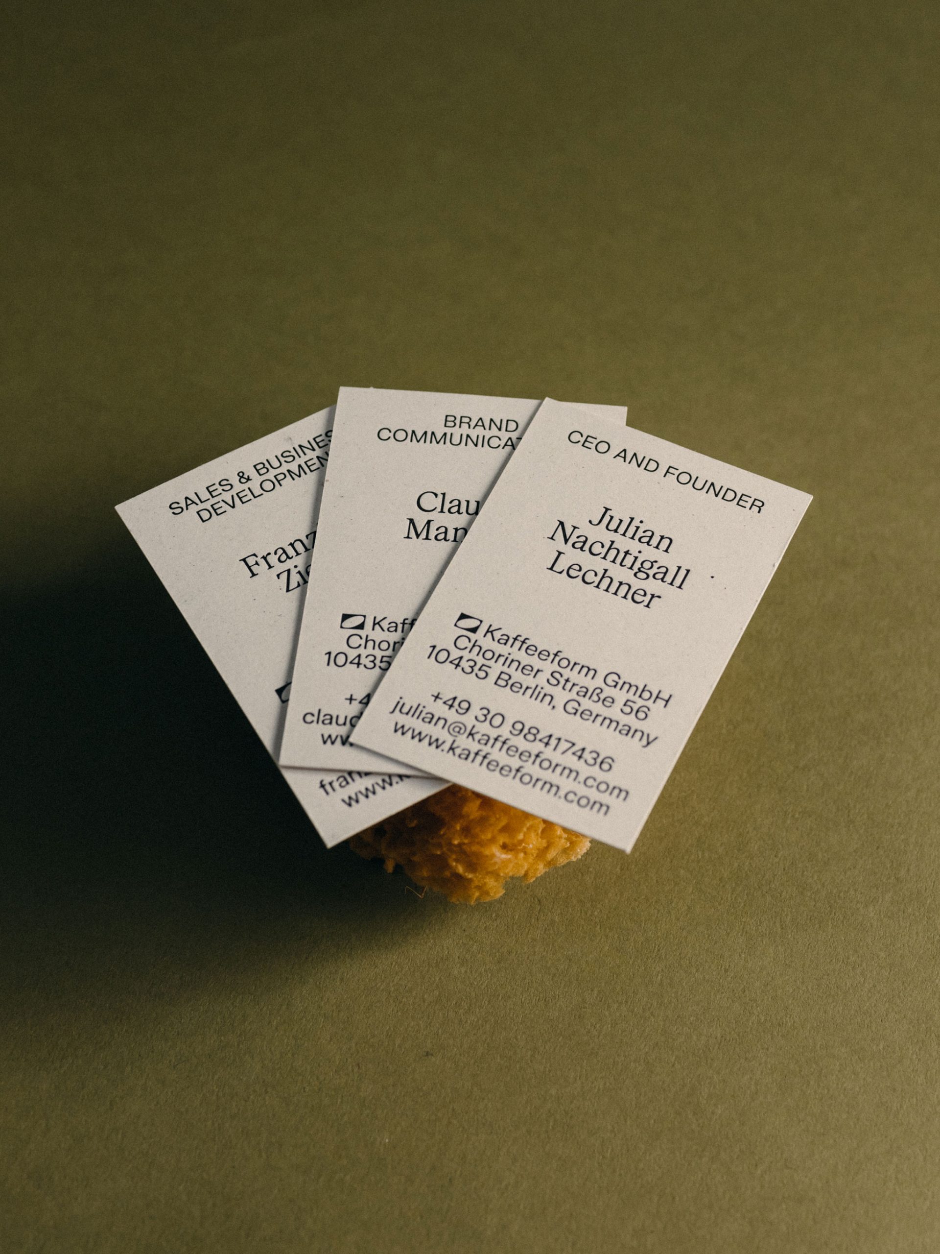
Creative & Art Direction: Kurt Glänzer, Josef Heigl • Photography: Max Manavi Huber • Product Design: Julian Nachtigall Lechner
• Creative & Art Direction: Kurt Glänzer, Josef Heigl
• Photography: Max Manavi Huber
• Product Design: Julian Nachtigall Lechner