 More
More
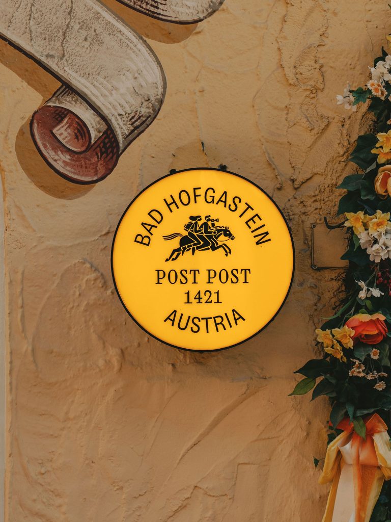
Post Post Hotel
Since 1421
More
Post Post Hotel
Since 1421
 More
More
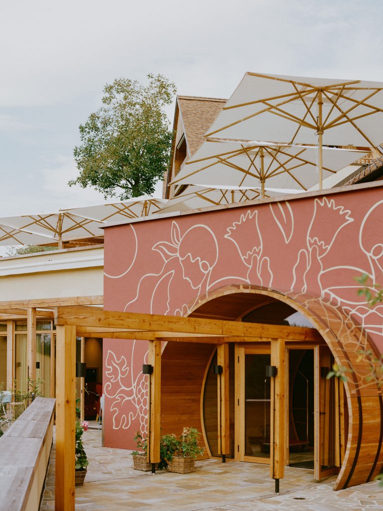
Autopalast Salzburg
A p(a)lace to be
 More
More
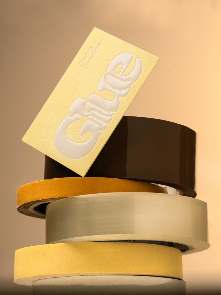
Glue
Time to glue
 More
More
Aiche Restaurant
Culinary stories
Hotel Gut Sein
Time to stay
 More
More
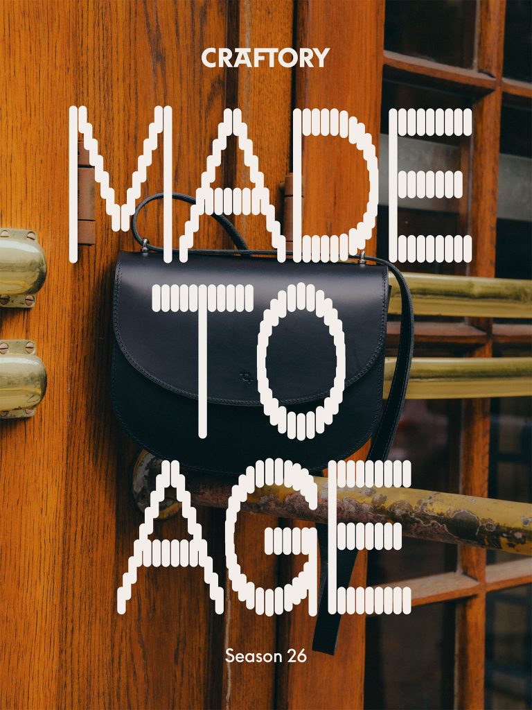
Craftory
Made to Age
Hotel Zum Hirschen
Stay joyful
 More
More
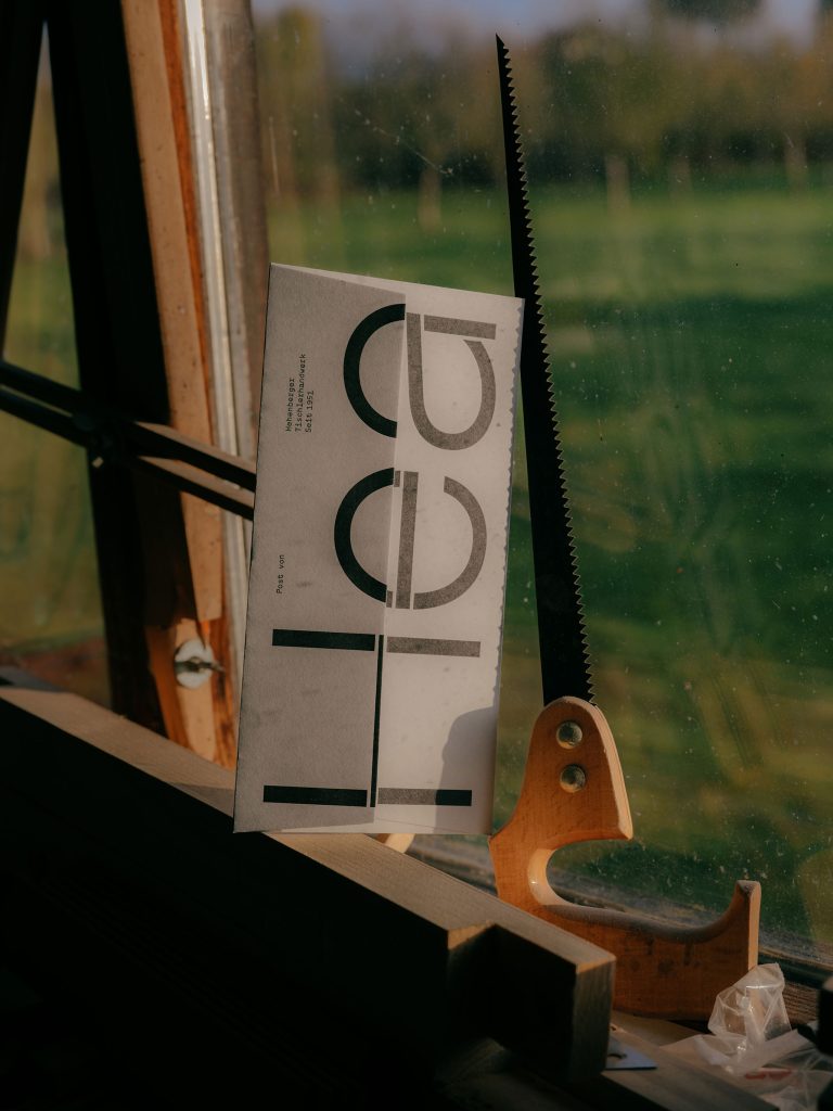
Hea Carpentry
Everything is built on wood
Ethicamper
Outsiders for life
 More
More
Leni Hotel
A gem on the hill
 More
More
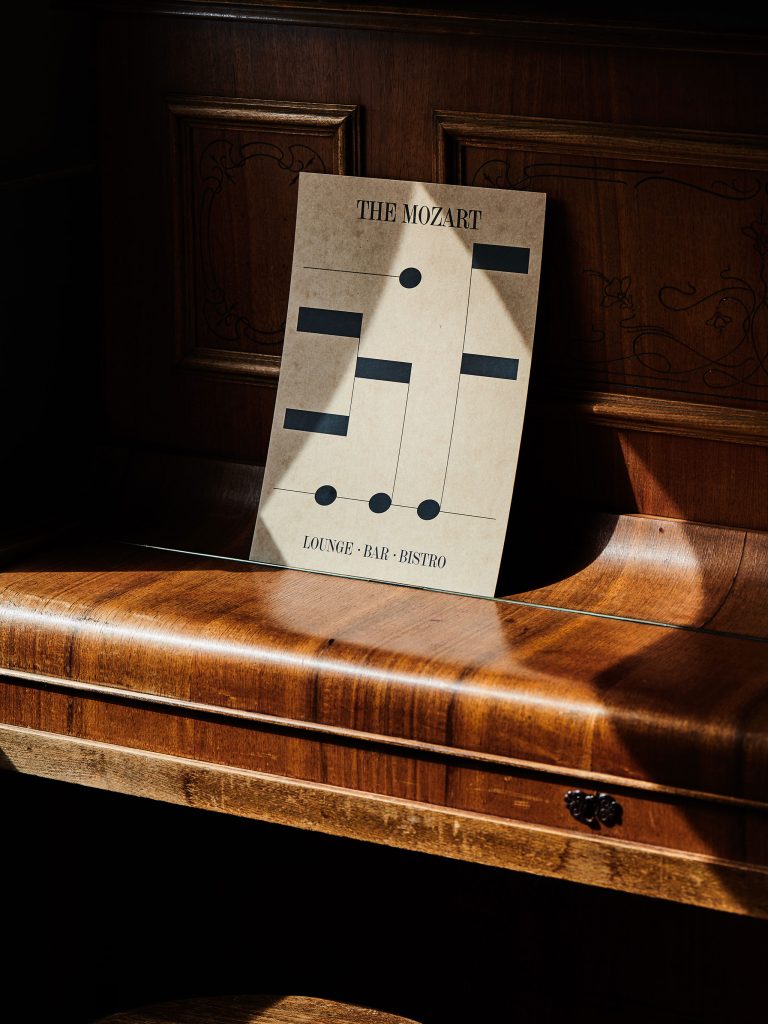
The Mozart Hotel
A modern classic
 More
More
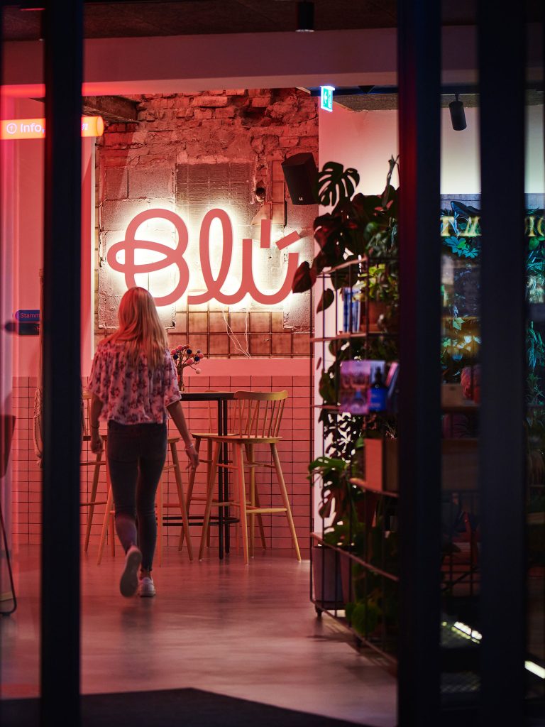
Blü Hotel
A hotel that sprouts wild buds
Engel
A place as a stage
 More
More
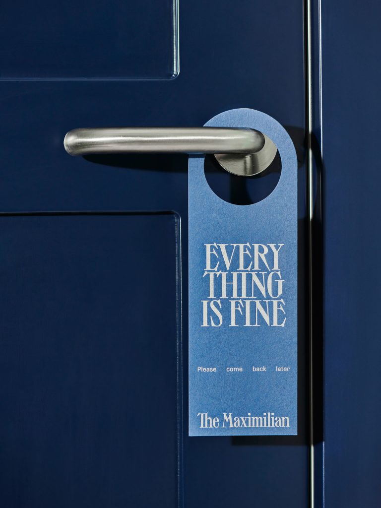
The Maximilian Hotel
A timeless stay
 More
More
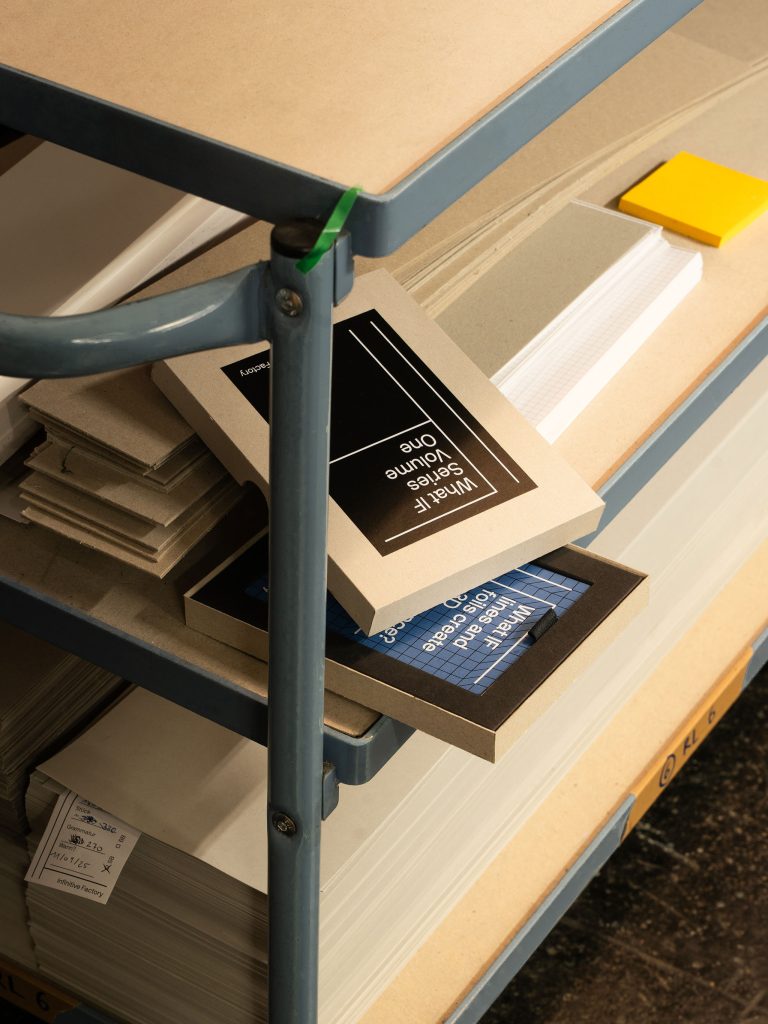
Infinitive Factory
Custom Made Letterpress
Kaffeeform
Unwaste & Reshape
 More
More
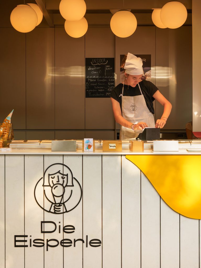
Eisperle
Pure Vegan Ice Cream
 More
More
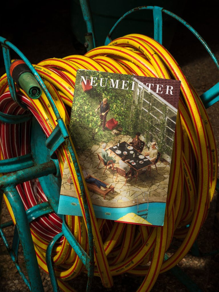
Neumeister
At the bottom of the facts
 More
More
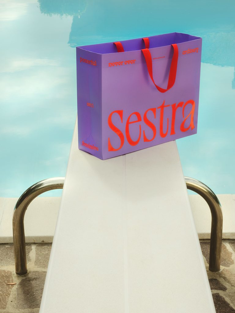
Sestra
Never ever ordinary
 More
More
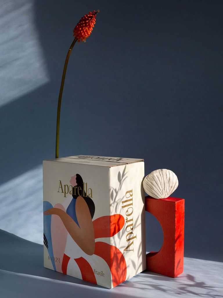
Aparella
The fruits of the landscape